Benjamin Moore Apparition (860) is a sophisticated and ethereal shade that elegantly bridges the gap between gray and blue. Its timeless appeal makes it a favorite among homeowners and designers seeking a serene, versatile color that effortlessly complements various styles and spaces. Apparition’s understated beauty creates an atmosphere of calm sophistication, making it an excellent choice for both modern and traditional interiors.
Apparition is a soft gray with subtle blue undertones that lend it a cool, tranquil quality. These blue undertones help Apparition stand apart from warmer grays, providing a refreshing alternative for spaces in need of a crisp yet soothing backdrop. The undertones are delicate, ensuring the color doesn’t overwhelm or clash with other elements in the room. Depending on the lighting, Apparition may lean slightly cooler, making it perfect for rooms with natural light or spaces where a clean, airy look is desired.
The versatility of Apparition allows it to pair beautifully with a wide range of complementary hues. Whether you’re layering neutrals, introducing bold accents, or creating a monochromatic palette, Apparition adapts gracefully to your vision. Below are some coordinating colors that work harmoniously with this dreamy gray:
These coordinating colors provide endless opportunities to tailor your space to your desired aesthetic, whether you aim for a serene sanctuary or a visually dynamic interior.
Apparition is a wonderfully adaptive color that works well in a variety of applications and spaces. Its soft, neutral character makes it a top choice for creating inviting, harmonious interiors. Here are some ideas for incorporating Apparition into your home:
Transform your living room into a tranquil retreat with Apparition as the main wall color. Pair it with crisp white trim and textured textiles in complementary shades such as navy, beige, or soft greens. Add metallic accents like brushed nickel or matte gold for a touch of sophistication.
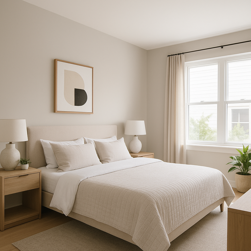
Apparition is ideal for bedrooms, where its calming qualities contribute to a restful environment. Layer it with plush bedding in soft blues, grays, or whites, and add natural wood furniture for a cozy yet contemporary vibe.
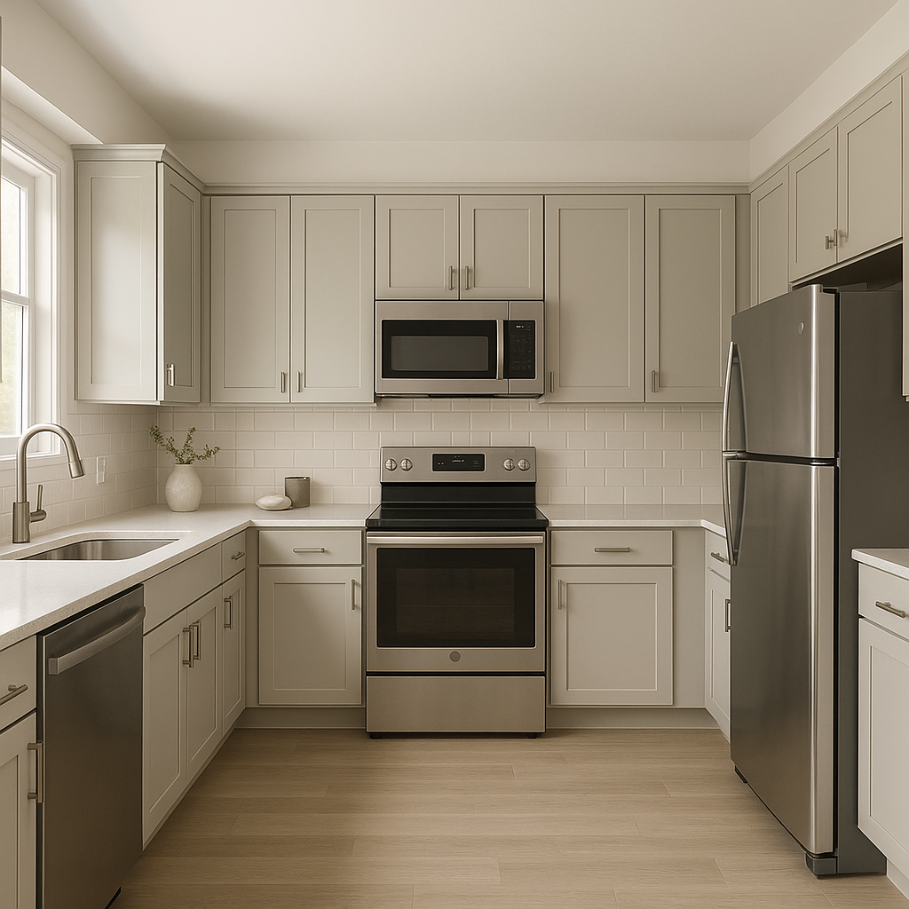
For a spa-like ambiance, use Apparition on bathroom walls. Combine it with white subway tiles, marble countertops, and chrome fixtures to create a clean, refreshing space. Consider adding pops of greenery or natural wood decor for an organic touch.
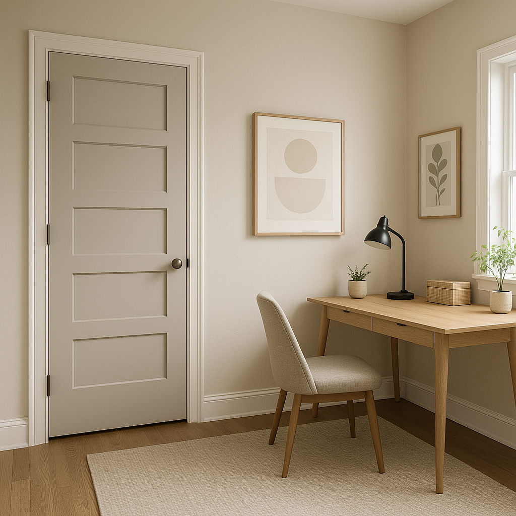
Apparition’s subtle blue undertones promote focus and calm, making it an excellent choice for a home office. Pair it with deep navy accents and modern furniture to create a stylish, productive workspace.
Elevate transitional spaces like hallways and entryways by using Apparition as the wall color. Its understated elegance adds a polished touch while allowing artwork, mirrors, or decorative accents to shine.
Apparition’s appearance can shift depending on the lighting in your space. In rooms with ample natural light, its blue undertones will become more pronounced, creating a fresh and airy feel. In dimmer areas or spaces with artificial lighting, Apparition may read as a pure gray, offering a more grounded and neutral tone. Testing the color in your specific lighting conditions is key to achieving the perfect look.
Benjamin Moore Apparition is more than just a paint color—it’s a mood-setting hue that embodies sophistication and tranquility. Its versatility, subtle undertones, and ability to coordinate effortlessly with a wide range of colors make it an exceptional choice for any interior design project. Whether you’re refreshing a single room or transforming your entire home, Apparition offers a timeless elegance that adapts beautifully to your vision.
View Colors Only by Brand (No Imagery):
Sherwin-Williams
|
Benjamin-Moore
|
Behr
|
Valspar
Live on the Eastern Slope of Colorado and looking for a local painting professional, check out all our painting services and reach out for a free estimate.
Copyright © 2026 : Wild Fox Painting Inc. : 12435 Mead Way, Littleton, CO 80125


