Benjamin Moore Fanfare (874) is a versatile and elegant neutral that seamlessly bridges the gap between sophistication and coziness. This shade is part of Benjamin Moore’s Classics Collection, celebrated for its enduring appeal and ability to complement a wide variety of design styles. Whether you’re looking to create a serene backdrop for your living room or a polished ambiance in your office, Fanfare delivers.
Fanfare is a warm beige with subtle golden undertones that infuse spaces with an inviting glow. Unlike cooler neutrals that can feel stark or aloof, Fanfare has a pleasant richness that adds depth without overwhelming the room. Its golden undertones make it particularly well-suited to spaces that crave a touch of warmth, such as north-facing rooms that lack natural light or areas where you want to foster a cozy, welcoming atmosphere.
The beauty of Benjamin Moore Fanfare lies in its adaptability. It pairs effortlessly with a range of hues, allowing you to experiment with different color schemes to suit your style. Some coordinating colors include:
For an earthy palette, Fanfare also works beautifully with muted greens like Benjamin Moore Prescott Green (HC-140) or soft browns like Benjamin Moore Alexandria Beige (HC-77).
Fanfare’s versatility allows it to shine in virtually any space. Here are some ideas for incorporating this timeless neutral into your home or commercial design:
Fanfare creates an inviting and elegant backdrop for living areas. Pair it with plush furniture in soft grays or taupes, and accent with metallic finishes like brushed gold or bronze for a touch of refinement.
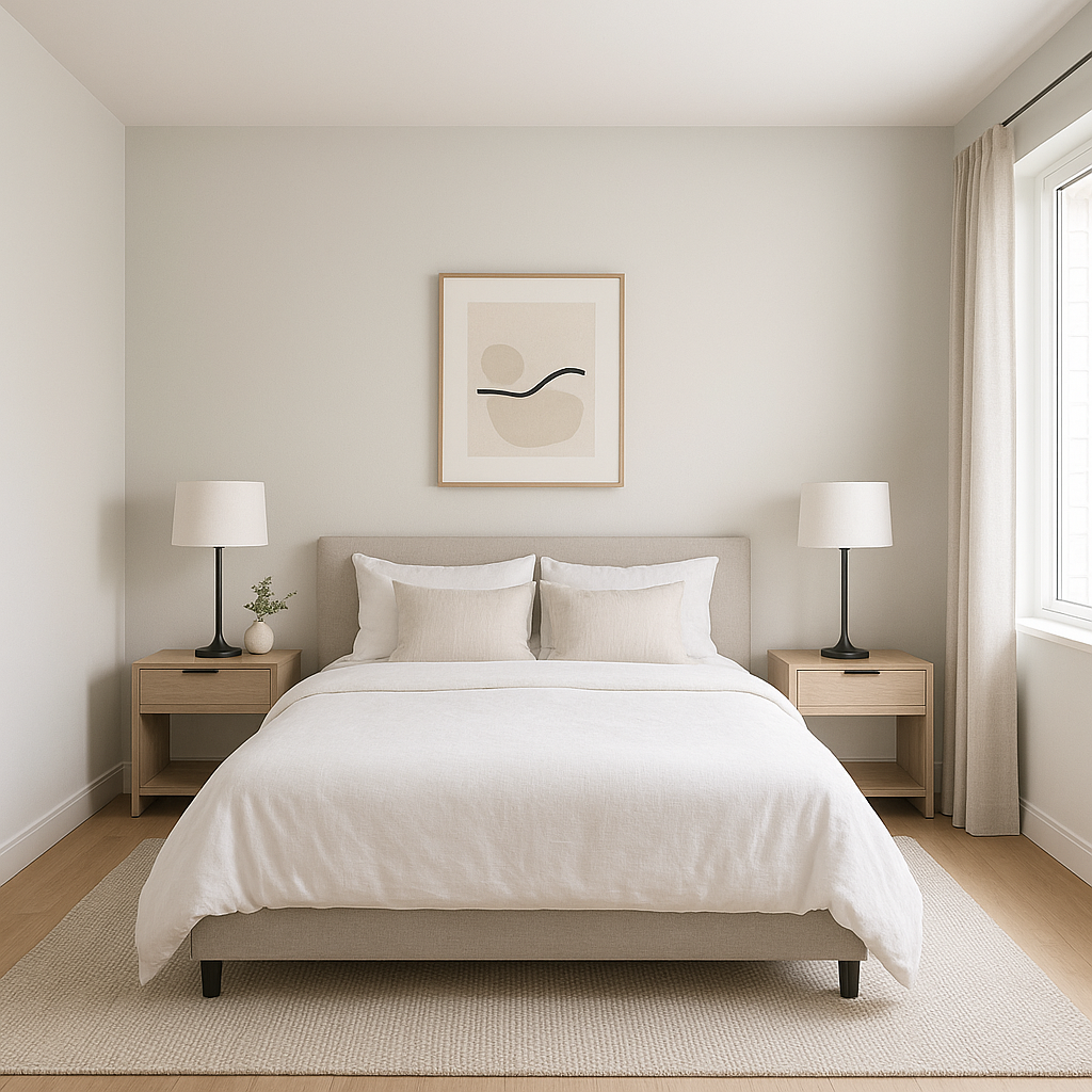
The warm undertones in Fanfare make it ideal for bedrooms, where comfort and relaxation are key. Layer the room with soft linens and textiles in cream, ivory, or light blush tones to complement its warmth.
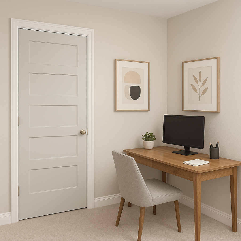
Create a professional yet approachable vibe by using Fanfare on walls and pairing it with rich wood furniture and deep accent colors like navy or forest green.
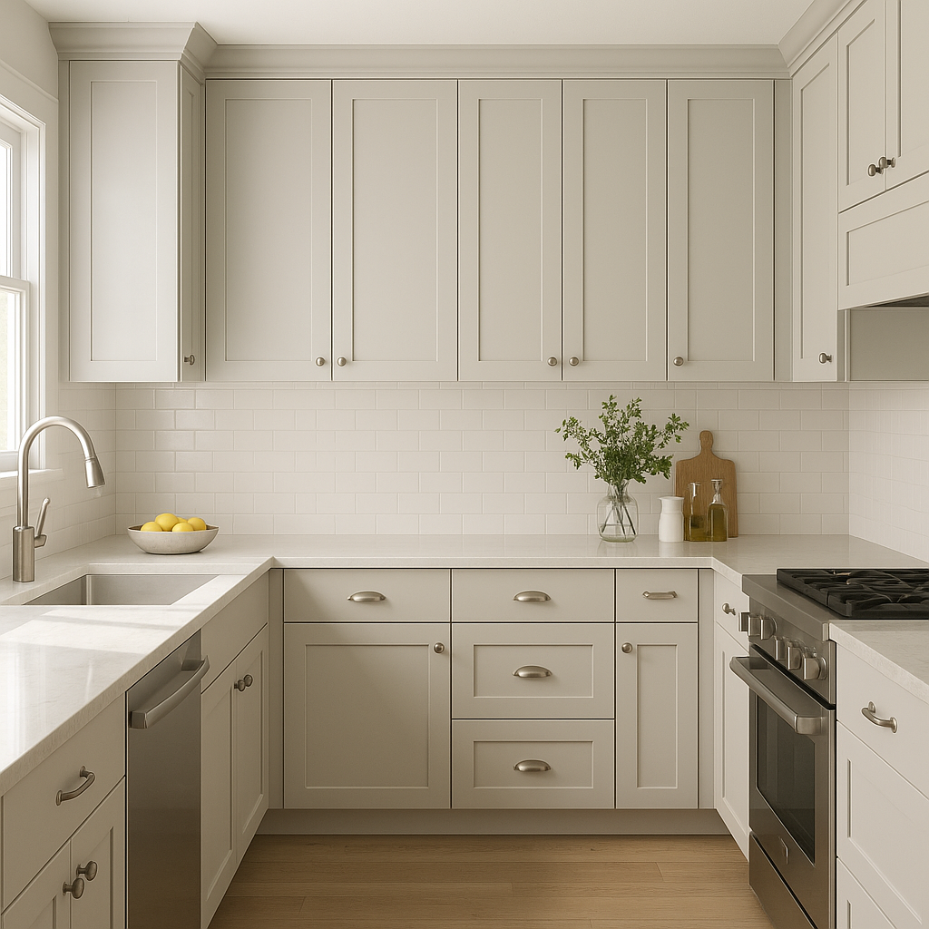
Fanfare’s neutral nature allows it to work beautifully in kitchens and dining spaces. Use it on walls alongside white cabinetry and natural stone countertops for a fresh and timeless look. Add pops of color through décor, such as vibrant dishware or bold artwork.
For offices, retail spaces, or lobbies, Fanfare’s understated elegance provides a polished and professional ambiance. Use it as the primary wall color and add texture with accent walls in darker tones or geometric patterns.
Fanfare’s warm beige base is highly responsive to lighting conditions. In spaces with ample natural light, it appears soft and creamy, while in dimmer settings, its golden undertones become more pronounced. To achieve the best results, test the color in your space under various lighting conditions before committing to it.
Fanfare strikes the perfect balance between understated elegance and approachable warmth. It’s a neutral that doesn’t feel boring or flat, making it ideal for anyone seeking a timeless foundation for their interior design projects. Its adaptability to different color palettes and design styles ensures it will remain relevant as your tastes evolve.
Whether you’re refreshing a single room or reimagining your entire space, Benjamin Moore Fanfare (874) is a smart, stylish choice that delivers lasting beauty.
View Colors Only by Brand (No Imagery):
Sherwin-Williams
|
Benjamin-Moore
|
Behr
|
Valspar
Live on the Eastern Slope of Colorado and looking for a local painting professional, check out all our painting services and reach out for a free estimate.
Copyright © 2026 : Wild Fox Painting Inc. : 12435 Mead Way, Littleton, CO 80125


