Benjamin Moore White 880 is a versatile and elegant shade that has become a staple in interior design. Its subtle sophistication makes it an ideal choice for both modern and traditional spaces, offering a clean and refreshing backdrop that enhances the overall ambiance of any room. Whether you're creating a serene minimalist retreat or a cozy, layered design, this shade effortlessly adapts to your vision.
One of the defining characteristics of Benjamin Moore White 880 is its soft, neutral undertone. It leans slightly warm, which gives it a welcoming and inviting quality without veering into stark or clinical territory. This subtle warmth prevents the white from feeling too cold or sterile, making it a popular choice for spaces that require a balanced and approachable aesthetic.
The undertones are gentle enough to pair with a wide range of colors while still providing the crispness expected from a white paint. This delicate balance is what makes White 880 a timeless and versatile option for walls, ceilings, trim, and cabinetry.
Benjamin Moore White 880 pairs beautifully with a variety of colors, thanks to its neutral foundation. Here are some suggestions to inspire your palette:
Soft Neutrals: Pair White 880 with warm beige tones like Benjamin Moore’s "Edgecomb Gray" or "Revere Pewter" for a cohesive and harmonious look. These combinations work particularly well in living rooms, bedrooms, or hallways for a calm and inviting atmosphere.
Cool Grays and Blues: For a more modern or coastal aesthetic, coordinate White 880 with cool grays such as "Stonington Gray" or soft blues like "Wedgewood Gray." This pairing brings a refreshing, tranquil quality to spaces such as bathrooms or kitchens.
Bold Accents: To make a statement, use contrasting deep tones like "Hale Navy" or "Kendall Charcoal" on furniture, cabinetry, or accent walls. The crispness of White 880 allows these bold colors to pop while maintaining a balanced overall look.
Earthy Greens: If you're aiming for an organic, nature-inspired palette, try pairing White 880 with muted greens like "Saybrook Sage" or "October Mist." This combination feels fresh and grounded, perfect for dining rooms or home offices.
The subtle versatility of White 880 makes it suitable for nearly every surface and room in your home. Here are some ideas for incorporating this shade into your design:
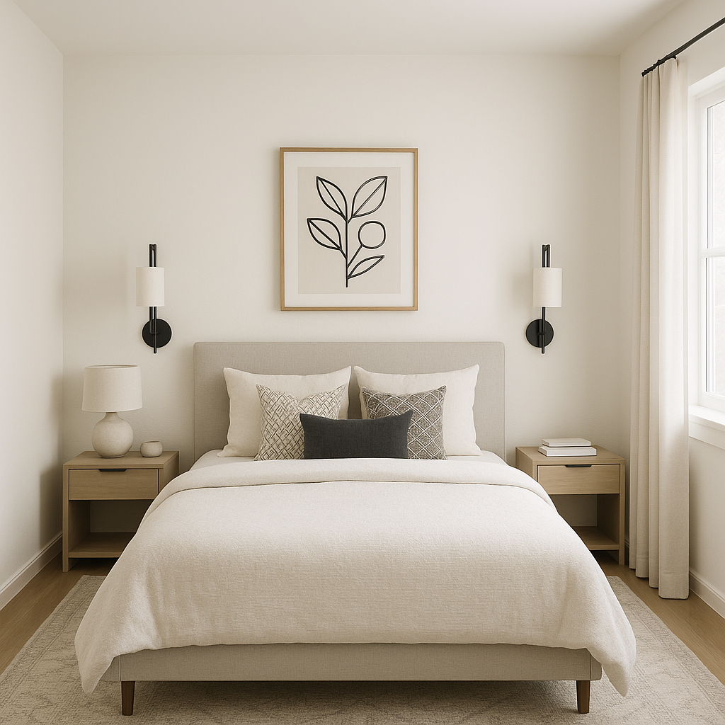
White 880 creates a perfect neutral backdrop for spaces like living rooms, bedrooms, and dining areas. Its understated warmth adds depth to the room, ensuring it feels welcoming and not overly stark. Use it in spaces with ample natural light to enhance the brightness or in smaller rooms to create an illusion of openness.
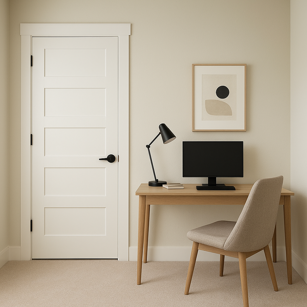
If you're looking for a cohesive design, White 880 works wonderfully on ceilings, baseboards, and trim. Its soft warmth complements a variety of wall colors, adding continuity and elegance to any room.
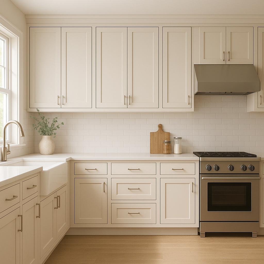
For kitchens and bathrooms, White 880 is a popular choice for cabinetry. Its clean, neutral tone pairs beautifully with both light and dark countertops, as well as a variety of backsplash styles. It lends an air of timeless sophistication that never feels dated.
In open floor plans, White 880 can unify the overall aesthetic by acting as a consistent thread that ties different areas together. Its adaptability ensures that it works seamlessly with various design elements in adjoining spaces.
View Colors Only by Brand (No Imagery):
Sherwin-Williams
|
Benjamin-Moore
|
Behr
|
Valspar
Live on the Eastern Slope of Colorado and looking for a local painting professional, check out all our painting services and reach out for a free estimate.
Copyright © 2026 : Wild Fox Painting Inc. : 12435 Mead Way, Littleton, CO 80125


