Benjamin Moore Key (885) is a beautifully balanced neutral that effortlessly bridges the gap between warm and cool tones. It is a soft, versatile gray with calming undertones that make it a popular choice for creating serene and sophisticated spaces. Whether you're designing a cozy living room, a spa-like bathroom retreat, or a modern office, this elegant shade provides a timeless backdrop that complements a variety of interior styles.
Key (885) is a complex gray with subtle green undertones, lending it a gentle earthiness that adds depth and richness to the color. These undertones make it an ideal choice for spaces where you want a hint of warmth without veering into beige territory. The green undertones also help Key harmonize beautifully with natural materials like wood, stone, and greenery, making it a great option for organic-inspired designs or spaces with outdoor views.
Benjamin Moore Key (885) pairs seamlessly with a wide range of colors, offering flexibility when designing a cohesive palette. Here are some suggestions for coordinating hues:
Key (885) is a versatile gray that works well in a variety of applications throughout the home. Its ability to balance warm and cool tones makes it a universal choice for both traditional and contemporary aesthetics.
Create a refined yet welcoming living room by using Key (885) on the walls. Pair it with white trim and natural wood accents to maintain a light and airy feel, or introduce darker gray furniture and metallic finishes for a more dramatic ambiance.
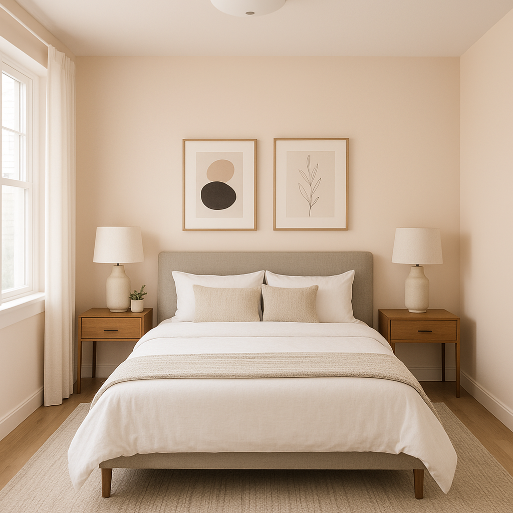
In bedrooms, Key (885) promotes relaxation and comfort. It works wonderfully as a wall color alongside soft, pastel linens and natural textures like woven baskets or jute rugs. Add greenery for a fresh, organic touch.
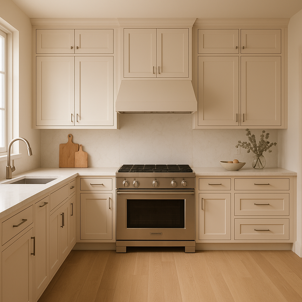
Key (885) is a stunning choice for kitchen cabinetry or walls, especially when paired with white countertops and brushed nickel or matte black hardware. Its understated elegance makes it a great backdrop for showcasing vibrant decor or colorful accessories.
Transform your bathroom into a tranquil retreat by using Key (885) as the main wall color. Pair it with marble countertops, white subway tiles, and soft fern-green towels for a spa-like vibe.
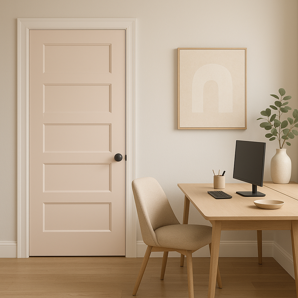
For a productive yet calming office space, Key (885) provides a neutral base that encourages focus without feeling sterile. Pair it with rich wood desks or shelving, and consider adding navy or charcoal accents for a polished finish.
Key (885) responds beautifully to different lighting conditions. In rooms with ample natural light, its green undertones become more pronounced, lending a fresh and slightly brighter appearance. Under artificial lighting, the color tends to lean more neutral gray, providing a consistent and reliable backdrop.
Benjamin Moore Key (885) is a masterful choice for anyone seeking a versatile, sophisticated neutral that adapts to a variety of spaces and styles. Whether you're designing a bold modern space or a serene retreat, this gray delivers understated elegance and timeless appeal.
View Colors Only by Brand (No Imagery):
Sherwin-Williams
|
Benjamin-Moore
|
Behr
|
Valspar
Live on the Eastern Slope of Colorado and looking for a local painting professional, check out all our painting services and reach out for a free estimate.
Copyright © 2026 : Wild Fox Painting Inc. : 12435 Mead Way, Littleton, CO 80125


