Benjamin Moore Pink 887: A Soft and Sophisticated Hue
Benjamin Moore Pink 887 is a delicate and versatile color that brings a subtle touch of elegance to any space. This soft pink shade is light and airy, making it a fantastic choice for creating interiors that feel cozy, inviting, and serene. Its understated charm allows it to adapt effortlessly to a variety of design styles, from contemporary and minimalist to traditional and classic.
Undertones of Benjamin Moore Pink 887
One of the defining features of Pink 887 is its gentle undertones. This shade leans toward a warm blush with a hint of peach, giving it a slightly creamy and sunlit appearance. The undertones are subtle enough to avoid looking overly sweet or juvenile, striking a perfect balance between warmth and sophistication. This versatile undertone makes Pink 887 an excellent backdrop for both bold and neutral color schemes, as it complements a wide range of hues without overpowering them.
Coordinating Colors for Benjamin Moore Pink 887
To enhance the beauty of Benjamin Moore Pink 887, consider pairing it with the following coordinating colors:
- Warm Neutrals: Soft beige tones like Benjamin Moore's "White Sand" or "Natural Linen" provide a harmonious, monochromatic palette that exudes calmness and refinement.
- Whites: Crisp whites such as "Chantilly Lace" or "Simply White" can be used to create contrast, adding brightness and a clean, modern aesthetic to the space.
- Earthy Greens: Muted greens like "Saybrook Sage" or "October Mist" (2022 Color of the Year) complement the warm undertones of Pink 887, creating a balanced and organic color story.
- Charcoal and Gray: Deep grays like "Kendall Charcoal" or lighter tones like "Stonington Gray" offer a striking contrast, adding depth and drama to your design while maintaining an elegant look.
Where to Use Benjamin Moore Pink 887 in Your Home
The softness and versatility of Pink 887 make it an excellent choice for a variety of spaces. Here are some ideas for incorporating this shade into your home:
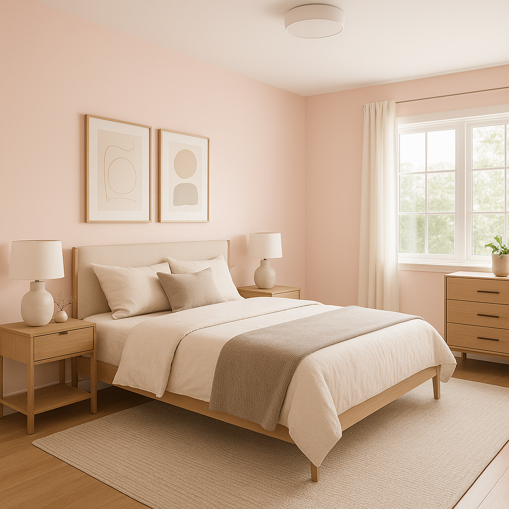
- Bedrooms: Pink 887 is a natural fit for bedrooms, creating a tranquil and soothing atmosphere. Pair it with plush bedding and soft textures for a cozy retreat.
- Living Rooms: Use Pink 887 as a main wall color or an accent wall to add warmth and charm. It pairs beautifully with both modern and vintage-inspired furnishings.
- Nurseries: This gentle pink is ideal for a nursery, offering a sophisticated alternative to more traditional pastel shades.
- Bathrooms: Bring a spa-like feel to your bathroom with Pink 887, especially when paired with crisp white tiles and gold or brass fixtures.
- Dining Rooms: For a touch of romance and drama, consider using Pink 887 in a dining room. Add metallic accents or dark wood furniture to elevate the look.
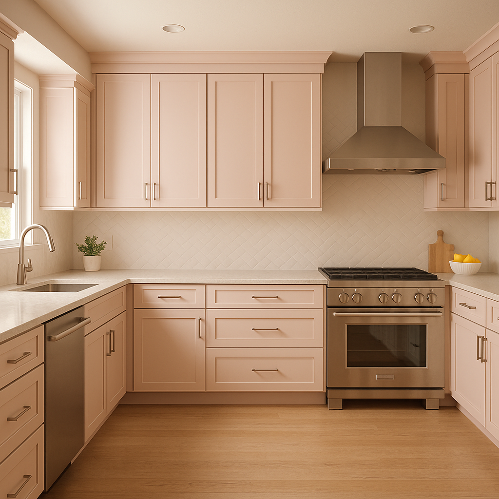
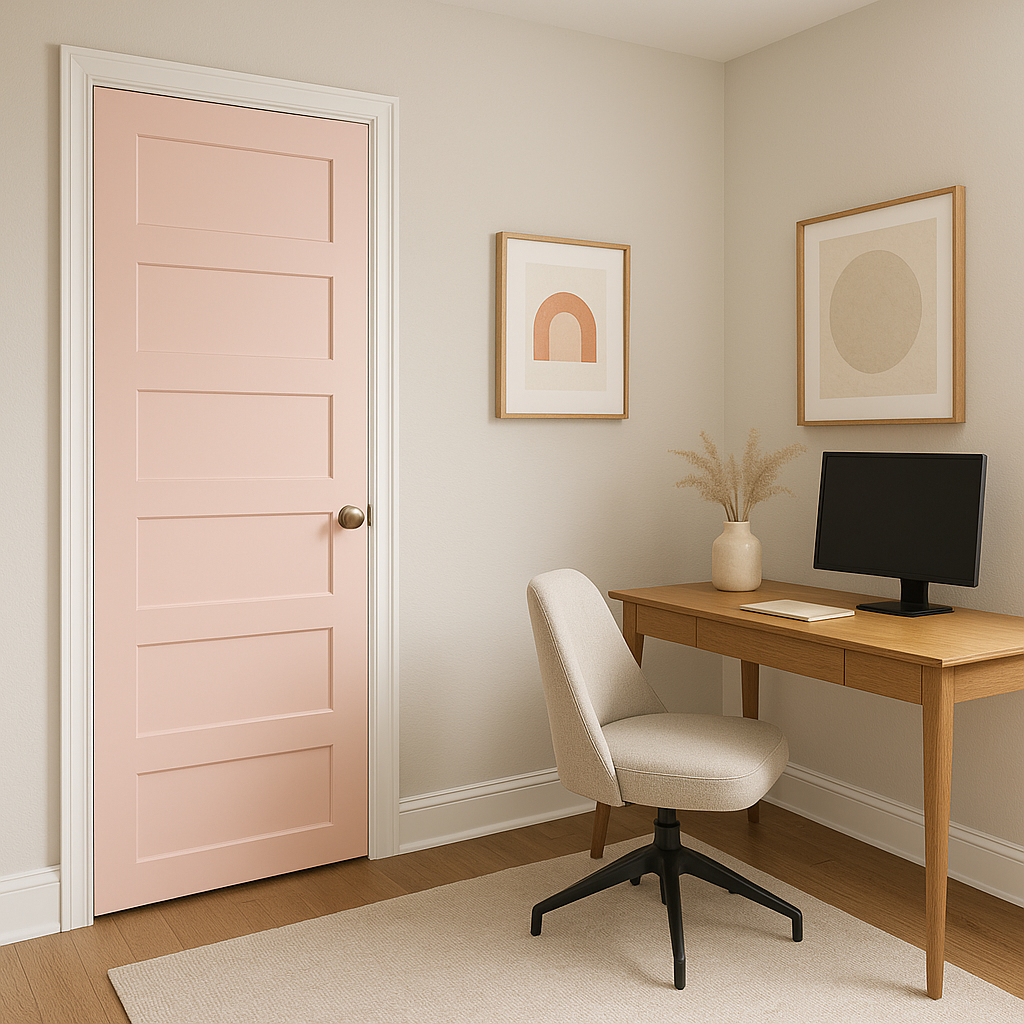
- Accent Pieces: If you’re hesitant to commit to painting an entire room, consider using Pink 887 on furniture, cabinetry, or decorative accents like picture frames and planters.
Key Design Tips for Using Pink 887
- Lighting Matters: The way Pink 887 appears can vary depending on the lighting. In natural light, its warm undertones may feel more pronounced, while in cooler artificial light, it may take on a neutral blush tone. Always test it in your space before committing.
- Layer Textures: Accentuate the softness of this pink by layering textures like velvet, linen, and wool to create a cozy and inviting environment.
- Mix Metallics: Pink 887 pairs beautifully with metallic finishes, especially gold, brass, and rose gold for a glamorous, polished look.
- Balance with Neutrals: To avoid overwhelming the space, balance Pink 887 with neutral tones or grounding hues like deep browns, taupes, or grays.