

Benjamin Moore Pink (890) is a delicate, pastel shade that exudes warmth, subtlety, and sophistication. This timeless color embraces femininity without overwhelming the senses, making it an ideal choice for interiors that seek a gentle and inviting ambiance. Whether used as a primary wall color or as an accent, Pink (890) has the ability to transform spaces into serene and uplifting environments.
Pink (890) carries soft peachy undertones that add a hint of warmth to its overall appearance. These undertones prevent the shade from feeling overly cool or stark, ensuring it remains balanced and versatile. The subtle peach inflection enhances the color’s ability to complement a variety of palettes, whether you're aiming for a romantic, playful, or sophisticated look.
Depending on lighting conditions, Pink (890) may lean toward a warm blush during the day or take on a softer, powdery pink hue in the evening. Its adaptability makes it a favorite for spaces that benefit from a dynamic and fluid aesthetic.
Benjamin Moore Pink (890) pairs beautifully with a wide range of complementary shades. To create a harmonious and cohesive palette, consider the following coordinating colors:
Benjamin Moore Pink (890) is a versatile shade that works beautifully across different rooms and design styles. Here are some creative ways to incorporate this color into your home:
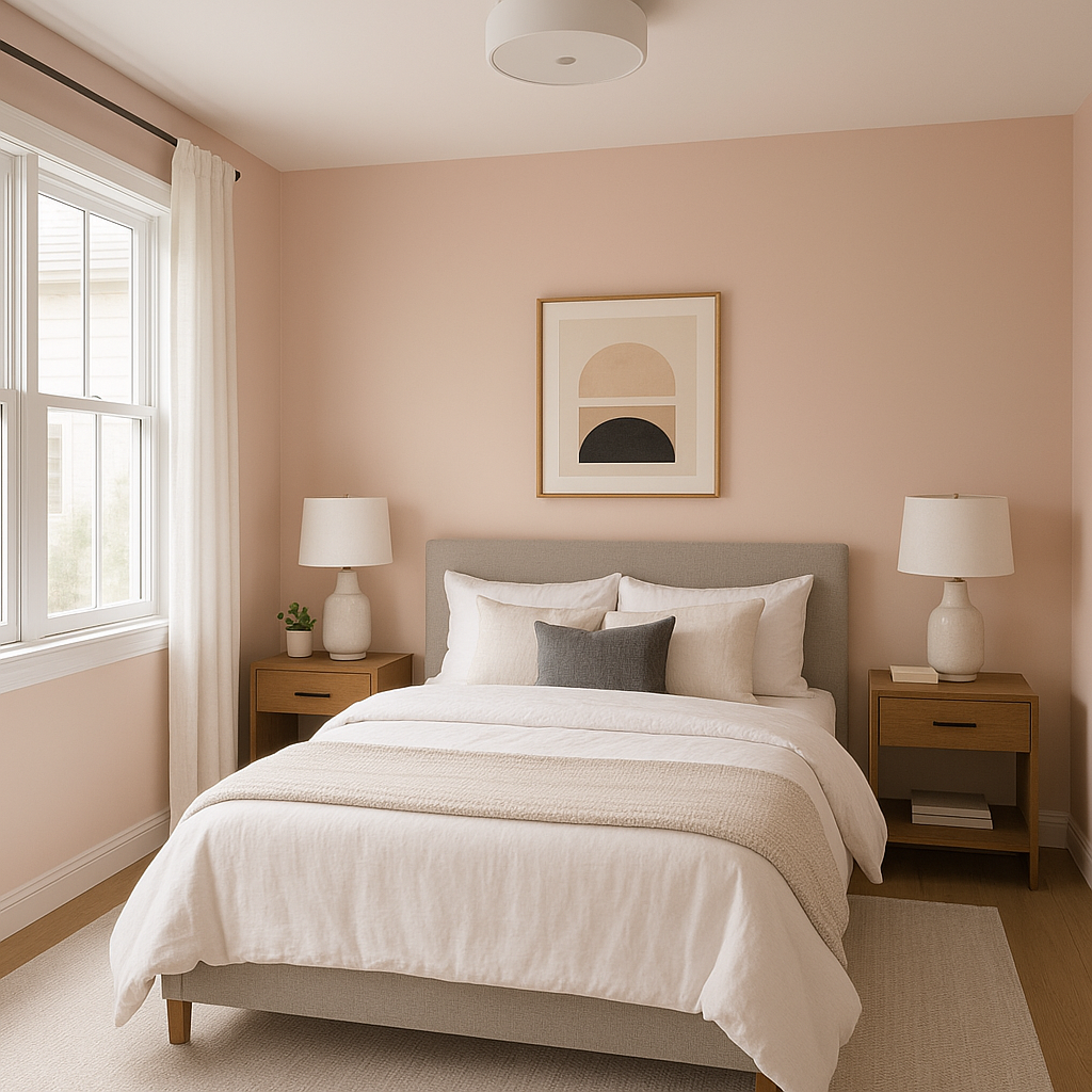
Pink (890) is an exceptional choice for bedrooms, especially those seeking a calming and romantic atmosphere. Its soft warmth creates a tranquil environment that encourages relaxation. Pair it with white bedding and gold accents for a touch of luxury, or incorporate natural wood tones for a cozy, farmhouse-inspired aesthetic.
This pastel pink is ideal for nurseries, providing a soothing backdrop for your little one. Its understated charm makes it suitable for both traditional and modern nursery designs. Pair with playful patterns or whimsical decor to create a joyful and comforting space.
Pink (890) can bring a refreshing softness to living rooms, especially when paired with neutral furniture and textured fabrics. Use it as an accent wall to add a splash of color, or combine it with light beige tones for a warm, inviting look.
For a spa-like bathroom, Pink (890) works beautifully alongside white tiles, brushed nickel fixtures, and soft gray accents. Its peachy undertones add a subtle warmth that keeps the space from feeling cold or sterile.
If you're not ready to commit to pink as a primary color, consider using Benjamin Moore Pink (890) for accent walls, furniture pieces, or decorative accessories. Its ability to complement a variety of shades allows it to blend seamlessly into existing designs while adding a touch of personality.
The appearance of Pink (890) can vary based on the lighting in your space. In natural sunlight, its warm undertones shine through, giving it a soft and cheerful blush. Under artificial light, especially warm bulbs, the peachy hues become more pronounced, creating a cozy and intimate feel. To ensure the color works as intended, test it in different lighting conditions before committing to large-scale applications.
Benjamin Moore Pink (890) is a versatile and elegant shade that combines warmth, softness, and adaptability. Whether you're designing a calming bedroom retreat, a cheerful nursery, or a sophisticated living space, this pastel pink has the ability to elevate your interiors with timeless charm.
View Colors Only by Brand (No Imagery):
Sherwin-Williams
|
Benjamin-Moore
|
Behr
|
Valspar
Live on the Eastern Slope of Colorado and looking for a local painting professional, check out all our painting services and reach out for a free estimate.
Copyright © 2026 : Wild Fox Painting Inc. : 12435 Mead Way, Littleton, CO 80125


