Benjamin Moore Opal (891) is a delicate and refined color that exudes timeless sophistication. This soft hue is a subtle blend of off-white with gentle pink undertones, making it a perfect choice for spaces where you want to introduce a sense of warmth and tenderness without overwhelming the room. Its understated elegance allows it to serve as either a primary wall color or a supporting accent in a variety of design schemes.
The subtle pink undertones in Opal (891) bring an inviting warmth that can soften the overall look of a space. These undertones lean toward a blush-like hue, creating a gentle glow that works beautifully in rooms with natural light. The pink undertone also ensures the color doesn’t feel stark or cold, making it a versatile option for both modern and traditional interiors.
Benjamin Moore Opal (891) pairs effortlessly with a wide range of colors, making it a dream for interior designers seeking harmony and balance. Some excellent coordinating colors include:
Benjamin Moore Opal (891) is a versatile paint color with applications across various design styles and spaces. Here are some ways to use it effectively:
Create a cozy yet sophisticated living space by using Opal as the main wall color. Pair it with soft neutrals, plush textiles, and metallic accents for a chic and inviting ambiance.
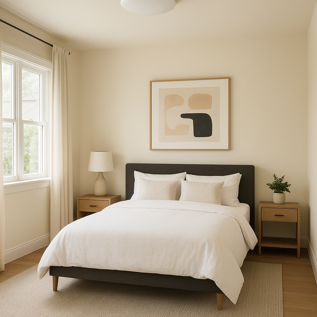
Opal’s subtle pink undertones make it a fantastic choice for bedrooms, where comfort and relaxation are key. Combine it with blush-toned bedding and gold accents for a romantic and serene retreat.
The gentle warmth of Opal makes it an ideal pick for nurseries or children’s rooms. It feels nurturing without leaning too heavily into traditional pastel tones, allowing for a more modern aesthetic.
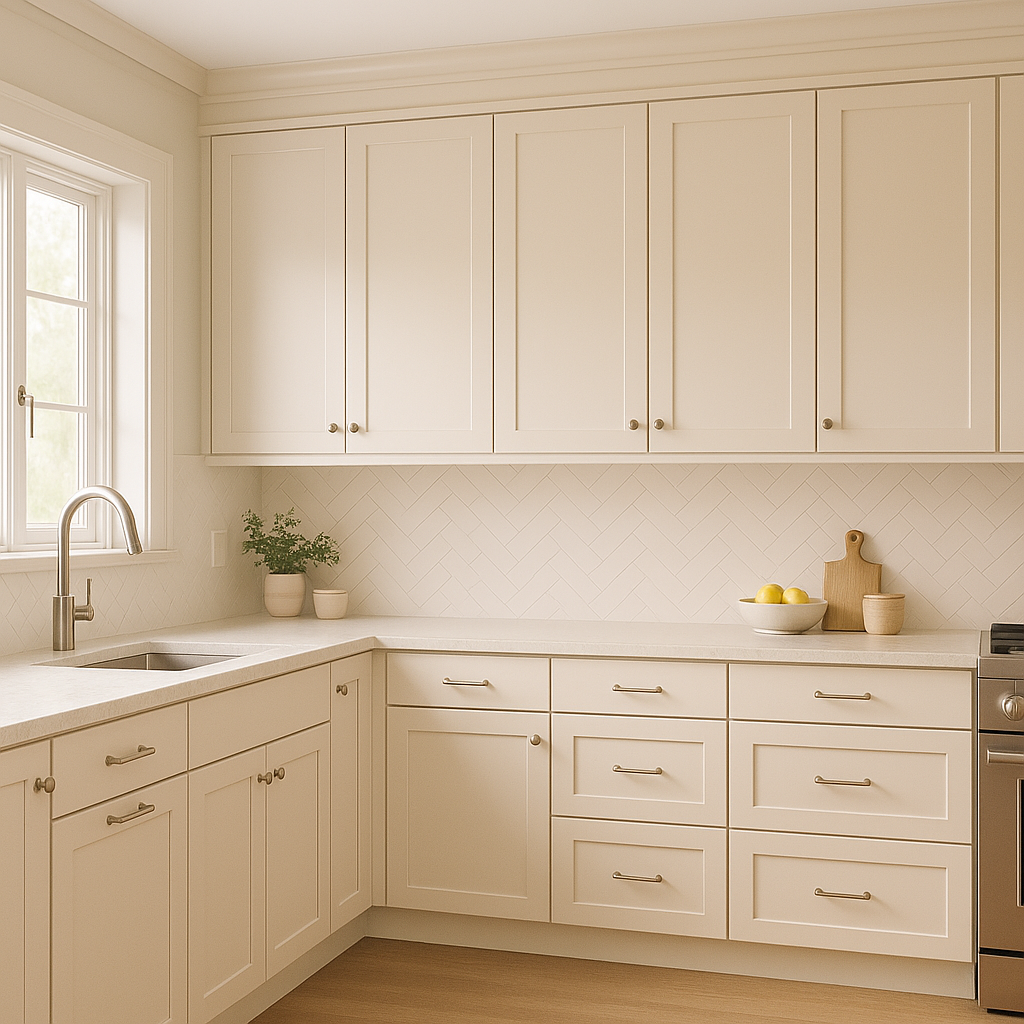
Elevate your bathroom by using Opal on the walls and pairing it with white subway tiles, gold hardware, and natural wood elements. This combination creates a spa-like atmosphere that is both calming and stylish.
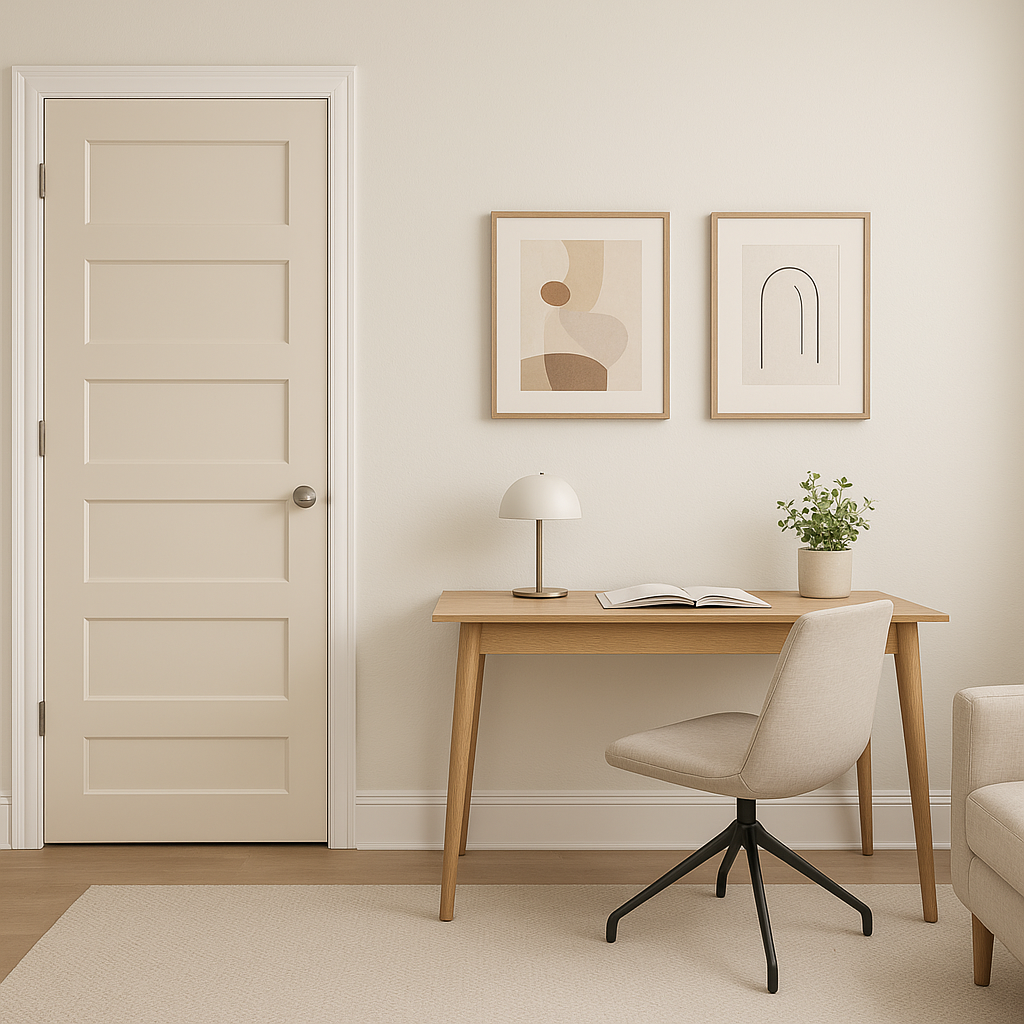
As a soft, welcoming color, Opal works beautifully in transitional spaces like hallways and entryways. Pair it with darker accent colors or patterned flooring to add depth and personality to these areas.
The appearance of Benjamin Moore Opal (891) can shift depending on the lighting in your space. In bright, natural light, its pink undertones become more apparent, offering a cheerful and inviting vibe. Under artificial light, it tends to appear more neutral, making it a versatile choice for day-to-night transitions.
Benjamin Moore Opal (891) is an exceptional choice for homeowners and designers seeking a soft and versatile color that balances warmth and elegance. Its ability to pair seamlessly with a variety of coordinating colors and its adaptability in different lighting conditions make it a standout option for creating spaces that feel welcoming, timeless, and effortlessly chic.
Whether you're designing a sophisticated living room, a cozy bedroom, or an inviting entryway, Benjamin Moore Opal (891) is sure to bring a hint of charm and refinement to your interiors.
View Colors Only by Brand (No Imagery):
Sherwin-Williams
|
Benjamin-Moore
|
Behr
|
Valspar
Live on the Eastern Slope of Colorado and looking for a local painting professional, check out all our painting services and reach out for a free estimate.
Copyright © 2026 : Wild Fox Painting Inc. : 12435 Mead Way, Littleton, CO 80125


