Benjamin Moore Ambrosia (893) is a delicate, muted shade that effortlessly combines warmth and tranquility. This soft, subdued color belongs to the beige family but carries a gentle pink undertone, making it a versatile choice for a variety of spaces. Ambrosia is the perfect hue for those seeking a neutral shade that exudes charm and sophistication while maintaining a sense of subtlety.
One of the defining characteristics of Benjamin Moore Ambrosia is its soft pink undertone, which adds a subtle warmth and depth to the color. This undertone makes Ambrosia feel inviting and refined, without veering into overly rosy or stark territory. Its beautifully balanced composition allows it to complement a range of design styles, from modern and minimalist to traditional and rustic. The gentle pink undertone also makes Ambrosia an excellent choice for spaces where you want to create a cozy and calming atmosphere.
The versatility of Benjamin Moore Ambrosia makes it easy to pair with a wide array of complementary colors. To create a cohesive and well-balanced palette, consider the following coordinating options:
These coordinating colors allow you to create a palette that suits your personal style, whether you prefer a light and airy aesthetic or a more grounded and dramatic look.
Benjamin Moore Ambrosia is an incredibly adaptable color that works well in a variety of spaces and lighting conditions. Here are some of the best uses for this elegant hue:
Ambrosia’s warmth and softness make it an ideal choice for living rooms, where it can create a welcoming and comfortable environment. Pair it with plush furniture, natural textures, and soft textiles for a cozy, lived-in feel.
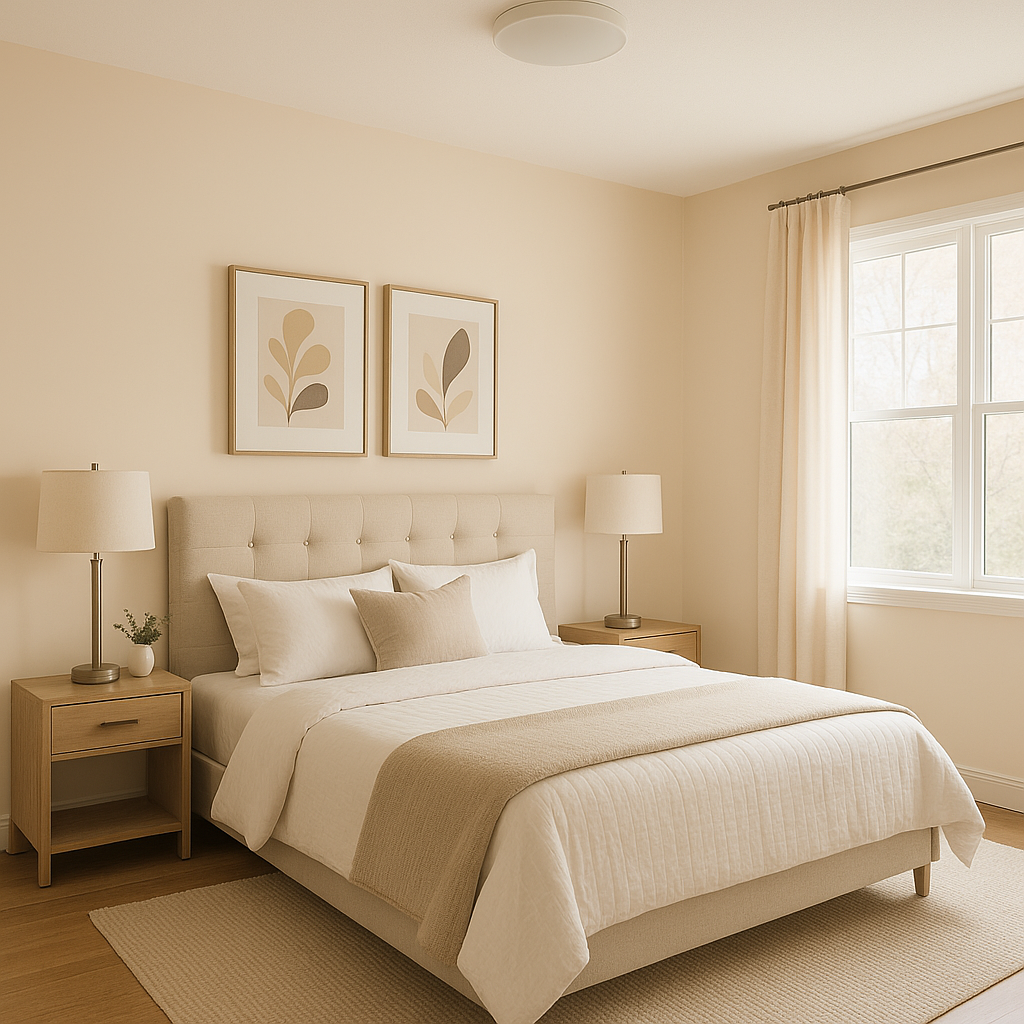
With its calming undertones, Ambrosia is perfectly suited for bedrooms. It promotes relaxation and pairs beautifully with both crisp white linens and rich, jewel-toned accents.
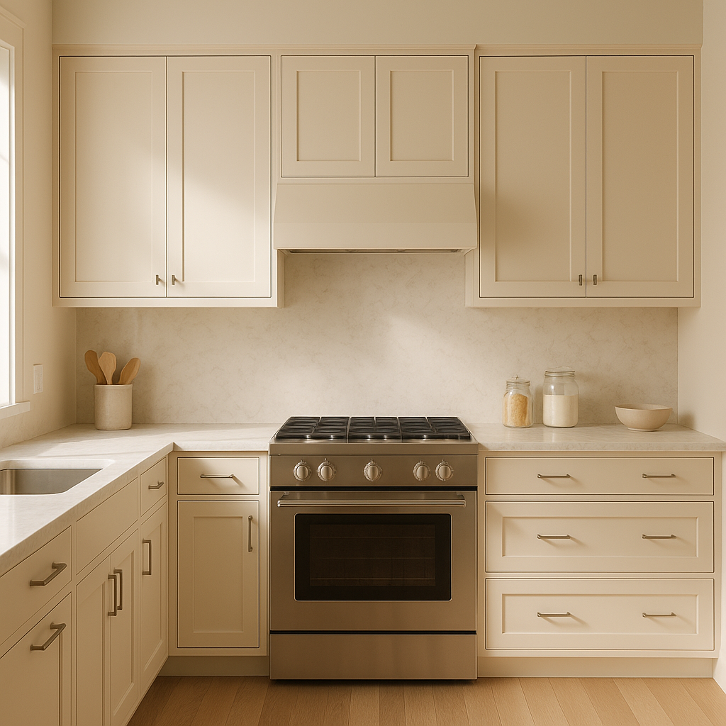
For kitchens and dining spaces, Ambrosia offers a warm and inviting backdrop. Pair it with white cabinetry and natural wood finishes for a timeless, farmhouse-inspired look, or incorporate sleek metallic accents for a more contemporary vibe.
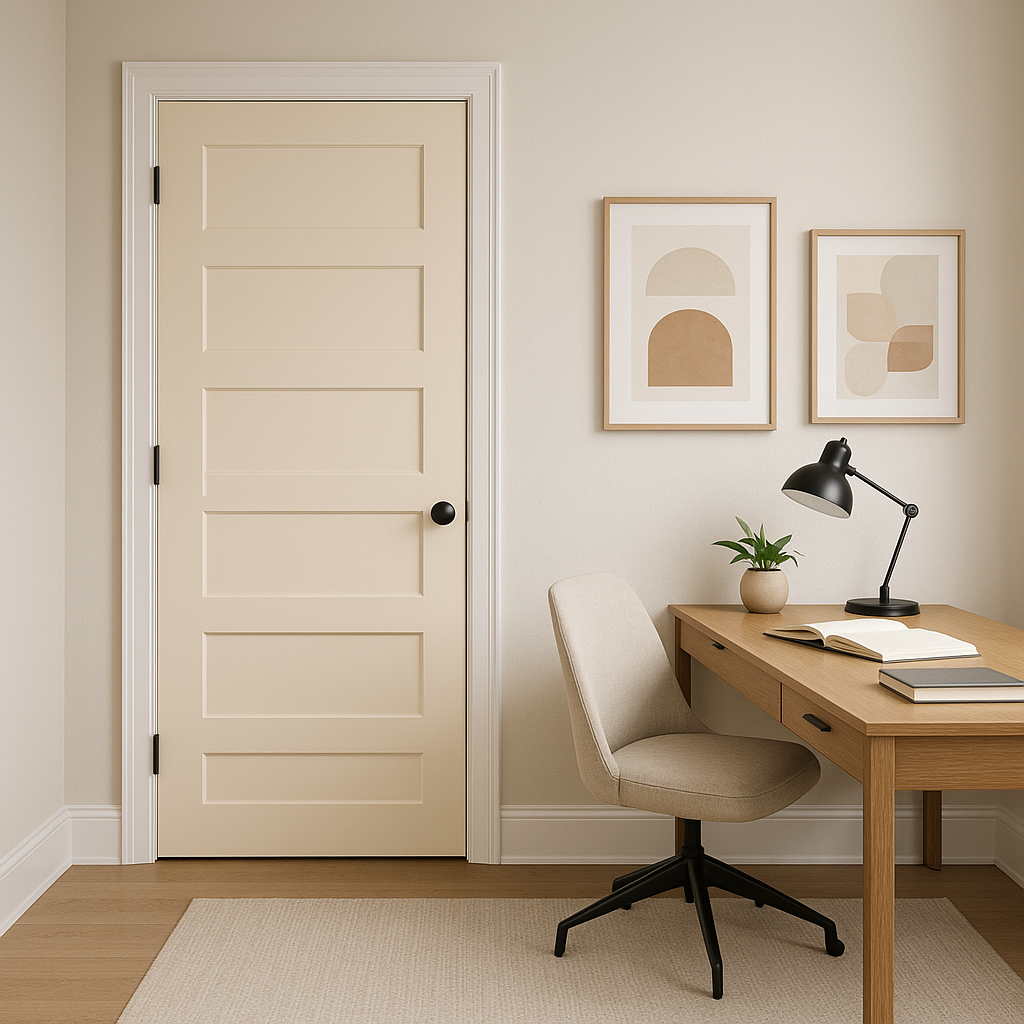
In transitional spaces like hallways and entryways, Ambrosia adds a touch of softness and sophistication. It helps create a seamless flow between rooms while maintaining a welcoming atmosphere.
If you’re designing a workspace, Ambrosia’s understated elegance can help foster focus and tranquility. Pair it with simple, clean-lined furniture and a mix of muted accents for a productive yet stylish environment.
Lighting plays a key role in how Benjamin Moore Ambrosia appears in your space. In rooms with ample natural light, the pink undertones become more noticeable, adding a warm and inviting glow. In lower light or artificial lighting conditions, Ambrosia leans more toward a soft beige, maintaining its neutral appeal. Always test the color in your space to see how it interacts with your specific lighting.
Benjamin Moore Ambrosia (893) is a timeless, versatile color that brings a touch of softness and sophistication to any room. Its subtle pink undertones add warmth and charm without overwhelming your space, making it a perfect choice for homeowners and designers who want a refined yet approachable neutral. Whether used as the primary wall color or as part of a larger palette, Ambrosia is sure to elevate your interiors with its understated elegance.
View Colors Only by Brand (No Imagery):
Sherwin-Williams
|
Benjamin-Moore
|
Behr
|
Valspar
Live on the Eastern Slope of Colorado and looking for a local painting professional, check out all our painting services and reach out for a free estimate.
Copyright © 2026 : Wild Fox Painting Inc. : 12435 Mead Way, Littleton, CO 80125


