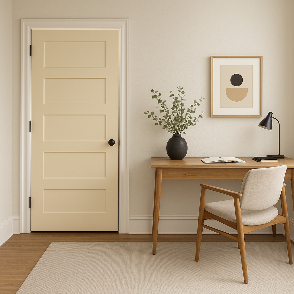
Benjamin Moore Butterfield (897) is a versatile, warm neutral that effortlessly bridges the gap between soft beige and creamy taupe. Its understated elegance makes it a favorite among homeowners and designers alike, offering a welcoming and sophisticated ambiance in any space. With its warm undertones and subtle depth, Butterfield is the perfect backdrop for a variety of interior styles, from classic to contemporary.
Butterfield (897) features delicate yellow and beige undertones, giving it a warm and inviting character. Unlike cooler neutrals, which can feel stark or sterile, Butterfield’s warmth adds a sense of coziness without being overwhelming. These undertones make it an adaptable choice that complements both natural and artificial lighting, ensuring your space feels harmonious throughout the day.
Benjamin Moore Butterfield (897) pairs beautifully with a range of coordinating colors, making it ideal for creating a cohesive palette across your home. Here are a few suggestions to inspire your design:
Trim and Accent Colors:
Opt for crisp whites like Benjamin Moore Chantilly Lace (OC-65) or Simply White (OC-117) for trim and molding. These clean shades provide a sharp contrast, emphasizing Butterfield's warmth and depth.
Complementary Neutrals:
Pair Butterfield with soft greys such as Gray Owl (2137-60) or Balboa Mist (OC-27) to maintain a serene, monochromatic look. These hues balance Butterfield's warmth while adding subtle dimension.
Bold Accent Colors:
For a pop of color, consider rich, earthy tones like Kendall Charcoal (HC-166) or Newburg Green (HC-158). These dramatic shades work well in furniture, cabinetry, or accent walls, creating a striking contrast against Butterfield's softness.
Natural Greens and Blues:
Butterfield complements muted greens and blues like Saybrook Sage (HC-114) or Woodlawn Blue (HC-147), perfect for creating a tranquil, nature-inspired aesthetic.
Benjamin Moore Butterfield (897) is incredibly versatile, making it suitable for a wide range of applications in your home. Here are some popular ways to incorporate this timeless neutral:
Living Rooms:
Butterfield’s warm undertones create a cozy yet refined atmosphere, ideal for living rooms. Pair it with textured fabrics, natural woods, and metallic accents for a balanced and inviting space.
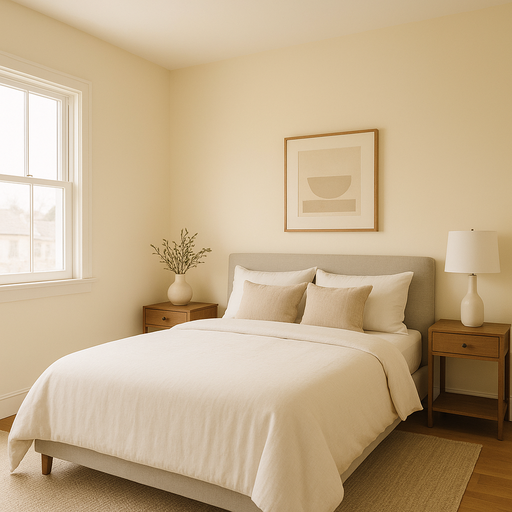
Bedrooms:
Bring a sense of calm and relaxation to your bedroom with Butterfield. It serves as the perfect canvas for soft linens, plush rugs, and understated décor in coordinating hues.
Dining Areas:
Elevate your dining room with Butterfield's sophisticated charm. Use it on walls to highlight furniture and accessories in dark woods or bold accent colors for a refined, layered look.
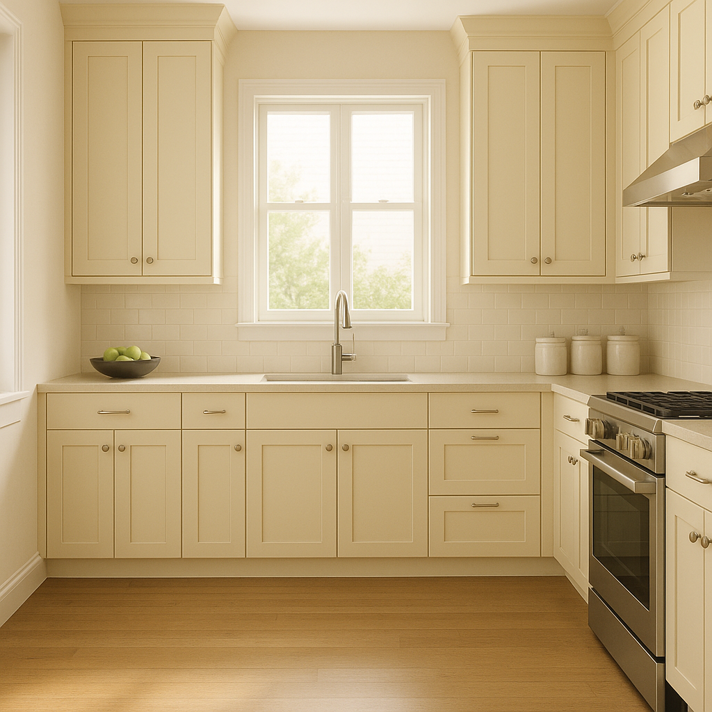
Kitchens:
Butterfield works beautifully in kitchens, whether on walls, cabinetry, or backsplashes. Its warmth pairs well with natural stone countertops and stainless steel appliances, creating a balanced blend of modern and traditional elements.
Bathrooms:
Transform your bathroom into a spa-like retreat with Butterfield. Its light, airy quality pairs wonderfully with crisp white tiles, brushed nickel finishes, and lush greenery for a tranquil escape.
Butterfield’s ability to adapt to various lighting conditions and color schemes makes it a go-to choice for homeowners looking to create a timeless, cohesive aesthetic. Whether you're designing a cozy cottage-inspired space or a sleek, contemporary interior, this warm neutral provides the perfect foundation.
Butterfield (897) isn’t just a paint color—it’s a statement of enduring style and versatility.
View Colors Only by Brand (No Imagery):
Sherwin-Williams
|
Benjamin-Moore
|
Behr
|
Valspar
Live on the Eastern Slope of Colorado and looking for a local painting professional, check out all our painting services and reach out for a free estimate.
Copyright © 2026 : Wild Fox Painting Inc. : 12435 Mead Way, Littleton, CO 80125


