Benjamin Moore Windsor (913) is a versatile and elegant paint color that combines the richness of a soft taupe with understated gray undertones. This balanced neutral offers a warm yet refined presence, making it an ideal choice for creating harmonious interiors that feel both inviting and polished. Whether you're designing a cozy living space or a modern office, Windsor's adaptability ensures it will blend beautifully into any design aesthetic.
Windsor delicately balances warm and cool undertones, making it a neutral that works across a variety of lighting conditions. Its taupe base carries subtle gray influences, which prevent it from leaning too warm or yellow. At the same time, the earthy warmth of Windsor keeps it from appearing too cool or sterile. These undertones make Windsor a true chameleon, adapting seamlessly to both traditional and contemporary spaces while complementing a wide range of accent colors and furnishings.
In brighter light, Windsor may lean slightly cooler, showcasing its soft gray notes, while in dimmer or warmer lighting, its taupe undertones shine through, offering a cozy and grounded appearance.
To maximize the beauty of Benjamin Moore Windsor (913), consider pairing it with the following coordinating colors:
These coordinating colors allow Windsor to shine in both vibrant and subdued palettes, depending on the mood you want to create in your space.
The versatility of Windsor makes it an exceptional choice for a wide range of applications:
Windsor is perfect for living rooms where you want a sense of understated elegance. Pair it with light-colored furniture and warm metallic accents like gold or brass for a sophisticated and cozy atmosphere.
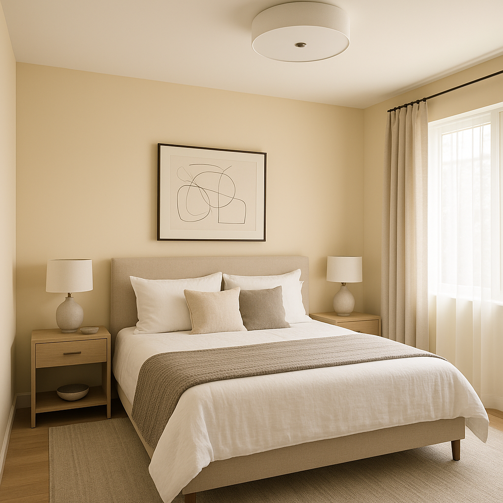
In bedrooms, Windsor creates a calming and serene environment. Combine it with soft whites or muted greens for a relaxing retreat, or add deep navy accents for a more dramatic, luxurious feel.
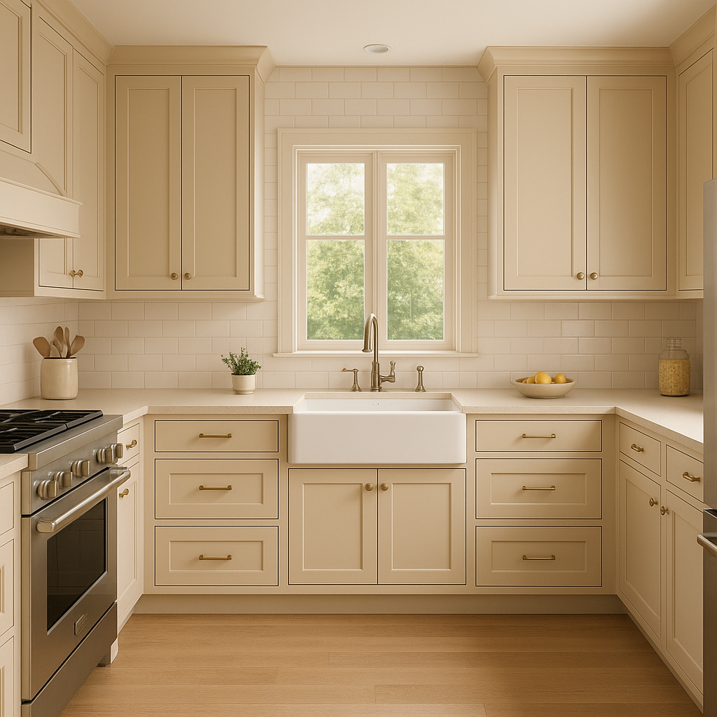
Windsor works beautifully in kitchens and dining areas, especially when paired with white cabinets or wood finishes. Its neutral tone serves as an ideal backdrop for showcasing colorful dinnerware or vibrant artwork.
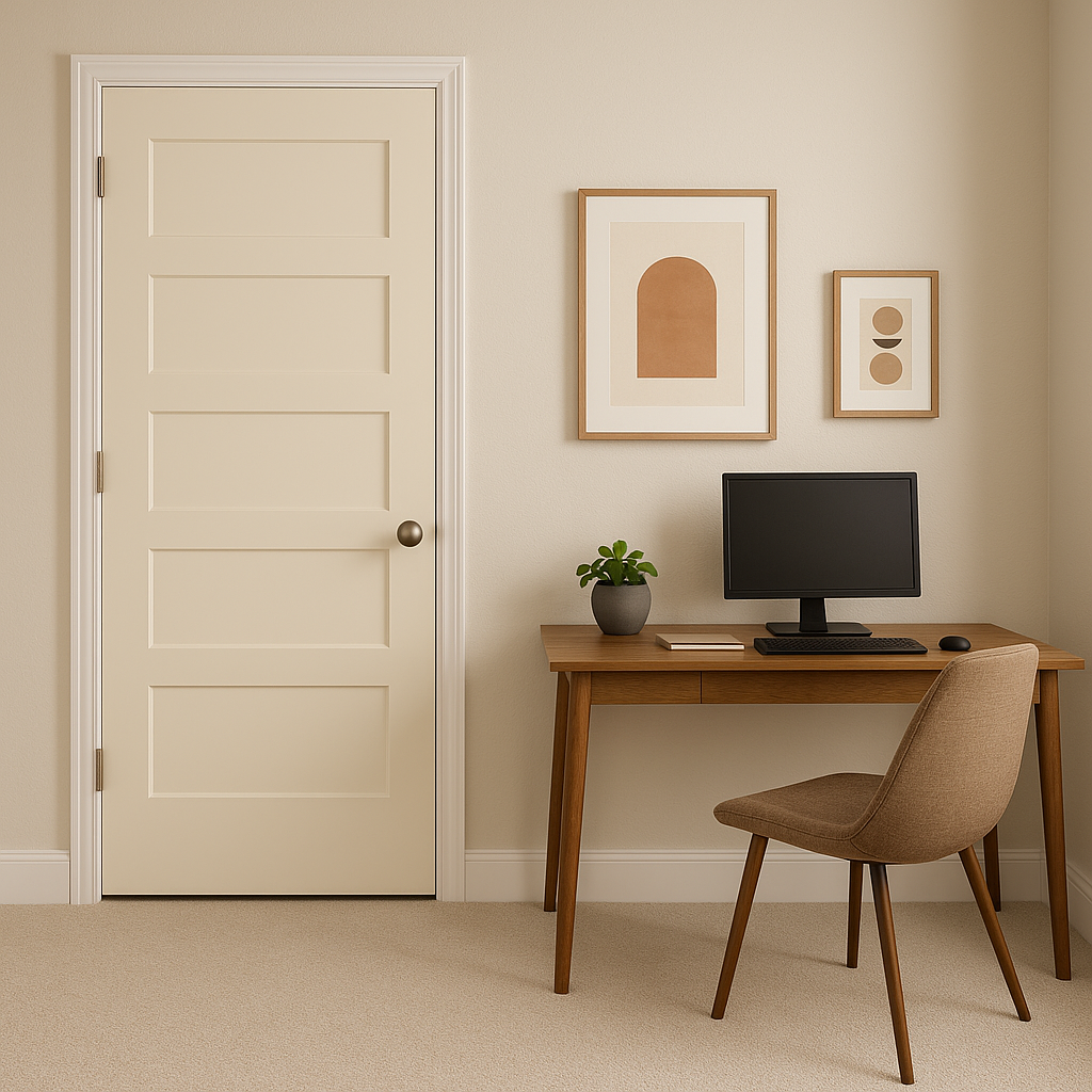
For home offices, Windsor provides a professional yet inviting atmosphere. Pair it with dark woods and leather furnishings for a classic look, or opt for sleek modern pieces to create a contemporary workspace.
In transitional spaces like hallways and entryways, Windsor adds warmth and sophistication without overwhelming small areas. It pairs nicely with light-colored trim and darker accent doors for a polished finish.
Windsor isn't limited to interiors! Its neutral tone translates beautifully to exterior applications, whether as a primary color or an accent for shutters and doors. Pair it with crisp whites and deep charcoals for timeless curb appeal.
Benjamin Moore Windsor (913) is a masterful blend of taupe and gray that offers endless design possibilities. Its neutral yet nuanced qualities make it a go-to choice for spaces that demand a touch of elegance without overpowering the overall aesthetic. With its ability to coordinate effortlessly with a variety of colors and adapt to diverse lighting conditions, Windsor is sure to enrich any design project with sophisticated charm and timeless appeal.
View Colors Only by Brand (No Imagery):
Sherwin-Williams
|
Benjamin-Moore
|
Behr
|
Valspar
Live on the Eastern Slope of Colorado and looking for a local painting professional, check out all our painting services and reach out for a free estimate.
Copyright © 2026 : Wild Fox Painting Inc. : 12435 Mead Way, Littleton, CO 80125


