Benjamin Moore Sparkling (949) is a delicate and versatile light gray with a subtle hint of blue, making it a modern yet timeless choice for both residential and commercial spaces. Its soft, airy appearance brings an understated elegance to any room, while its nuanced undertones add depth and character. Whether you're designing a tranquil retreat or a polished living area, Sparkling is a color that effortlessly elevates your space.
The beauty of Sparkling lies in its cool undertones. Primarily a light gray, the shade carries a gentle touch of blue that lends it a refreshing, almost ethereal quality. This slight coolness makes it particularly suited for spaces where you want to evoke calm, serenity, and sophistication. Its blue undertones are subtle enough to remain neutral, ensuring that it pairs seamlessly with a wide variety of other colors and design elements.
Sparkling also has an understated silver quality, giving it a luminous edge that reflects light beautifully. This makes it an excellent choice for rooms with ample natural light, as the color shifts slightly throughout the day, adding visual intrigue to your interiors.
Sparkling’s versatility means it works harmoniously with a wide range of coordinating colors. Here are some suggestions for pairing:
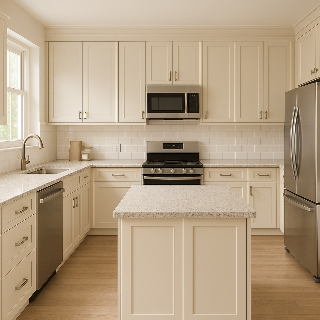
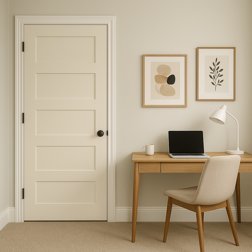
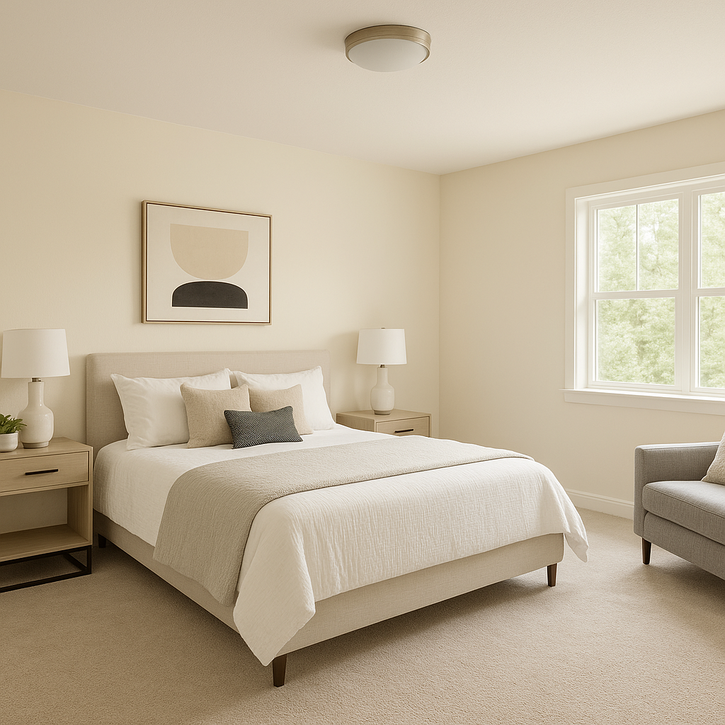
Sparkling is incredibly versatile, making it a go-to choice for a variety of applications across your home or office. Here are some ideas for where and how to use this stunning shade:
Benjamin Moore Sparkling (949) offers the perfect balance of neutrality and personality, making it a standout choice for any interior design project. Its cool gray base with blue undertones makes it adaptable to different styles, while its light-reflecting properties enhance the natural beauty of your space. Whether you're looking to create a soothing sanctuary or a polished, sophisticated interior, Sparkling is a color that delivers both charm and versatility.
View Colors Only by Brand (No Imagery):
Sherwin-Williams
|
Benjamin-Moore
|
Behr
|
Valspar
Live on the Eastern Slope of Colorado and looking for a local painting professional, check out all our painting services and reach out for a free estimate.
Copyright © 2026 : Wild Fox Painting Inc. : 12435 Mead Way, Littleton, CO 80125


