Benjamin Moore Pale (951) is a delicate, understated paint color that embodies tranquility and sophistication. This gentle neutral is perfect for creating serene interiors, offering a subtle yet impactful backdrop that harmonizes with various design styles. Whether you're curating a modern minimalist aesthetic or embracing classic elegance, Pale (951) is a versatile choice that adapts beautifully to its surroundings.
Pale (951) is a light, muted beige with a whisper of gray undertone, giving it a soft greige appearance. These undertones lend the color a sophisticated edge, ensuring it doesn’t feel too warm or overly cool. The gray influence balances the beige base, making Pale (951) ideal for spaces where you want to maintain a neutral palette without leaning too far into traditional beige warmth.
This subtle balance of undertones makes it a wonderful option for rooms with natural light, as it gently shifts in appearance throughout the day. In brighter spaces, Pale (951) may lean slightly cooler, while in dimmer settings, its beige warmth becomes more pronounced, creating an inviting atmosphere.
Benjamin Moore Pale (951) pairs effortlessly with a wide range of coordinating colors, making it a dream for designers and homeowners alike. Below are some suggestions for complementary hues:
Accent Colors:
To add depth and contrast, try pairing Pale (951) with darker shades like Benjamin Moore Kendall Charcoal (HC-166) or Black Pepper (2130-40). These rich, dramatic tones create a striking focal point while allowing Pale (951)’s softness to shine.
Trim and Ceiling Colors:
For a clean and crisp look, pair Pale (951) with bright whites such as Benjamin Moore Chantilly Lace (OC-65) or Simply White (OC-117). These whites enhance the neutral tones and help create a sense of airiness in the space.
Complementary Neutrals:
If you're aiming for a layered neutral palette, consider coordinating Pale (951) with lighter shades like Benjamin Moore Swiss Coffee (OC-45) or mid-tone neutrals such as Revere Pewter (HC-172). These combinations evoke a harmonious and cohesive design.
Earthy Tones:
For a natural and grounded feel, pair Pale (951) with muted greens like Benjamin Moore Soft Fern (2144-40) or warm browns such as Benjamin Moore Alexandria Beige (HC-77). These hues enhance Pale (951)’s serene qualities and bring a sense of organic warmth to the room.
Pale (951) is a highly versatile paint color that works beautifully across a wide range of spaces and applications. Here are some ideas for integrating this soft neutral into your home:
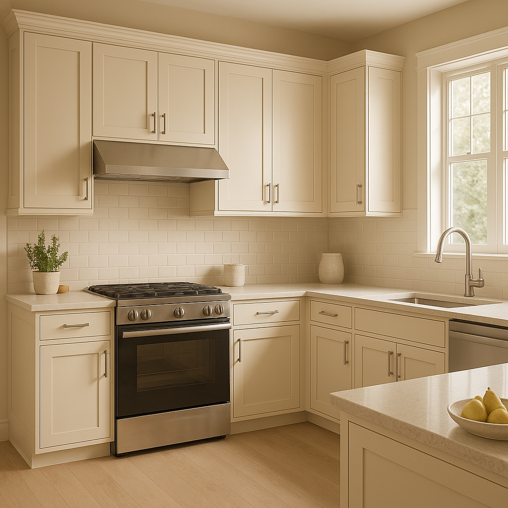
Living Rooms:
Create a cozy, welcoming environment by using Pale (951) as the foundation for your living space. Pair it with layered textures like woven rugs, plush throws, and warm wood accents for a balanced and inviting look.
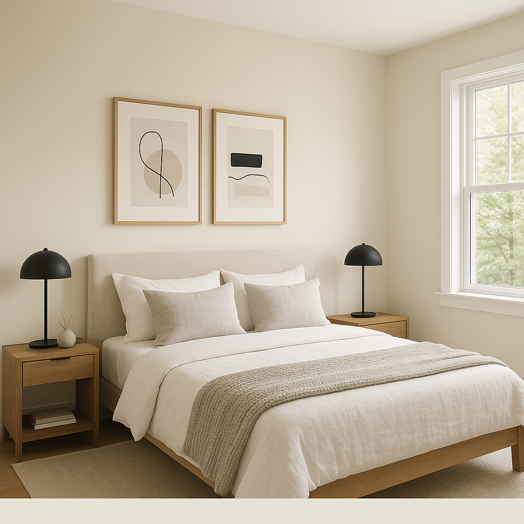
Bedrooms:
Pale (951) is an excellent choice for bedrooms thanks to its calming presence. Combine it with soft linens in whites or pastels and add touches of natural greenery for a peaceful retreat.
Bathrooms:
Use this neutral in bathrooms to achieve a spa-like vibe. Pale (951) pairs beautifully with marble countertops, brushed nickel hardware, and soft white towels for a clean yet luxurious aesthetic.
Hallways and Entryways:
Enhance the flow of your home by painting hallways and entryways in Pale (951). Its neutral tone makes it a perfect transitional color, seamlessly connecting different rooms while maintaining a cohesive design.
Open-Concept Spaces:
For open-concept living, Pale (951) serves as a unifying backdrop that allows furniture, art, and décor to stand out. Its adaptable undertones ensure it works well with varied styles and finishes.
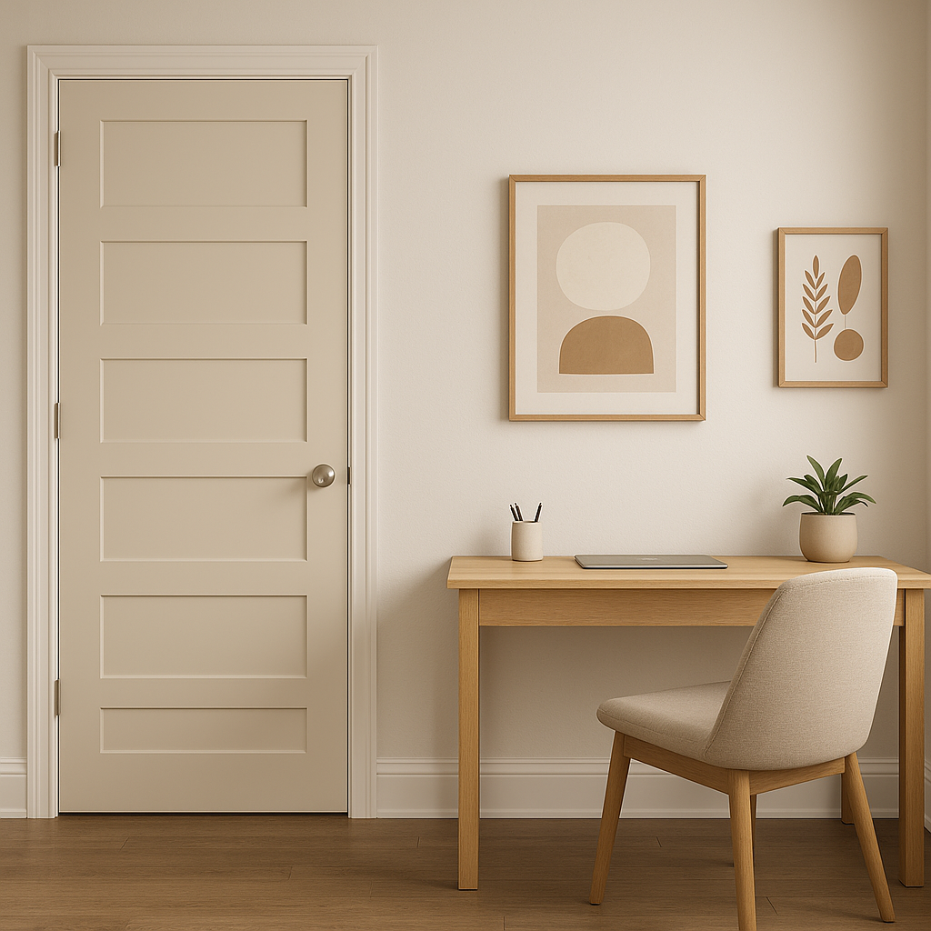
Offices:
In home offices, Pale (951) fosters focus and calm, providing a neutral canvas that minimizes distraction and enhances productivity. Pair it with sleek furniture and understated décor for a refined workspace.
The beauty of Benjamin Moore Pale (951) lies in its subtlety and adaptability. Its greige undertones allow it to bridge the gap between warm and cool color palettes, making it a go-to choice for designers seeking a neutral that offers both sophistication and versatility. Whether you're refreshing a single room or designing an entire home, Pale (951) is a timeless option that exudes effortless elegance.
Decorating with Pale (951) ensures your space remains stylish, serene, and welcoming for years to come. Its ability to coordinate with a wide spectrum of colors makes it a favorite among interior designers, while its soft, muted tone promises to complement any décor style.
View Colors Only by Brand (No Imagery):
Sherwin-Williams
|
Benjamin-Moore
|
Behr
|
Valspar
Live on the Eastern Slope of Colorado and looking for a local painting professional, check out all our painting services and reach out for a free estimate.
Copyright © 2026 : Wild Fox Painting Inc. : 12435 Mead Way, Littleton, CO 80125


