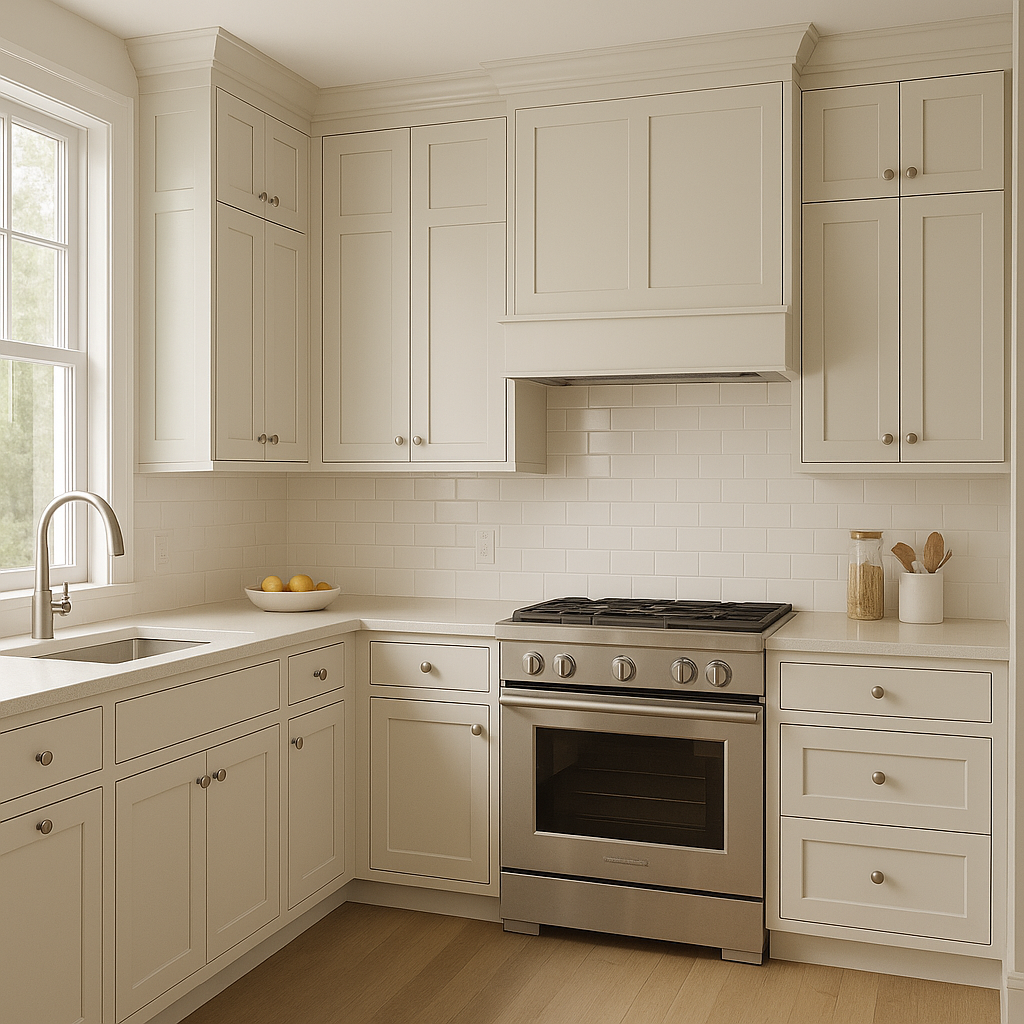
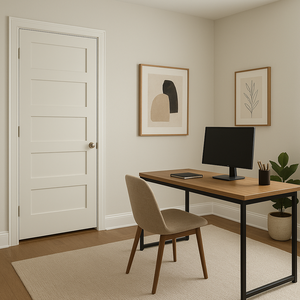
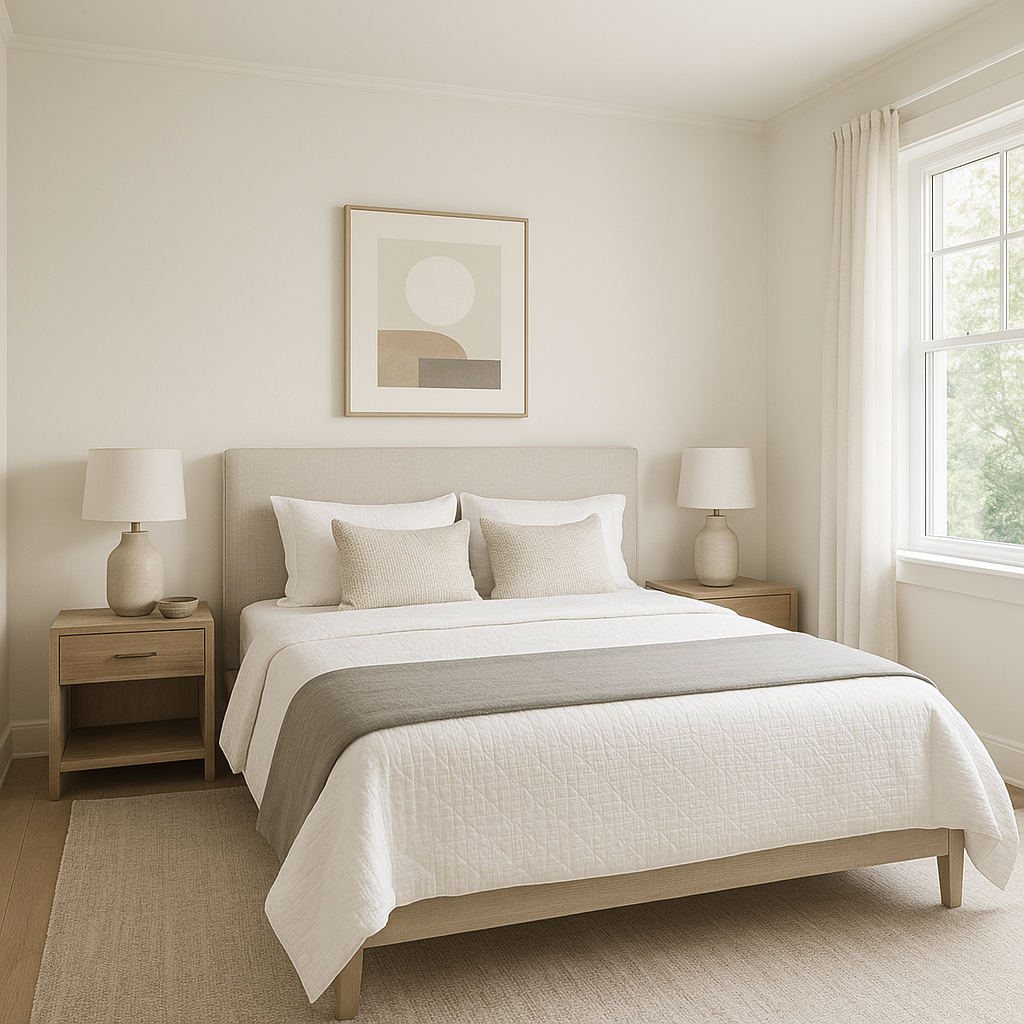
Benjamin Moore Seapearl (961) is a timeless, versatile off-white that exudes understated sophistication. Its soft, creamy appearance makes it a favorite among homeowners and designers alike, offering a delicate balance between warmth and coolness. Perfect for creating serene spaces, Seapearl works effortlessly across design styles, from modern minimalism to classic traditional.
Seapearl is known for its subtle greige (gray-beige) undertones, which add depth and character to this otherwise neutral shade. It leans slightly cool but remains balanced enough to avoid feeling stark or sterile. These undertones make it adaptable to various lighting conditions, as it can shift between a soft grayish-white in cooler lighting and a warmer off-white in sunnier spaces. Its ability to harmonize with both cool and warm palettes makes it an excellent choice for any room in the home.
To maximize Seapearl’s versatility, pair it with complementary colors that highlight its neutral undertones. Here are some coordinating hues that work beautifully with Seapearl:
These coordinating colors allow you to tailor Seapearl to your design vision, whether you want to create a calm retreat or a bold statement.
The subtle charm of Seapearl makes it incredibly versatile, suitable for a variety of design applications. Here are some ways you can use this shade to elevate your interiors:
Seapearl’s ability to layer warmth and coolness makes it an incredibly adaptable hue that works in almost any space. Its greige undertones provide just enough complexity to keep it interesting, while its soft neutrality allows it to coordinate effortlessly with a wide range of design palettes. Whether you’re seeking an airy, tranquil ambiance or a sophisticated foundation for bold accents, Seapearl is a dependable choice that will stand the test of time.
By incorporating Benjamin Moore Seapearl into your interior or exterior design, you'll achieve a look that is equal parts refined and inviting.
View Colors Only by Brand (No Imagery):
Sherwin-Williams
|
Benjamin-Moore
|
Behr
|
Valspar
Live on the Eastern Slope of Colorado and looking for a local painting professional, check out all our painting services and reach out for a free estimate.
Copyright © 2026 : Wild Fox Painting Inc. : 12435 Mead Way, Littleton, CO 80125


