Benjamin Moore Wind's Breath (981) is a versatile and sophisticated neutral that effortlessly bridges the gap between warm and cool tones. With its soft, airy quality, this shade is a favorite among interior designers for creating spaces that feel calm, balanced, and inviting. Whether you're designing a modern minimalist retreat or a cozy, traditional home, Wind's Breath provides the perfect canvas for a multitude of design styles.
Wind's Breath is a subtle greige—a harmonious blend of gray and beige—that leans slightly warm. Its undertones include hints of taupe and the faintest whisper of violet, giving it a refined and elegant edge. The violet undertone is delicate enough to stay neutral under most lighting conditions, but it adds a richness that prevents the color from feeling flat or stark.
Because of its well-balanced nature, Wind's Breath shifts beautifully depending on the surrounding light. In brighter spaces, it can appear slightly cooler, while in dimmer rooms, its warmth takes center stage. This dynamic quality makes it an adaptable choice for any room in the house.
Wind's Breath pairs beautifully with a variety of hues, making it easy to incorporate into your design palette. Here are some coordinating colors to consider:
For a more dramatic pairing, consider incorporating Benjamin Moore Black Panther (2125-10) for modern accents or fixtures that ground the space.
Wind's Breath is a true chameleon and works beautifully in a wide range of applications. Here are some ideas for incorporating this shade into your home:
Wind's Breath is perfect for living rooms where you want to create a restful yet elegant atmosphere. Pair it with plush linen sofas, natural wood tones, and soft metallic accents like brushed gold or antique bronze. Layer textures with area rugs and throw blankets in complementary neutrals or muted colors for added depth.
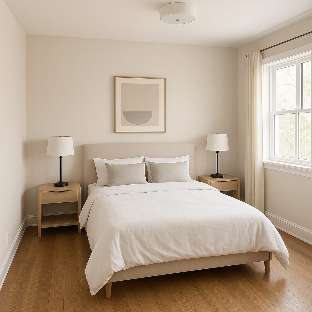
For a tranquil retreat, Wind's Breath is an excellent choice for bedrooms. Its soft greige tones promote relaxation and pair beautifully with crisp white bedding, soft blue-gray accents, and muted greenery. Add dimension with patterned textiles or curtains in coordinating tones.
In bathrooms, Wind's Breath shines as a neutral backdrop for spa-like serenity. Pair it with white subway tiles, marble countertops, and chrome or nickel fixtures for a timeless look. For a touch of drama, incorporate darker grout lines or a statement mirror.
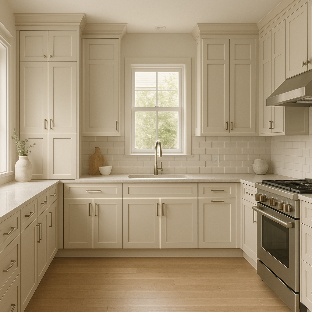
Wind's Breath is a popular choice for kitchens due to its ability to balance warmth and coolness. Use it on walls or cabinetry and pair it with butcher block countertops, white subway tile backsplashes, and matte black hardware for a clean, modern aesthetic.
Create a warm and welcoming entryway with Wind's Breath. Its neutral tone works well in transitional spaces, especially when paired with darker accent colors like Chelsea Gray or Black Panther for trim, railings, or furniture.
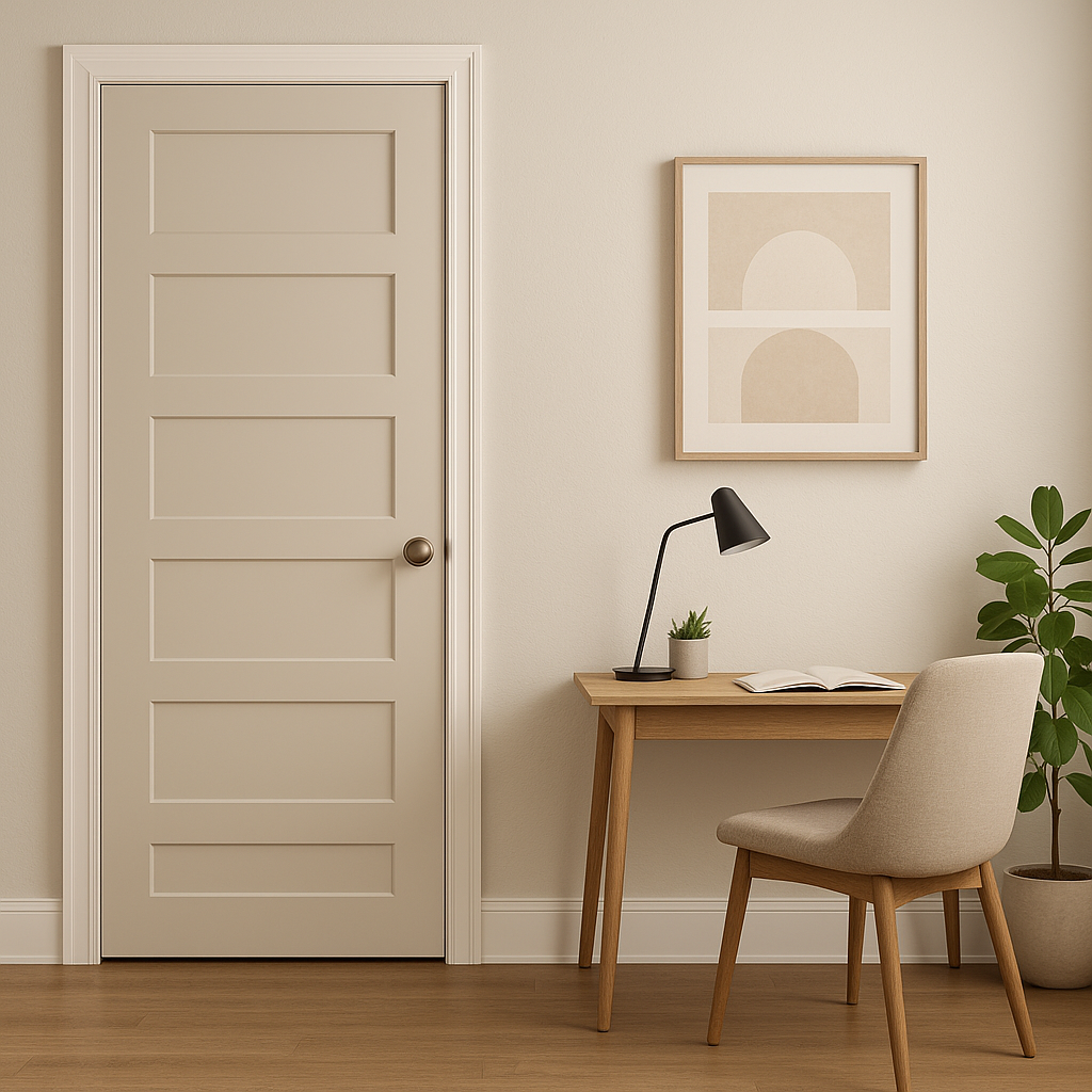
Wind's Breath provides a calm and neutral environment for home offices, encouraging focus and productivity. Pair it with natural woods, sleek metallics, and pops of greenery for a polished yet tranquil workspace.
Because Wind's Breath has subtle undertones, lighting plays a significant role in how the color appears in your space. In rooms with ample natural light, the violet undertones may be more noticeable, lending a slightly cooler feel. In spaces with warm artificial lighting, its beige qualities come forward, creating a cozier ambiance. Always test the paint in different areas of your room to observe how it reacts to your lighting conditions.
Wind's Breath is a truly timeless neutral that enhances a wide range of design styles. Its soft greige tone has enough character to stand on its own but is understated enough to support bold accent colors or intricate patterns. Whether you're refreshing a single room or updating your entire home, Wind's Breath is a versatile choice that will look stunning for years to come.
View Colors Only by Brand (No Imagery):
Sherwin-Williams
|
Benjamin-Moore
|
Behr
|
Valspar
Live on the Eastern Slope of Colorado and looking for a local painting professional, check out all our painting services and reach out for a free estimate.
Copyright © 2026 : Wild Fox Painting Inc. : 12435 Mead Way, Littleton, CO 80125


