Benjamin Moore Buckhorn (987) is a versatile and sophisticated paint color that brings understated elegance to any space. As part of Benjamin Moore's collection of timeless hues, Buckhorn is a warm, neutral shade that strikes the perfect balance between beige and taupe, making it a go-to choice for creating cozy and inviting interiors. With its subtle depth and ability to complement a variety of design styles, Buckhorn is an exceptional choice for homeowners and designers alike.
The magic of Buckhorn lies in its nuanced undertones. This warm neutral carries delicate hints of brown and gray, resulting in a rich taupe-like appearance. It also has faint golden undertones that add a touch of warmth, making it feel welcoming without being overly yellow or orange. These subtle undertones allow Buckhorn to play beautifully in different lighting conditions, shifting slightly between a soft beige in brighter light and a deeper taupe in lower light.
Buckhorn’s versatility makes it an ideal choice for spaces where you want a neutral color that feels grounded yet sophisticated. Its warmth ensures it doesn’t feel stark or cold, making it a perfect base for layering textures and complementary hues.
Pairing Buckhorn with the right colors can elevate its beauty and bring balance to your space. Whether you're aiming for a monochromatic palette or a more dynamic contrast, Buckhorn works wonderfully with a variety of shades:
Buckhorn also pairs beautifully with natural materials such as wood, stone, and woven textiles, making it a perfect choice for transitional or rustic-inspired spaces.
Buckhorn’s adaptable nature makes it suitable for a wide variety of applications, from walls to cabinetry to accents. Here are some of the best ways to incorporate Buckhorn into your home:
Buckhorn is a superb choice for living rooms, where its warm undertones create a sense of comfort and relaxation. It works well as the primary wall color, especially when paired with cream-colored trim and cozy furniture. Add natural wood tones or metallic accents to highlight Buckhorn's earthy elegance.
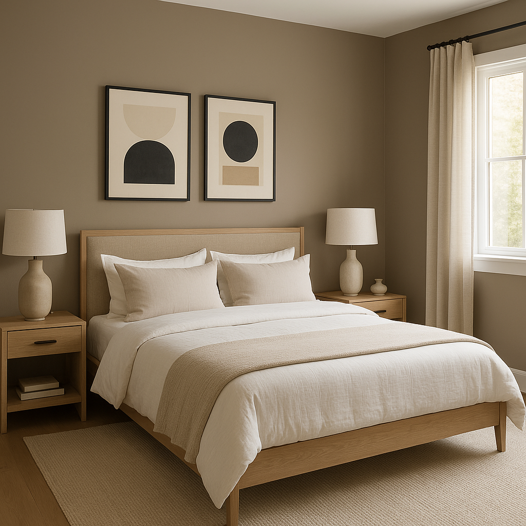
In bedrooms, Buckhorn offers a calming and cocoon-like atmosphere. Pair it with soft linens in off-white or muted green tones for a serene retreat. Layer with textures like plush throws or woven rugs to bring depth and cozy charm.
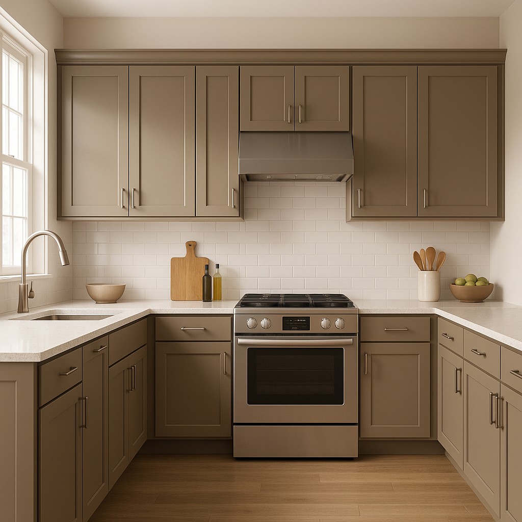
Buckhorn also shines in kitchens, whether as a wall color or on cabinetry. Its warm taupe shade complements natural stone countertops and stainless steel appliances. Pair it with white subway tiles for a classic look or brushed gold hardware for a modern touch.
For bathrooms, Buckhorn provides a spa-like ambiance when paired with crisp white fixtures and soft beige or gray tiles. Incorporate greenery or botanical accents to add freshness to the space.
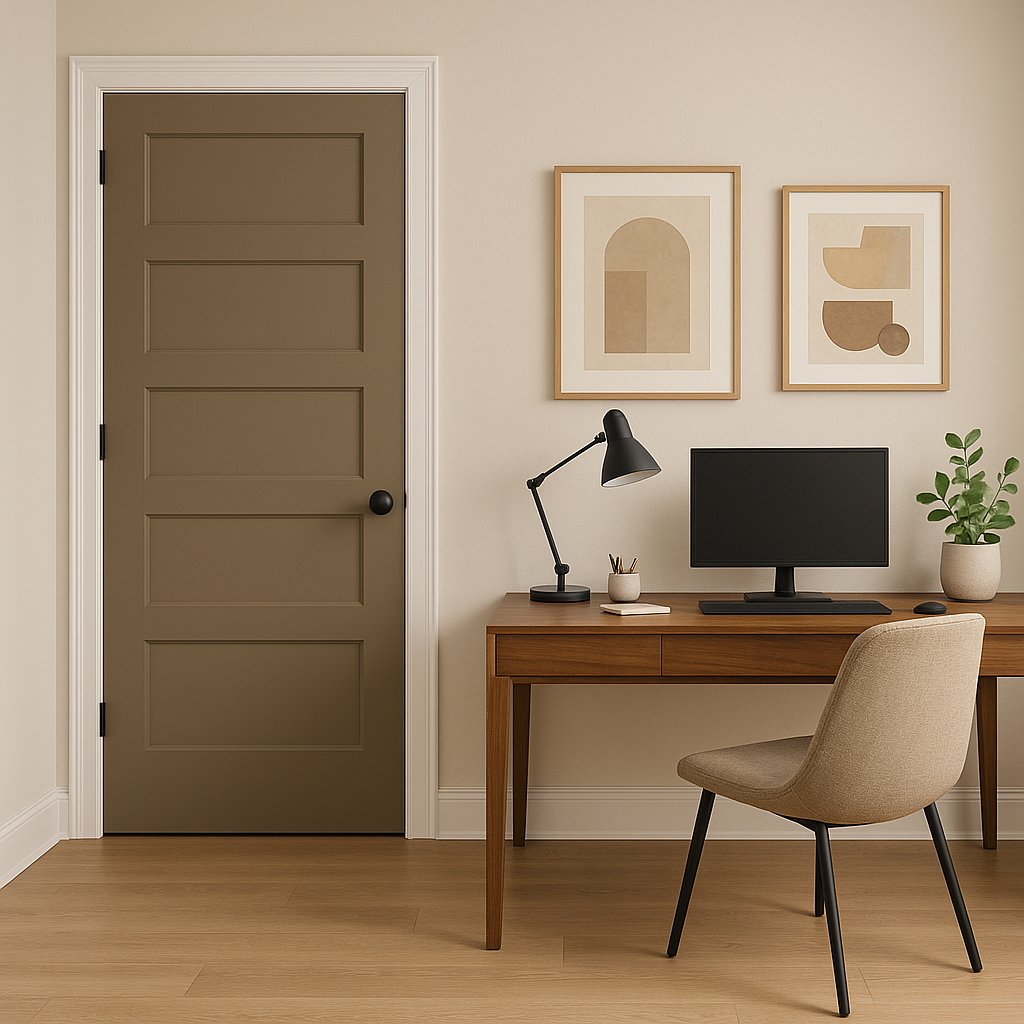
Buckhorn is an excellent option for hallways and entryways, where its neutral tone can make small or narrow spaces feel more expansive while maintaining a sense of warmth.
Benjamin Moore Buckhorn (987) is more than just a neutral paint color; it’s a versatile canvas that adapts seamlessly to your design vision. Its warm undertones, ability to coordinate with a wide range of colors, and suitability for various spaces make it an invaluable choice for creating interiors that feel timeless, harmonious, and inviting.
Whether you're designing a cozy family room, a serene bedroom retreat, or a sophisticated kitchen, Buckhorn is a reliable and stylish choice that will stand the test of time.
View Colors Only by Brand (No Imagery):
Sherwin-Williams
|
Benjamin-Moore
|
Behr
|
Valspar
Live on the Eastern Slope of Colorado and looking for a local painting professional, check out all our painting services and reach out for a free estimate.
Copyright © 2026 : Wild Fox Painting Inc. : 12435 Mead Way, Littleton, CO 80125


