Benjamin Moore Ticonderoga (992) is a masterfully balanced neutral that exudes understated elegance. With its soft gray-beige blend, this color strikes the perfect harmony between warm and cool tones, making it a versatile choice for a wide range of interiors. Its ability to complement a variety of design styles, from modern minimalism to classic traditional, has solidified its status as a go-to paint color for homeowners and designers alike.
Ticonderoga (992) has subtle beige undertones infused with a whisper of gray, which gives it a refined greige appearance. The gray undertones help maintain a grounded, cool neutrality, while the beige adds warmth, preventing the color from feeling too stark or sterile. This balance ensures the shade works beautifully in spaces with both natural and artificial light, adapting effortlessly to the surrounding environment.
When exposed to ample natural light, Ticonderoga leans slightly cooler, showcasing its soft gray undertones. In dimmer or warm artificial lighting, the beige undertones come forward, lending a cozy and inviting ambiance.
Benjamin Moore Ticonderoga (992) pairs seamlessly with an array of complementary hues, offering endless possibilities for cohesive and stylish interiors. Here are some coordinating colors to consider:
These coordinating shades allow Ticonderoga to shine within diverse color schemes, whether you're aiming for a soft monochromatic look or introducing bold contrasts.
Benjamin Moore Ticonderoga (992) is a versatile neutral that works beautifully in a multitude of spaces. Whether you're refreshing a single room or designing an entire home, this hue adapts effortlessly to various functions and styles:
Ticonderoga creates a serene and welcoming environment in living spaces. Pair it with plush upholstered furniture, warm wood tones, and metallic accents for a sophisticated yet cozy retreat.
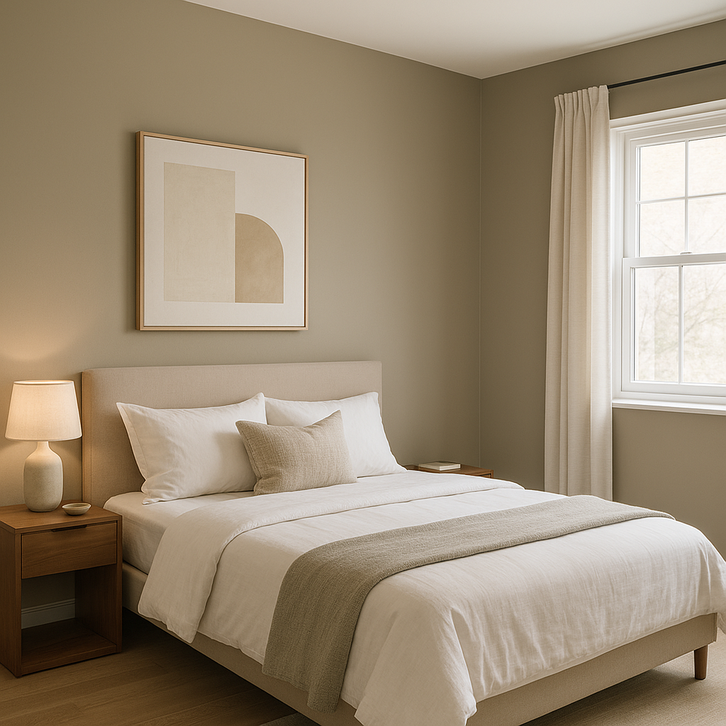
Its soothing undertones make it a perfect choice for creating a restful sanctuary. Combine with crisp white linens, soft grays, and muted blues for a tranquil atmosphere conducive to relaxation.
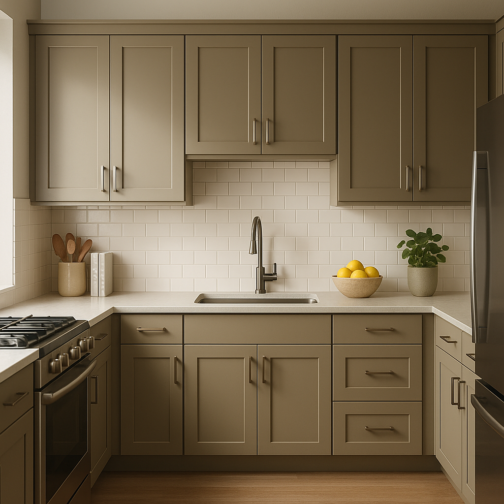
Ticonderoga’s neutral base offers a clean backdrop for kitchens and dining spaces. It pairs beautifully with white cabinetry, brushed nickel hardware, and quartz countertops for a timeless aesthetic.
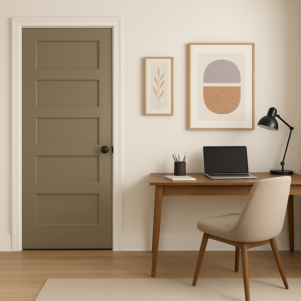
In home offices, Ticonderoga fosters an environment of focus and productivity. Pair it with deep navy or charcoal accents for a professional yet stylish workspace.
This shade is particularly stunning in bathrooms, where its neutral undertones complement white tiles, marble surfaces, and chrome finishes, creating a spa-like ambiance.
As a versatile neutral, Ticonderoga is a fantastic choice for transitional spaces like hallways and entryways. It provides a clean and cohesive backdrop that connects adjoining rooms effortlessly.
The overall impact of Benjamin Moore Ticonderoga (992) can shift depending on lighting conditions. It's essential to test the color in different areas of your home to understand how it interacts with natural and artificial light. In north-facing rooms, Ticonderoga may lean cooler, while in south-facing spaces, its warmer beige undertones become more pronounced.
Benjamin Moore Ticonderoga (992) is a timeless neutral that offers versatility, elegance, and adaptability. Its balanced undertones ensure it works beautifully in almost any setting, while its ability to pair seamlessly with a wide range of coordinating colors makes it a valuable asset in any interior design project. Whether you're designing a modern apartment, a traditional home, or a transitional space, Ticonderoga’s subtle sophistication will elevate your interiors with ease.
View Colors Only by Brand (No Imagery):
Sherwin-Williams
|
Benjamin-Moore
|
Behr
|
Valspar
Live on the Eastern Slope of Colorado and looking for a local painting professional, check out all our painting services and reach out for a free estimate.
Copyright © 2026 : Wild Fox Painting Inc. : 12435 Mead Way, Littleton, CO 80125


