Wild Fox Painting Logo

Beachcomber

993 | benjamin-moore | HEX: #867567 | RGB: 134, 117, 103

Benjamin Moore Beachcomber 993: A Timeless Neutral with Subtle Warmth

Benjamin Moore Beachcomber 993 is a versatile and sophisticated neutral paint color that evokes a sense of calm and serenity. Perfect for a variety of interior design styles, this hue is part of Benjamin Moore's Classic Color Collection, reflecting timeless elegance and effortless charm. Beachcomber is a warm beige tone that strikes the perfect balance between coziness and refinement, making it a go-to choice for homeowners and designers alike.

Undertones: Warm and Subtle

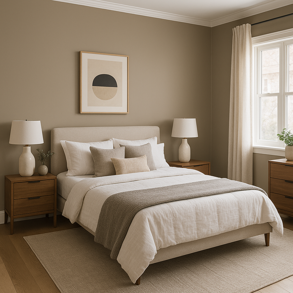
Beachcomber 993 is characterized by its warm beige base with soft undertones of yellow and taupe. These subtle undertones give the color its inviting nature, making it feel neither too stark nor too muddy. Unlike cooler grays or stark whites, Beachcomber brings a gentle warmth to a space, making it ideal for creating a welcoming atmosphere. The yellow undertones ensure that the color won’t feel dull or flat, while the taupe undertones add a layer of sophistication, preventing it from appearing overly golden or dated.

Coordinating Colors: Pairing for Perfect Harmony

One of the standout qualities of Benjamin Moore Beachcomber 993 is its remarkable versatility when it comes to coordinating colors. Whether you’re aiming for a monochromatic look or a more dynamic palette, Beachcomber pairs beautifully with a wide range of hues:

  • Whites and Off-Whites: Pair Beachcomber with crisp whites like Benjamin Moore Chantilly Lace OC-65 or softer off-whites like White Dove OC-17 for a clean, fresh, and timeless look. These combinations enhance the neutral warmth of Beachcomber without overpowering it.
  • Earthy Neutrals: Complement Beachcomber with muted earth tones like Edgecomb Gray HC-173 or Revere Pewter HC-172 for a layered and cohesive design. These shades create a soothing, transitional palette perfect for open-concept spaces.
  • Accent Colors: For a pop of color, consider pairing Beachcomber with muted blues like Santorini Blue 1634 or soft greens such as Saybrook Sage HC-114. These shades add depth and character while maintaining a harmonious balance.

Ideal Uses: Where Beachcomber Shines

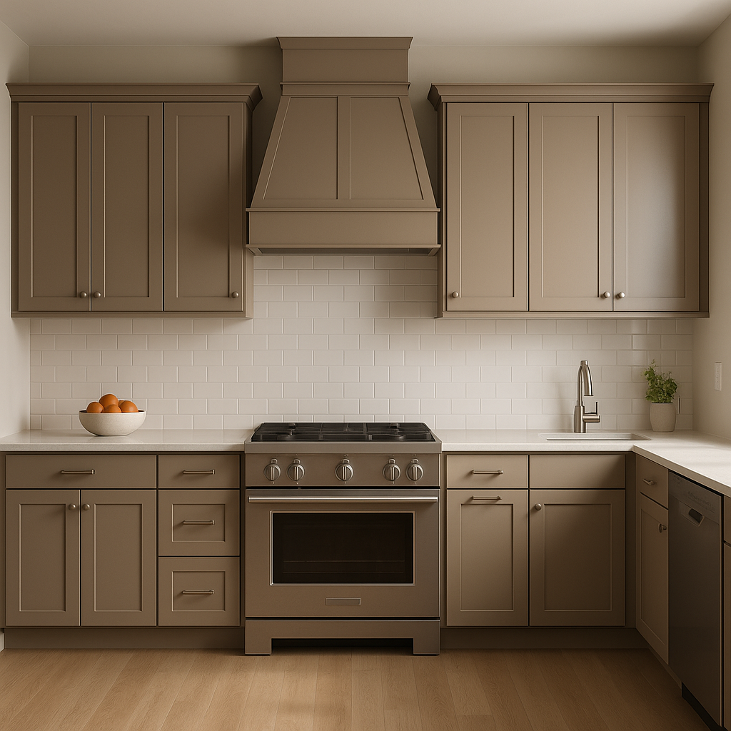
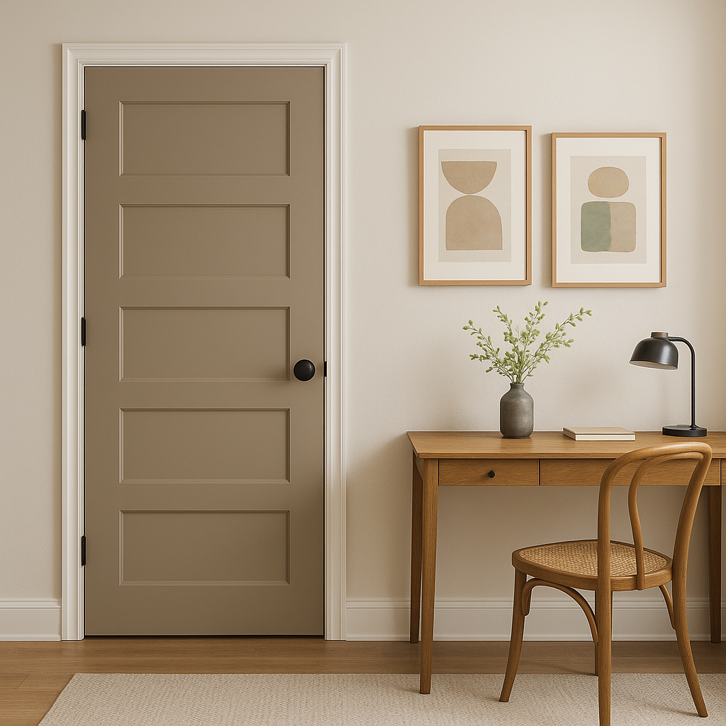
Beachcomber 993’s neutral appeal makes it a versatile choice for virtually any room in your home. Here are some ideas for where and how to use this stunning shade:

  • Living Rooms: Its warm undertones create a cozy yet polished atmosphere, perfect for living spaces where you gather with family and friends. Pair with soft furnishings in natural textures like linen or wool for an inviting, layered look.
  • Bedrooms: Beachcomber’s soothing qualities make it a wonderful choice for bedrooms, where comfort and relaxation are key. Use it on walls and pair it with crisp white bedding and soft pastel accents for a tranquil retreat.
  • Kitchens and Dining Areas: This hue works beautifully in kitchens and dining spaces, especially when paired with white cabinetry and natural wood tones. It adds warmth without overwhelming the space, making it ideal for areas where you entertain or share meals.
  • Hallways and Entryways: Beachcomber’s neutral nature makes it an excellent backdrop for entryways and hallways, where it can seamlessly connect different rooms and design schemes.
  • Bathrooms: For a spa-like feel, use Beachcomber in bathrooms with white tiles, marble accents, and brushed nickel fixtures. Its warm undertones bring a sense of comfort to these often-cool spaces.

Lighting Considerations

As with any paint color, lighting can significantly influence how Beachcomber 993 appears in your space. In bright, natural light, the yellow undertones may be more pronounced, giving the color a sunny, uplifting quality. In dimmer, artificial light,

Explore All Our Core Services in More Detail

Live on the Eastern Slope of Colorado and looking for a painting professional, check out all our painting services and reach out for a free estimate.

Copyright © 2025 : Wild Fox Painting Inc.