Benjamin Moore Cape (AC-34) is a sophisticated and versatile neutral that blends understated elegance with a touch of character. This medium-toned gray offers a balanced aesthetic, making it a go-to choice for creating serene interiors or grounding bolder design schemes. Whether used as a main wall color, an accent, or even on cabinetry, Cape provides a timeless foundation for a variety of spaces.
One of the standout features of Cape (AC-34) is its subtle undertones, which are key to its versatility. This color leans slightly warm, with soft taupe and beige undertones that give it a welcoming and approachable feel. However, depending on the lighting, it can also exhibit cooler gray qualities, ensuring it adapts beautifully to different environments.
These shifting undertones make Cape an excellent choice for transitional interiors that blend both traditional and contemporary styles.
Pairing Cape with complementary colors is effortless due to its neutral composition. Whether you’re aiming for a monochromatic palette or introducing contrasting hues, Cape works harmoniously with a wide range of shades.
For a refined and layered look, consider pairing Cape with lighter or darker grays:
Cape also works seamlessly with other neutrals to create understated elegance:
For a pop of color, Cape provides the ideal backdrop for bold hues:
Cape’s versatility makes it suitable for a wide range of applications, from cozy living rooms to chic offices. Here are some ideas to bring this adaptable neutral into your home:
Use Cape as the main wall color in living rooms to create a calming and elegant atmosphere. Pair it with plush furniture in soft, warm tones or sleek metallic accents for a modern touch.
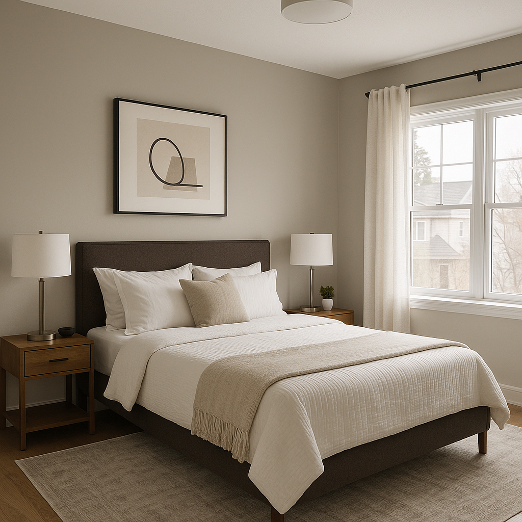
In bedrooms, Cape provides a soothing backdrop that promotes relaxation. Pair it with crisp white bedding and soft textures, such as velvet or linen, to craft a luxurious retreat.
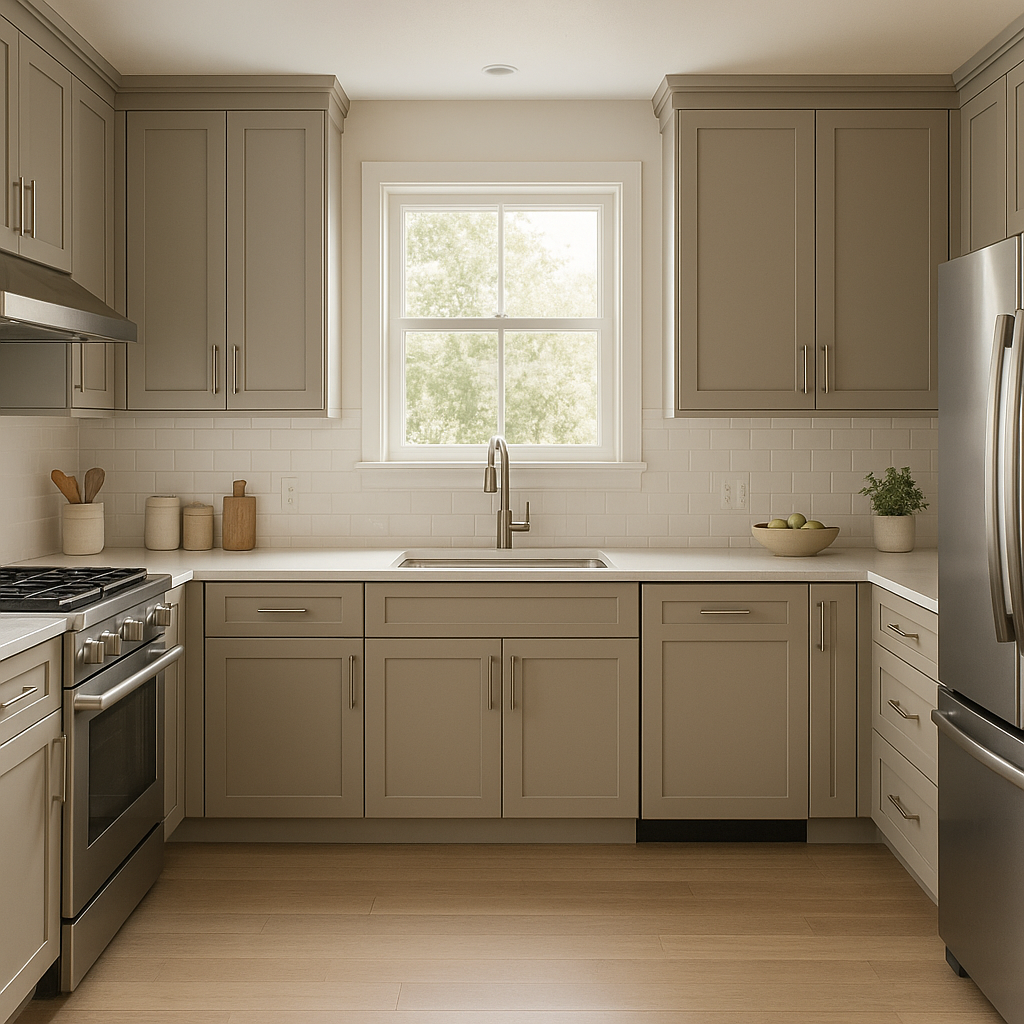
Cape is an exceptional choice for kitchen cabinetry or walls. Its taupe undertones coordinate well with natural wood finishes, marble countertops, or brushed brass hardware for a sophisticated and timeless look.
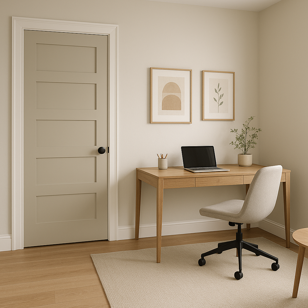
For home offices, Cape strikes the right balance between professional and inviting. Pair it with darker furniture and bold accessories to create a focused and inspiring workspace.
Transform transitional spaces like hallways and entryways with Cape. Its medium tone adds depth without overwhelming, and it pairs beautifully with statement lighting or artwork.
Lighting plays a crucial role in how Benjamin Moore Cape (AC-34) is perceived. To optimize its beauty:
Benjamin Moore Cape (AC-34) stands out as a timeless neutral that adapts effortlessly to a wide range of design styles and palettes. Its subtle undertones, ability to coordinate with a variety of colors, and suitability for virtually any room make it a must-have in any designer’s toolkit. Whether you’re revamping a single space or designing an entire home, Cape is sure to elevate your interiors with its understated charm.
View Colors Only by Brand (No Imagery):
Sherwin-Williams
|
Benjamin-Moore
|
Behr
|
Valspar
Live on the Eastern Slope of Colorado and looking for a local painting professional, check out all our painting services and reach out for a free estimate.
Copyright © 2026 : Wild Fox Painting Inc. : 12435 Mead Way, Littleton, CO 80125


