Benjamin Moore Mt. Rainier Gray AC-39 is a serene, sophisticated shade that embodies the tranquility of misty mountain landscapes. Part of Benjamin Moore's esteemed Off-White Collection, this color offers a subtle balance of gray and blue tones, making it a versatile choice for a wide variety of interior and exterior spaces. Whether you're designing a modern retreat or a classic, timeless home, Mt. Rainier Gray effortlessly delivers a sense of calm and elegance.
The defining characteristic of Mt. Rainier Gray is its delicate undertone—a soft, cool blue subtly layered over a gray base. This combination creates a color that feels airy yet grounded, offering a sense of lightness without being overly cold. The blue undertones become more apparent in spaces with ample natural light, giving the room a fresh, breezy feel. In lower light conditions, the gray undertones take center stage, lending a more muted and sophisticated ambiance. This duality makes Mt. Rainier Gray a chameleon-like hue, capable of adapting to various lighting environments and design styles.
Mt. Rainier Gray is incredibly versatile, pairing beautifully with a wide range of coordinating colors to suit different aesthetics. Below are some suggested pairings to inspire your design:
Neutral Companions: Pair Mt. Rainier Gray with warm whites such as White Dove OC-17 or Simply White OC-117 to create a clean, timeless look. These shades enhance the airy quality of Mt. Rainier Gray while maintaining a cohesive and tranquil palette.
Bold Accents: For a pop of contrast, consider deeper blues like Hale Navy HC-154 or rich charcoals such as Kendall Charcoal HC-166. These striking hues ground the space while adding depth and sophistication.
Earthy Tones: Bring warmth to the cool undertones with earthy shades like Revere Pewter HC-172 or Edgecomb Gray HC-173. These greige tones create a harmonious balance, ideal for transitional or farmhouse-inspired interiors.
Soft Pastels: To craft a serene and cohesive look, combine Mt. Rainier Gray with gentle pastels such as Wickham Gray HC-171 or Woodlawn Blue HC-147. These delicate hues enhance the color’s blue undertones for a soothing, coastal-inspired vibe.
Thanks to its neutral yet distinctive character, Mt. Rainier Gray is a versatile hue that works beautifully in various spaces and design contexts:
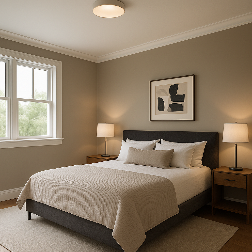
The calming mix of blue and gray makes Mt. Rainier Gray a perfect choice for living rooms and bedrooms. Its soft undertones create a peaceful atmosphere, ideal for relaxation and unwinding. Pair it with plush textiles in complementary colors to elevate the cozy factor.
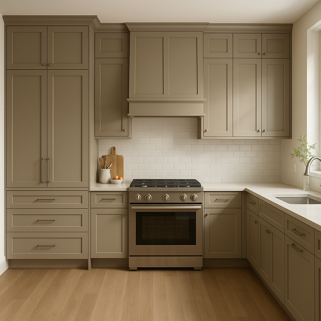
For kitchens and bathrooms, Mt. Rainier Gray offers a clean, polished look without feeling stark or sterile. Use it on cabinetry for a fresh, modern aesthetic, or as a wall color to complement white subway tiles and marble countertops.
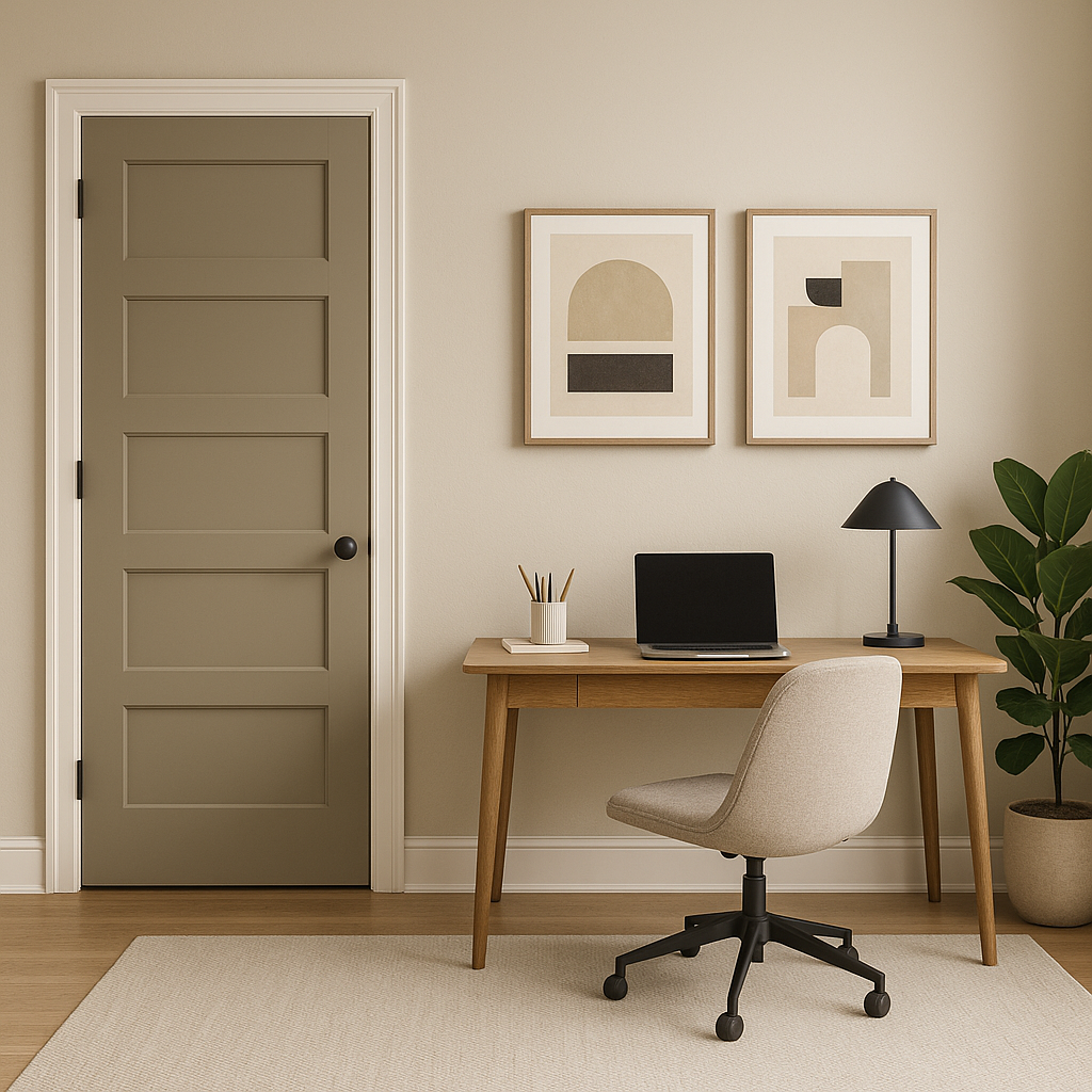
The serene and balanced nature of this color promotes focus and clarity, making it an excellent choice for home offices. Pair it with natural wood tones and metallic accents for a chic, inspiring workspace.
Mt. Rainier Gray isn’t limited to interiors—it also shines as an exterior paint color. Its subtle cool tones work beautifully with natural stone, white trim, and darker accents, giving your home a classic and inviting curb appeal.
Mt. Rainier Gray strikes the perfect balance between neutral and colorful,
View Colors Only by Brand (No Imagery):
Sherwin-Williams
|
Benjamin-Moore
|
Behr
|
Valspar
Live on the Eastern Slope of Colorado and looking for a local painting professional, check out all our painting services and reach out for a free estimate.
Copyright © 2026 : Wild Fox Painting Inc. : 12435 Mead Way, Littleton, CO 80125


