Benjamin Moore Pashmina (AF-100) is a sophisticated, earthy neutral that bridges the gap between gray and beige, offering a unique and versatile tone that effortlessly enhances a variety of design styles. Its subtle warmth and understated richness make it a go-to choice for homeowners and designers alike. Whether you’re creating a cozy retreat or a polished, modern space, Pashmina’s timeless appeal adds depth and character to any room.
Pashmina is a taupe-inspired shade with warm undertones that lean slightly green. These green undertones give it a unique edge, allowing it to shift beautifully under different lighting conditions. While it retains the softness of a greige, its muted green base provides a grounded, natural feel that works well in both traditional and contemporary designs.
Understanding its undertones is essential for pairing and placement. Pashmina’s warmth prevents it from coming across as too cool or sterile, while the green undertones keep it from feeling overly yellow or muddy. This perfect balance makes it highly adaptable and a favorite for spaces that need a bit of refinement without overwhelming the senses.
Benjamin Moore Pashmina works beautifully with a curated palette of complementary and contrasting colors. Here are some options to consider:
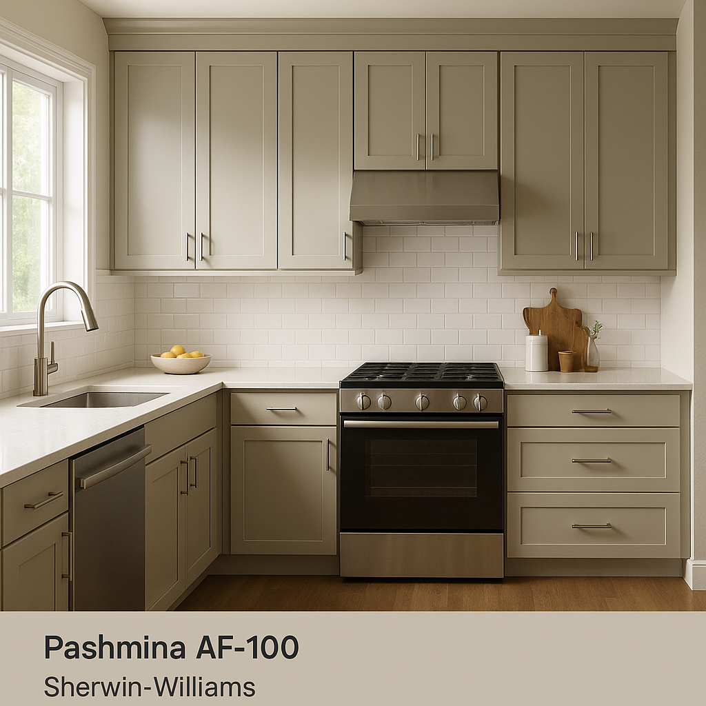
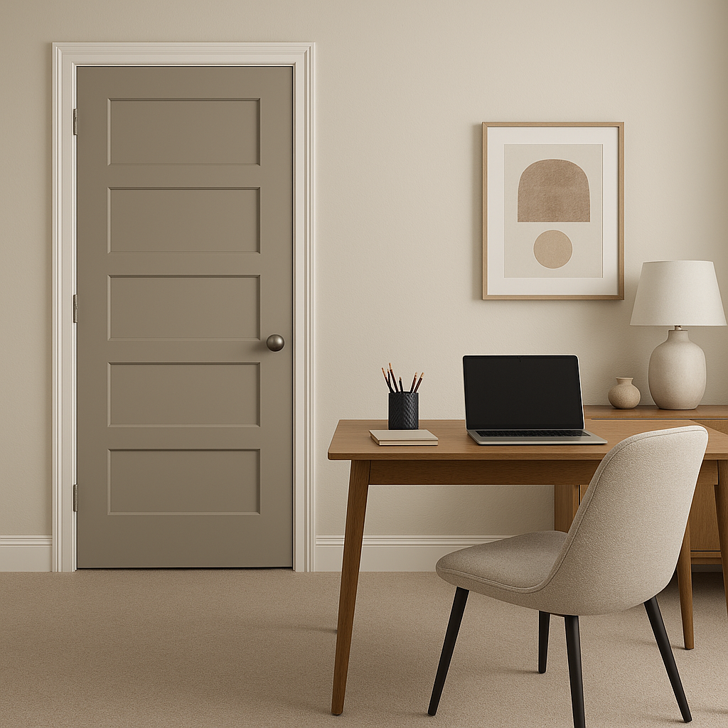
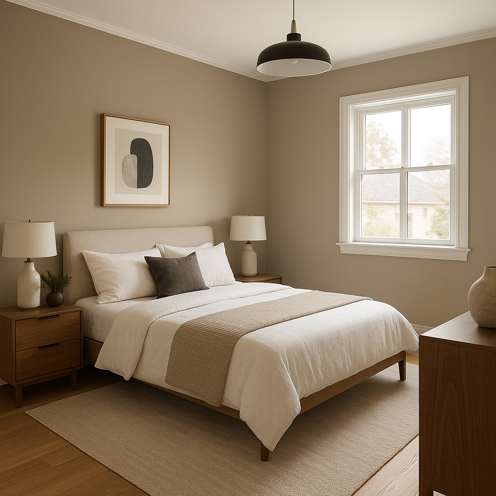
Pashmina’s versatility makes it a popular choice for a variety of applications. Its earthy tone can serve as a neutral backdrop or a statement color, depending on how it’s used. Here are some excellent ways to incorporate Pashmina into your home:
Benjamin Moore Pashmina is highly responsive to lighting conditions. In spaces with ample natural light, its green undertones become more noticeable, giving it a fresh, organic feel. In dimmer lighting, Pashmina takes on a deeper, more subdued taupe appearance, creating a cozy and intimate vibe. For best results, test the color in various lighting scenarios to ensure it complements the intended space.
Pashmina (AF-100) is more than just a neutral; it’s a color that elevates interiors with its subtle complexity and timeless charm. Its warm undertones and versatility make it suitable for nearly any room in the home. Whether paired with complementary neutrals or bold accents, Pashmina adapts beautifully to different design aesthetics, ensuring your space feels curated and cohesive.
Benjamin Moore Pashmina is an ideal choice for those seeking a neutral with personality—a shade that quietly enhances without overpowering. Its earthy elegance and adaptability make it a favorite among interior designers looking to create spaces that feel both grounded and refined.
View Colors Only by Brand (No Imagery):
Sherwin-Williams
|
Benjamin-Moore
|
Behr
|
Valspar
Live on the Eastern Slope of Colorado and looking for a local painting professional, check out all our painting services and reach out for a free estimate.
Copyright © 2026 : Wild Fox Painting Inc. : 12435 Mead Way, Littleton, CO 80125


