Benjamin Moore Interlude (AF-135) is a nuanced and refined neutral that exudes sophistication and versatility. It’s part of Benjamin Moore's Affinity Collection, a curated palette designed to simplify color selection while offering harmonious pairings. Interlude is a soft taupe-gray with subtle warmth, making it a perfect balance between cool and warm tones. Its understated elegance allows it to complement a wide variety of design styles, from contemporary to traditional.
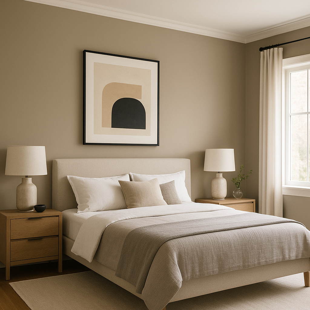
Interlude has gentle warm undertones that lean toward beige, giving it a welcoming and cozy feel. However, the gray aspect keeps it grounded and modern, avoiding any yellowish or overly warm appearance. This balance of warm and cool undertones makes Interlude highly adaptable to various lighting conditions. In spaces with natural light, it may appear slightly more beige, while in rooms with artificial or cooler lighting, the gray undertones become more prominent.
Benjamin Moore Interlude (AF-135) harmonizes beautifully with a range of coordinating colors, making it a versatile choice for both monochromatic and contrasting palettes.
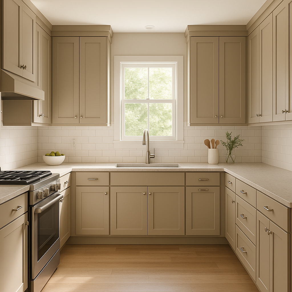
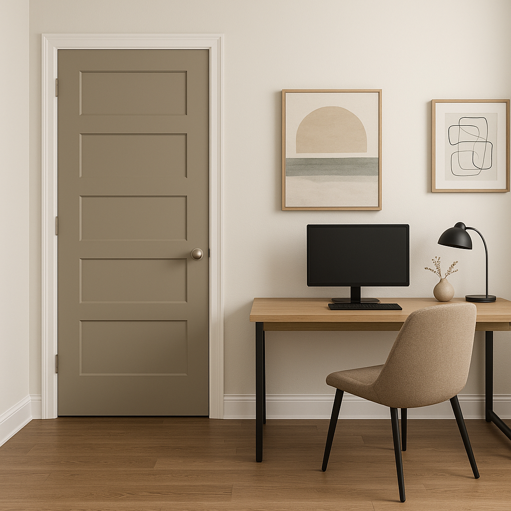
Benjamin Moore Interlude is a versatile choice that works across various rooms and design applications.
Lighting plays a significant role in how Benjamin Moore Interlude appears in a space. In rooms with ample natural light, the warm taupe undertones come forward, creating a cozy atmosphere. In spaces with cooler artificial lighting, the gray undertones dominate, lending a more contemporary vibe. Testing Interlude with swatches and different light sources is key to ensuring it aligns with your vision.
Benjamin Moore Interlude (AF-135) is more than just a paint color; it’s a statement of understated elegance. Its ability to bridge warm and cool tones makes it a go-to neutral for designers and homeowners alike. Whether you’re aiming for a serene retreat or a sophisticated gathering space, Interlude provides the perfect canvas to bring your design dreams to life.
View Colors Only by Brand (No Imagery):
Sherwin-Williams
|
Benjamin-Moore
|
Behr
|
Valspar
Live on the Eastern Slope of Colorado and looking for a local painting professional, check out all our painting services and reach out for a free estimate.
Copyright © 2026 : Wild Fox Painting Inc. : 12435 Mead Way, Littleton, CO 80125


