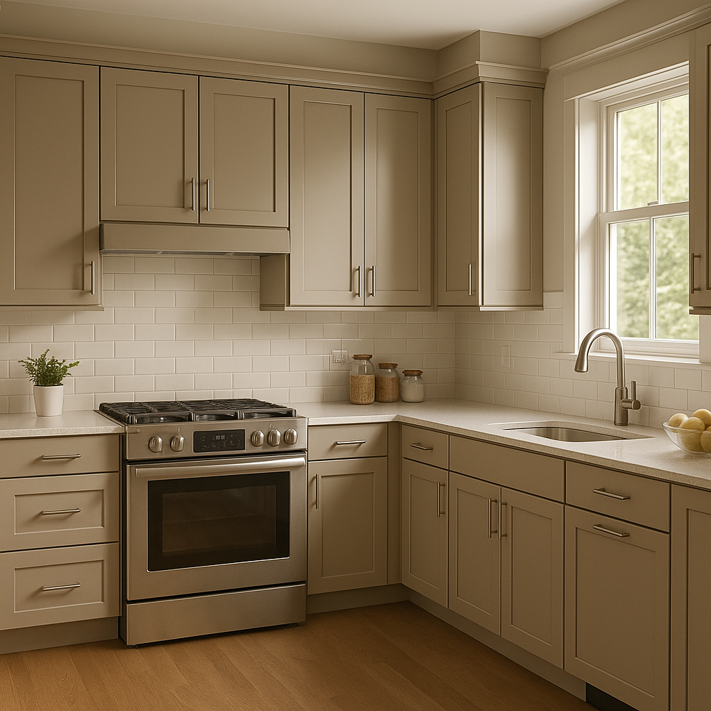
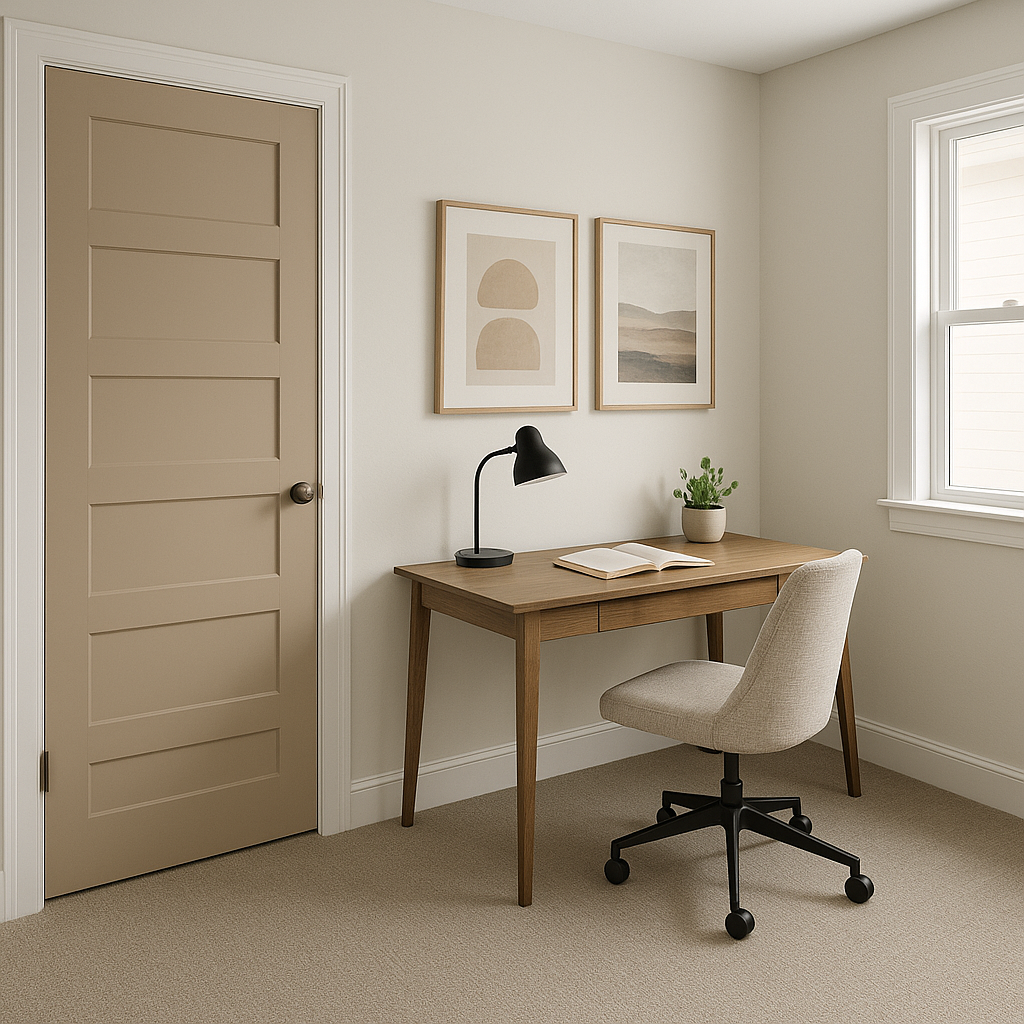
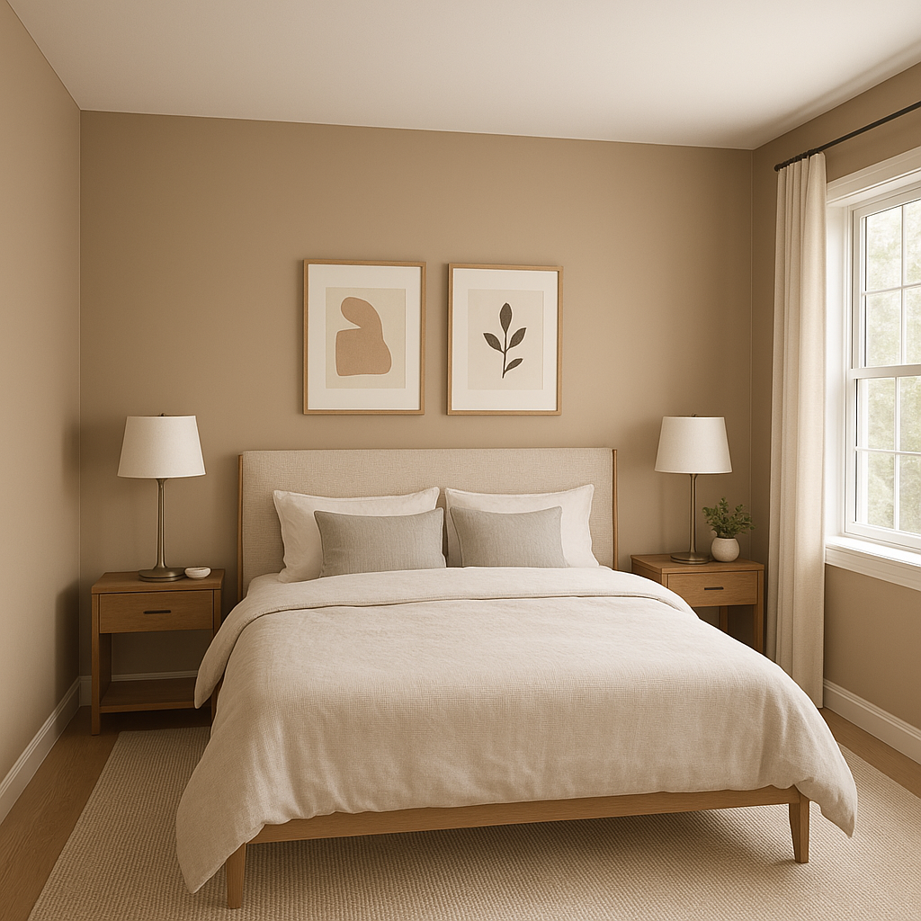
Benjamin Moore Pensive (AF-140) is a refined and versatile gray with a soft, muted quality that effortlessly enhances a wide range of interiors. This shade belongs to the Affinity® Collection, known for its harmonious palette designed to simplify color pairings. Pensive is a beautifully balanced medium gray that exudes understated elegance, making it a popular choice for creating tranquil and sophisticated environments.
Pensive features cool undertones with a gentle hint of blue, giving it a fresh and airy vibe without feeling too stark or cold. The subtle blue undertone allows this gray to remain neutral while lending a touch of depth and character. Depending on the lighting, you may notice this shade lean slightly cooler in north-facing rooms or warmer in spaces with abundant natural light, making it adaptable to various conditions.
One of the standout qualities of Pensive is its ability to pair beautifully with other colors. Whether you want to create a monochromatic scheme or add complementary hues, this gray is incredibly versatile.
Its adaptability ensures it works seamlessly with both warm and cool palettes, making it ideal for transitional and contemporary designs.
Pensive’s calming qualities make it a favorite for residential and commercial spaces alike. Here are some ideas on how to incorporate this timeless gray into your home or office:
The appearance of Benjamin Moore Pensive can shift depending on lighting conditions, making it essential to test this hue in your space before committing. In rooms with ample natural light, Pensive will appear lighter and cooler, while in dimly lit spaces, its depth and richness become more pronounced. For artificial lighting, opt for soft white bulbs to maintain its neutral charm.
Pensive is a sophisticated yet approachable gray that suits nearly any design style, from traditional to modern. Its versatility allows it to act as a grounding neutral or a complementary backdrop for more vibrant colors. Whether you're refreshing a single room or designing an entire home, Pensive is a timeless choice that delivers effortless elegance with every application.
View Colors Only by Brand (No Imagery):
Sherwin-Williams
|
Benjamin-Moore
|
Behr
|
Valspar
Live on the Eastern Slope of Colorado and looking for a local painting professional, check out all our painting services and reach out for a free estimate.
Copyright © 2026 : Wild Fox Painting Inc. : 12435 Mead Way, Littleton, CO 80125


