Benjamin Moore Kangaroo (AF-145) is a sophisticated and inviting neutral that effortlessly balances warmth and elegance. This taupe-inspired shade is part of Benjamin Moore’s Affinity® Color Collection, known for its harmonious and versatile palette that works beautifully in a variety of design styles. Kangaroo is a nuanced color that can create a cozy and welcoming atmosphere, making it a favorite among interior designers for both residential and commercial spaces.
Kangaroo (AF-145) is a warm neutral with subtle brown and gray undertones. Its soft taupe character leans more toward the warm side, with a hint of beige that prevents it from feeling too cool or stark. The gray undertones provide balance, making it an exceptionally adaptable shade that doesn’t overpower a room. Thanks to its muted quality, Kangaroo pairs well with a wide range of colors, materials, and finishes.
Kangaroo is a versatile hue that allows for effortless color pairings. Whether you're looking to create a monochromatic scheme or add contrast, here are some coordinating colors to consider:
You can also introduce pops of color by pairing Kangaroo with muted blues like Benjamin Moore Beach Glass (1564) or soft greens such as Benjamin Moore Saybrook Sage (HC-114) for a fresh, nature-inspired palette.
Kangaroo’s versatile nature makes it suitable for nearly any room in your home or office. Its warm undertones create a sense of comfort and sophistication, making it an excellent choice for the following spaces:
In living rooms, Kangaroo delivers a polished yet cozy vibe. Pair it with plush furnishings in complementary neutral tones, such as cream, beige, or charcoal, for an inviting environment. Add natural wood accents or metallic finishes to enhance the room’s texture and depth.
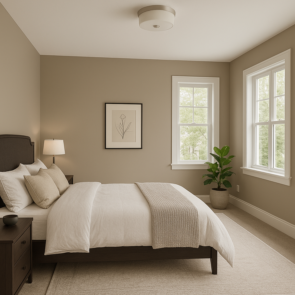
Kangaroo is perfect for creating a restful and serene bedroom retreat. Its warm undertones provide a comforting backdrop for bedding and décor in soft whites, muted blues, or earthy greens. Add layers of texture with throws, rugs, and curtains to elevate the overall ambiance.
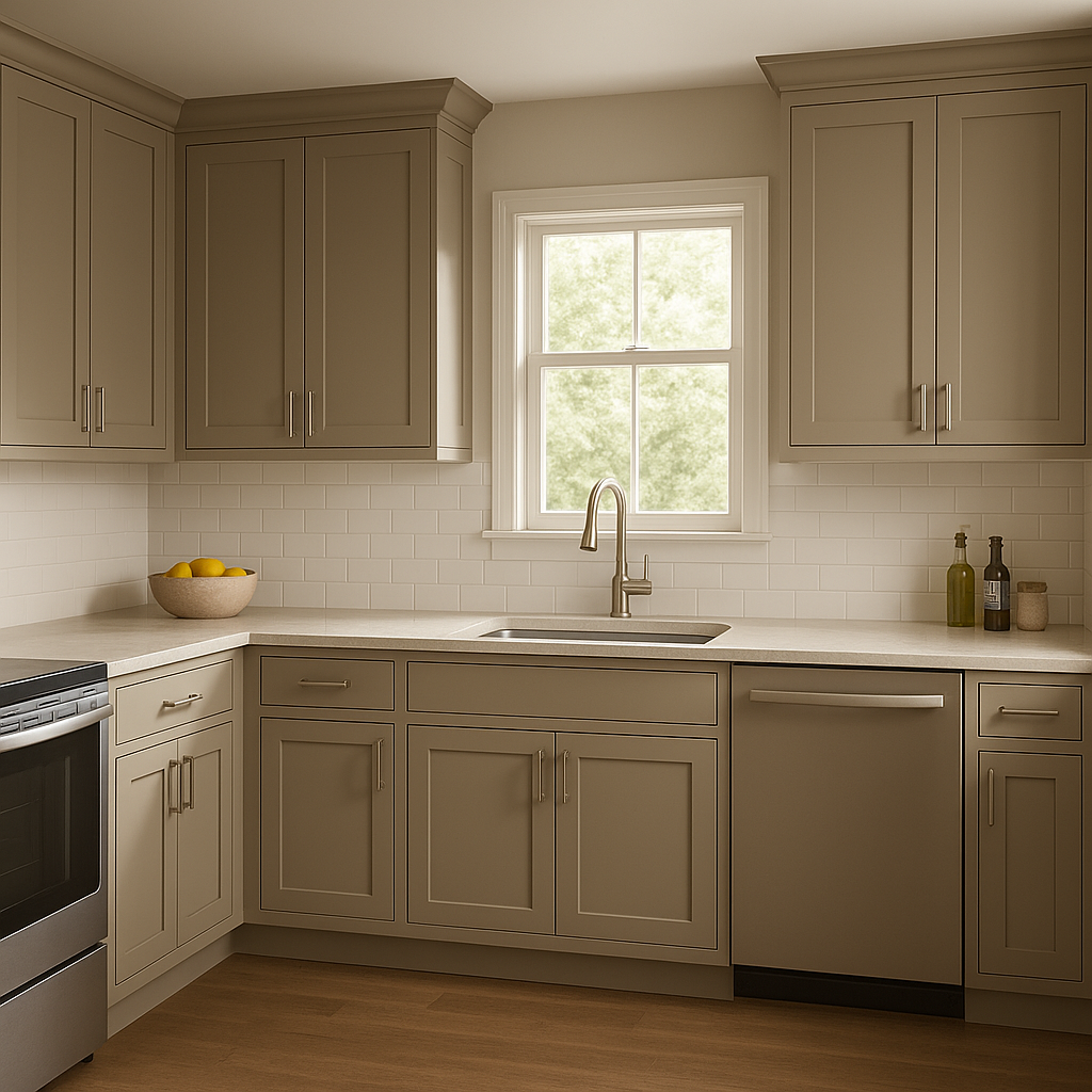
In kitchens, Kangaroo works beautifully on walls, cabinets, or even islands. It pairs seamlessly with natural stone countertops, wooden cabinetry, and stainless steel appliances for a modern yet timeless look. Add contrast with crisp white trim or bold hardware finishes.
Kangaroo shines in bathrooms, creating a spa-like atmosphere that feels both warm and clean. Pair it with white subway tiles, marble accents, or brushed nickel fixtures for a sophisticated and soothing space.
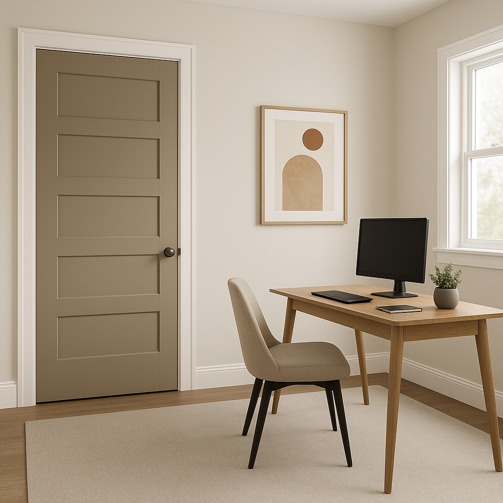
For home offices or commercial spaces, Kangaroo provides a neutral backdrop that encourages focus and productivity. Its understated elegance complements a variety of furniture styles, from traditional to contemporary.
Using Kangaroo in hallways and entryways adds a touch of refinement while ensuring the space feels welcoming. Pair it with warm wood flooring and white trim for a classic look or incorporate statement lighting fixtures to elevate the design.
Benjamin Moore Kangaroo (AF-145) is a timeless neutral that adapts beautifully to any design scheme. Whether you’re looking to create a cozy retreat or an elegant statement, this warm taupe is a reliable choice that delivers style, versatility, and sophistication.
View Colors Only by Brand (No Imagery):
Sherwin-Williams
|
Benjamin-Moore
|
Behr
|
Valspar
Live on the Eastern Slope of Colorado and looking for a local painting professional, check out all our painting services and reach out for a free estimate.
Copyright © 2026 : Wild Fox Painting Inc. : 12435 Mead Way, Littleton, CO 80125


