Benjamin Moore Cotswold (AF-150) is a refined and timeless neutral that effortlessly bridges the gap between warm and cool shades. Its understated elegance makes it a favorite among homeowners and interior designers alike, offering a sophisticated backdrop for a wide variety of design styles. Whether you’re creating a cozy retreat or a polished, modern aesthetic, Cotswold delivers a harmonious and well-balanced tone that elevates any space.
Cotswold is a soft beige with subtle gray undertones, giving it a versatile greige quality. This duality allows it to adapt beautifully to changing light throughout the day, appearing warmer in natural sunlight and cooler under artificial lighting. The gentle gray undertones prevent it from feeling overly yellow or muddy, ensuring that it remains crisp and clean while still offering a sense of warmth. This balance makes Cotswold an excellent choice for spaces where you want both a welcoming atmosphere and a modern edge.
Benjamin Moore Cotswold is a neutral tone that pairs seamlessly with a wide range of shades. Whether you’re looking to complement its softness or create contrast, here are a few suggestions:
White Trim and Accents: Pair Cotswold with Benjamin Moore White Dove (OC-17) or Chantilly Lace (OC-65) for crisp white trims and ceilings. These bright whites enhance Cotswold’s subtle undertones, making spaces feel airy and fresh.
Earthy Neutrals: For a monochromatic palette, consider coordinating with shades like Benjamin Moore Revere Pewter (HC-172) or Edgecomb Gray (HC-173). These complementary neutrals create a seamless flow between rooms, perfect for open-concept designs.
Bold Contrasts: To make Cotswold pop, pair it with deep, saturated hues like Benjamin Moore Hale Navy (HC-154) or Kendall Charcoal (HC-166). These dramatic shades contrast beautifully with the soft warmth of Cotswold, adding visual interest and depth.
Soft Pastels: For a serene and calming vibe, coordinate with gentle tones like Benjamin Moore Quiet Moments (1563) or Wedgewood Gray (HC-146). These pale blues and greens bring a touch of tranquility to the space, ideal for bedrooms or living areas.
Benjamin Moore Cotswold is a versatile color that works well in various applications and spaces. Its adaptability makes it a popular choice for both residential and commercial interiors. Here are some ideas on where and how to use this timeless shade:
Living Rooms: Create a welcoming and elegant living room by using Cotswold on the walls. Pair it with plush furniture in neutral tones or add pops of color with vibrant throw pillows and artwork.
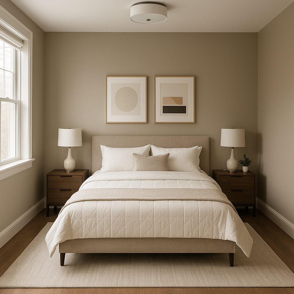
Bedrooms: Cotswold’s soothing qualities make it an ideal choice for bedrooms. It fosters a restful environment, especially when paired with soft textures like linen bedding and muted pastel accents.
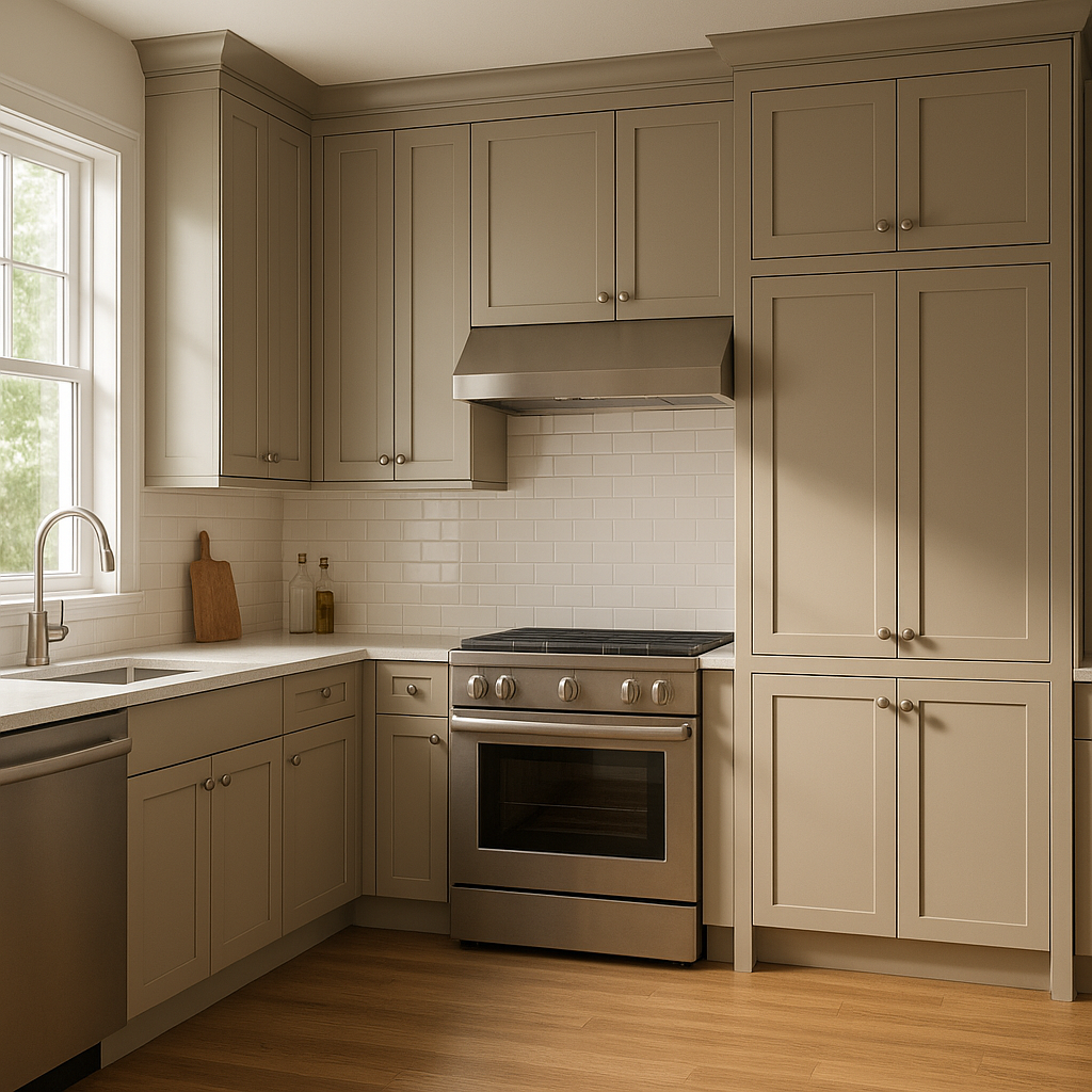
Kitchens: If you’re designing a kitchen with a classic yet modern aesthetic, Cotswold is a fantastic wall color that pairs beautifully with white cabinetry, marble countertops, and brushed metal fixtures.
Bathrooms: For bathrooms, Cotswold offers a spa-like feel, especially when paired with crisp whites and natural materials like wood or stone. Its adaptability to both warm and cool tones ensures it complements tiles and vanity finishes alike.
Hallways and Entryways: As a neutral that flows well with other colors, Cotswold is an excellent choice for hallways and entryways. It creates a sense of continuity and warmth as guests move through your home.
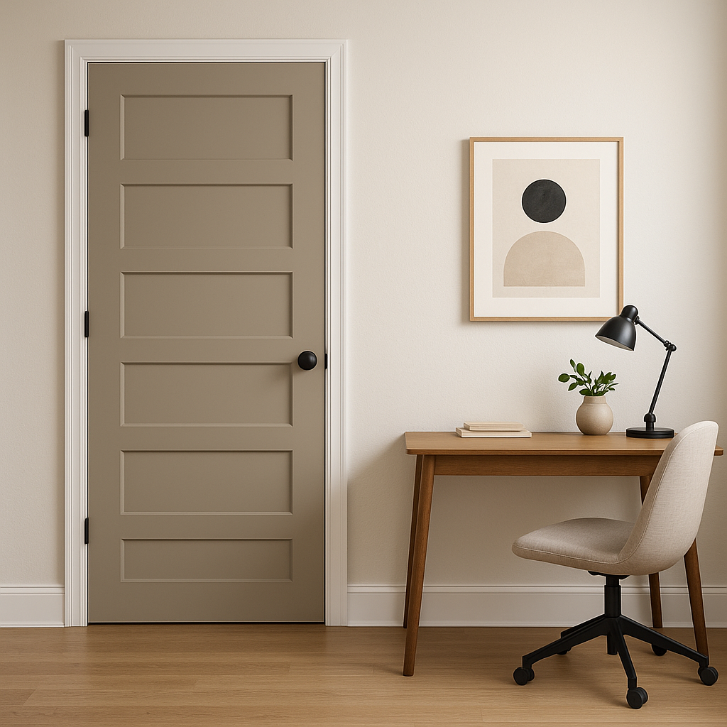
Home Offices: With its calming undertones, Cotswold is perfect for home offices. It fosters focus and productivity while maintaining a sophisticated aesthetic.
Cotswold stands out for its ability to harmonize beautifully with diverse design elements, making it a go-to neutral for any project. Its subtle undertones and versatility allow it to shine in both traditional and contemporary spaces. Whether you're painting an entire room, an accent wall, or trim, Cotswold offers a timeless canvas that complements almost any palette.
By incorporating Benjamin Moore Cotswold into your interior design, you’re choosing a color that exudes elegance, comfort, and versatility—all while maintaining a contemporary edge. It’s not just a paint color; it’s a foundation for creating spaces that feel effortlessly beautiful and perfectly balanced.
View Colors Only by Brand (No Imagery):
Sherwin-Williams
|
Benjamin-Moore
|
Behr
|
Valspar
Live on the Eastern Slope of Colorado and looking for a local painting professional, check out all our painting services and reach out for a free estimate.
Copyright © 2026 : Wild Fox Painting Inc. : 12435 Mead Way, Littleton, CO 80125


