Benjamin Moore Venetian (AF-185) is a sophisticated neutral paint color that exudes timeless elegance and versatility. Part of the Affinity® Collection, this hue balances warmth and subtle depth, making it an excellent choice for both modern and traditional interiors. Its refined character lends itself to creating spaces that feel welcoming, polished, and effortlessly chic.
Venetian is a greige—a harmonious blend of gray and beige—with soft taupe undertones. These undertones give it a warm, earthy quality that prevents it from feeling too stark or cool. The subtle taupe inflection makes Venetian adaptable to various lighting conditions, allowing it to appear slightly warmer in incandescent light and more balanced in natural daylight. This chameleon-like quality ensures the color works beautifully across different spaces and times of day.
Benjamin Moore Venetian pairs seamlessly with a diverse palette, making it a versatile anchor for any design scheme. Here are some coordinating colors to consider:
To create a clean, classic contrast, pair Venetian with Benjamin Moore Chantilly Lace (OC-65) or White Dove (OC-17). These whites enhance Venetian’s warm undertones while providing a crisp, fresh finish for molding, cabinetry, and ceilings.
For a harmonious look, combine Venetian with earthy hues such as Revere Pewter (HC-172) or Edgecomb Gray (HC-173). These shades share a similar warmth and depth, creating a cohesive palette perfect for open-concept spaces.
To add drama and personality, incorporate bold accents like Kendall Charcoal (HC-166) or Newburg Green (HC-158). These darker tones contrast beautifully with Venetian while maintaining an elegant aesthetic.
For a light and airy vibe, pair Venetian with pastel shades such as Concord Ivory (HC-12) or Silver Gray (2131-60). These colors add a touch of softness, ideal for bedrooms or serene living spaces.
Venetian is a perfect choice for living rooms, as its warm undertones create a cozy and inviting ambiance. Pair it with natural wood furniture, plush textures, and metallic accents for a polished yet comfortable space.
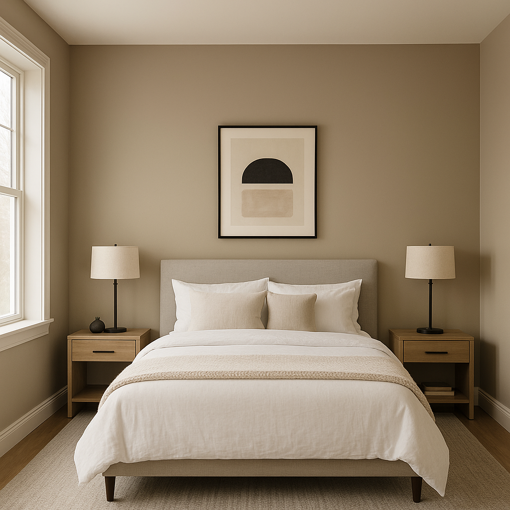
In bedrooms, Venetian sets the stage for relaxation and sophistication. Combine it with soft linens, neutral decor, and subtle lighting to craft a tranquil retreat.
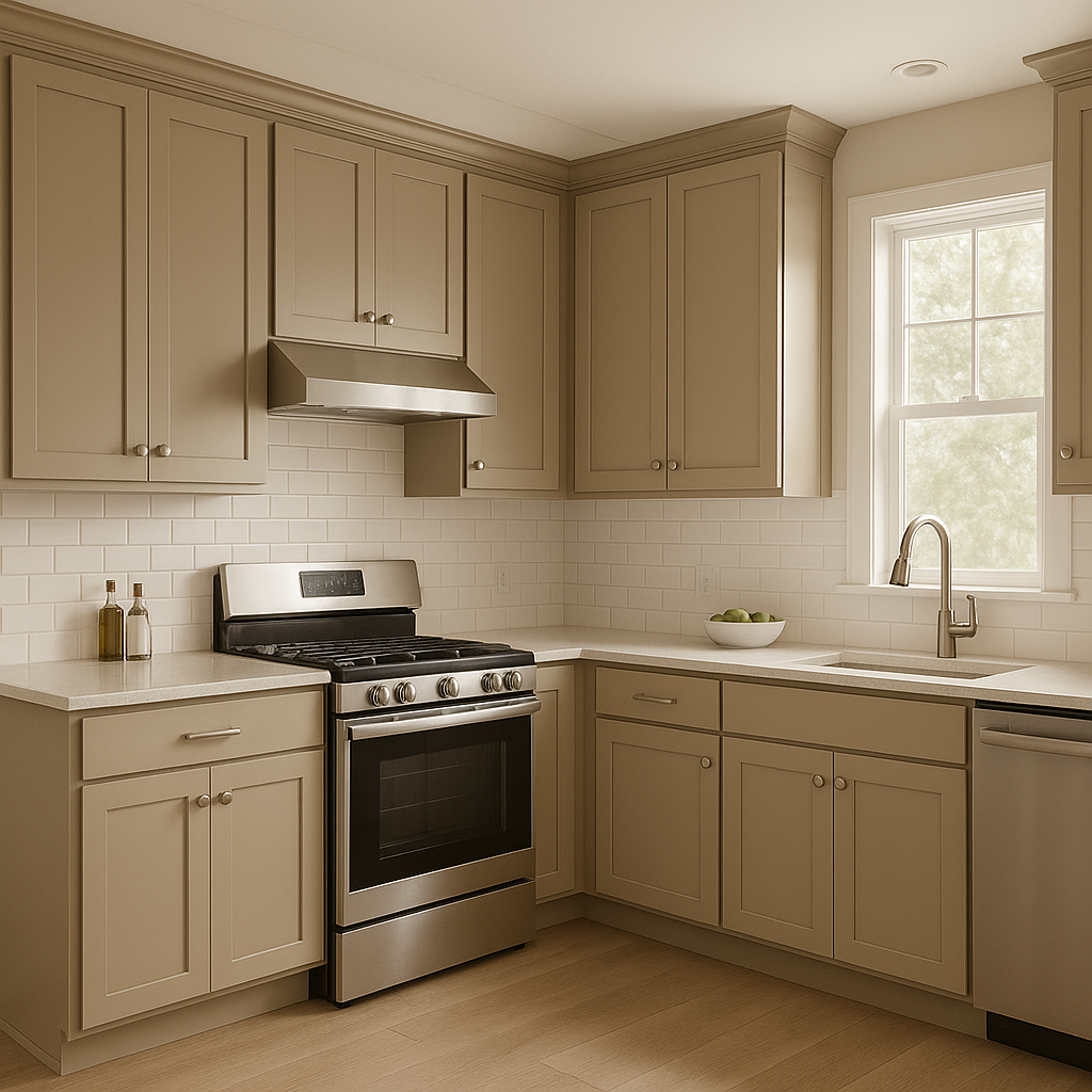
This versatile hue works beautifully in kitchens, especially when paired with white cabinetry and brushed nickel hardware. The greige undertones complement marble countertops and subway tile backsplashes, offering a timeless and elegant look.
For bathrooms, Venetian’s subdued warmth creates a spa-like atmosphere. Pair it with crisp white tiles, muted greens, or pale blues for a calming, fresh aesthetic.
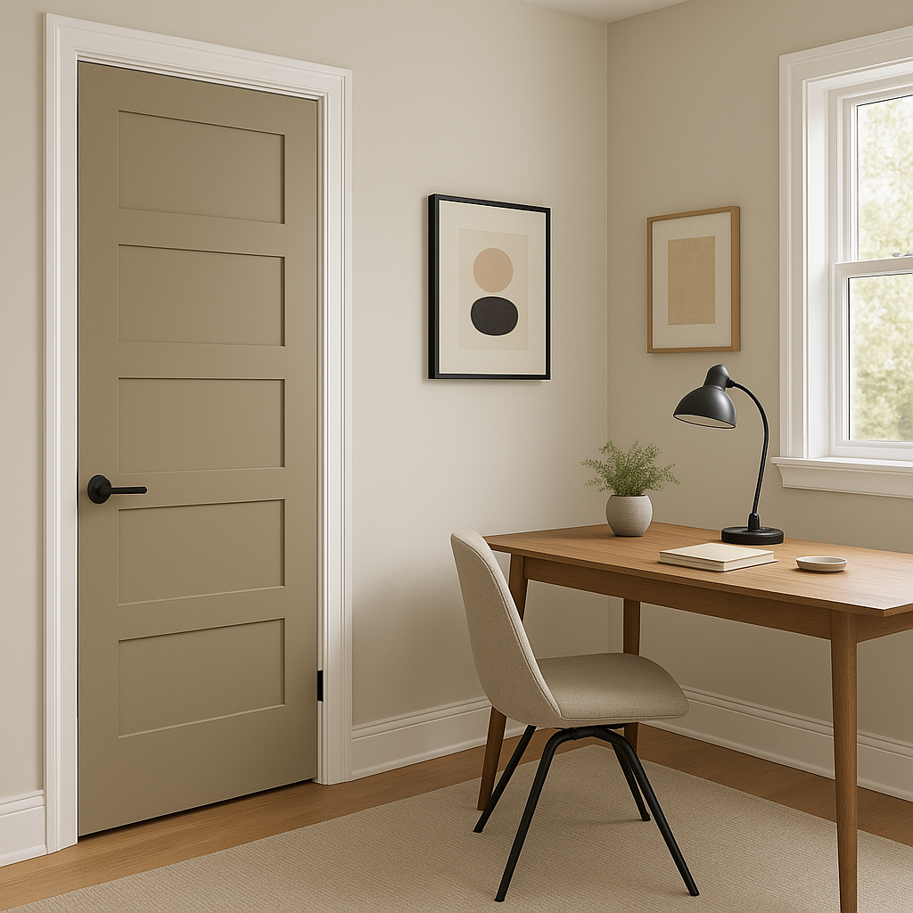
Venetian’s adaptability makes it ideal for transitional spaces like hallways and entryways. Its neutral tone ensures continuity throughout the home while providing a welcoming first impression.
Benjamin Moore Venetian (AF-185) is more than just a neutral paint color; it’s a design element that elevates spaces with its understated sophistication. Whether used as a primary wall color or as part of a layered palette, Venetian’s warm taupe undertones and effortless versatility make it a go-to choice for creating interiors that feel timeless and beautifully balanced.
By embracing this warm greige, homeowners can craft interiors that radiate elegance without overwhelming the senses. Whether your style leans modern, traditional, or somewhere in between, Venetian’s ability to adapt makes it a reliable option for achieving the perfect look.
View Colors Only by Brand (No Imagery):
Sherwin-Williams
|
Benjamin-Moore
|
Behr
|
Valspar
Live on the Eastern Slope of Colorado and looking for a local painting professional, check out all our painting services and reach out for a free estimate.
Copyright © 2026 : Wild Fox Painting Inc. : 12435 Mead Way, Littleton, CO 80125


