
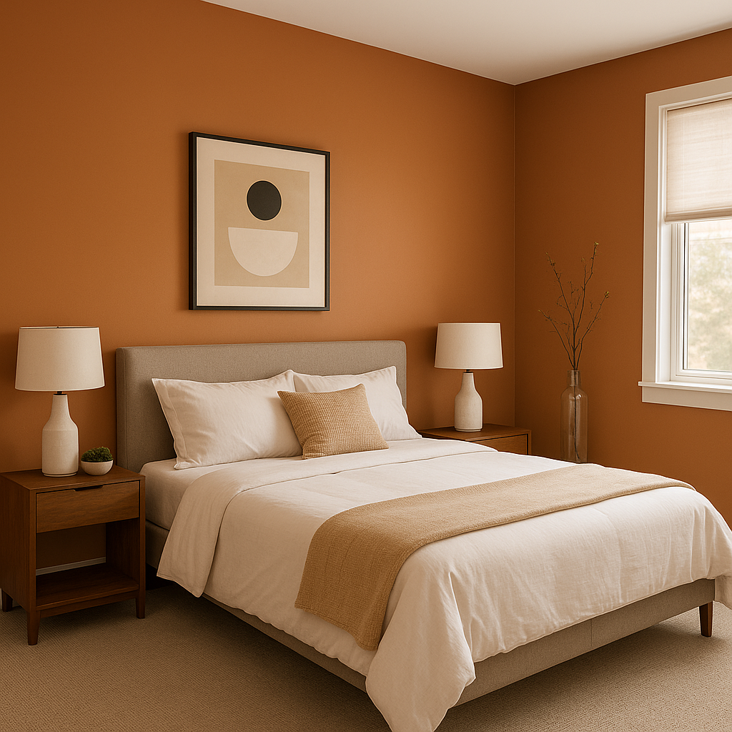
Benjamin Moore Firenze (AF-225) is a striking and luxurious color that evokes the charm and warmth of a Tuscan sunset. With its deep, earthy orange base and subtle red undertones, Firenze is a bold yet inviting shade that can transform any space into a cozy and visually stunning retreat. This color is part of Benjamin Moore’s Affinity Collection, known for its harmonious and versatile palette designed to simplify color selection.
Firenze has rich terracotta undertones that bring warmth and depth to the color, making it feel timeless and grounded. The subtle red and brown notes give it a natural, organic essence, reminiscent of clay, earthenware, and Italian architecture. These warm undertones ensure Firenze remains vibrant without being overwhelming, allowing it to work beautifully in both modern and traditional spaces.
Firenze pairs seamlessly with a variety of other colors, thanks to its earthy warmth. Here are some ideal coordinating hues to consider:
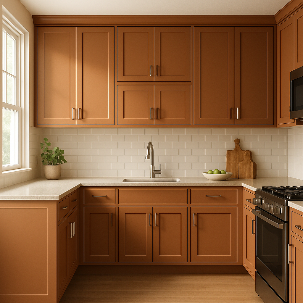
Firenze is a versatile color that can be used in a variety of ways to add character and charm to your home. Here are some creative ways to incorporate it:
Firenze is a color that exudes warmth, passion, and sophistication. It’s ideal for homeowners who want to create an inviting yet refined atmosphere. Its earthy tone inspires feelings of comfort and connection to nature, while its vibrancy adds a touch of drama and elegance. Whether used as a primary color or as an accent, Firenze has the ability to elevate any space, making it feel curated and full of character.
If you’re looking for a hue that blends boldness with timeless beauty, Benjamin Moore Firenze (AF-225) is an exceptional choice that will enrich your home and create lasting impressions.
View Colors Only by Brand (No Imagery):
Sherwin-Williams
|
Benjamin-Moore
|
Behr
|
Valspar
Live on the Eastern Slope of Colorado and looking for a local painting professional, check out all our painting services and reach out for a free estimate.
Copyright © 2026 : Wild Fox Painting Inc. : 12435 Mead Way, Littleton, CO 80125


