Benjamin Moore Pomegranate (AF-295) is a captivating shade that strikes the perfect balance between dramatic and inviting. This deep, rich red, reminiscent of the luscious fruit for which it is named, carries a timeless sophistication that makes it a standout choice for interiors. Its bold yet refined character adds warmth, depth, and elegance to spaces, making it ideal for those seeking a statement color. Whether you're designing a cozy retreat or an opulent dining room, Pomegranate effortlessly transforms ordinary spaces into extraordinary ones.
Pomegranate is enriched with warm undertones of brown and subtle hints of burgundy, giving it a depth that avoids feeling overly bright or brash. These undertones lend the color a grounded, earthy quality, ensuring it feels intimate and welcoming rather than overpowering. Its balanced composition makes it versatile for various design styles, from traditional and classic to contemporary and eclectic.
Benjamin Moore Pomegranate pairs beautifully with neutral tones, soft whites, and muted grays, creating a harmonious palette that highlights its richness without overwhelming the space. Some coordinating colors to consider include:
For a striking accent combination, pair Pomegranate with shades of gold or metallic finishes, such as brushed brass or antique bronze, to amplify its luxe appeal.
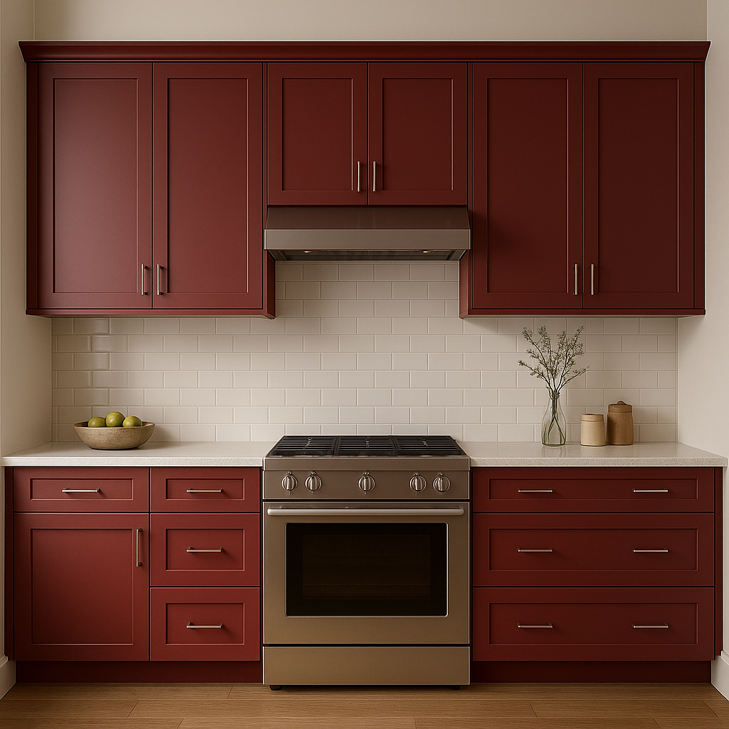
Pomegranate works beautifully in spaces where depth and drama are desired. Its rich tone is ideal for creating an intimate atmosphere, making it a popular choice for dining rooms, bedrooms, and living areas. Here are some specific ways to incorporate Pomegranate into your home:
The bold yet sophisticated nature of Pomegranate makes it an exceptional choice for dining rooms. Its warm undertones encourage conversation and create an inviting ambiance for gatherings. Pair it with classic wooden furniture and metallic accents for a luxurious, timeless aesthetic.
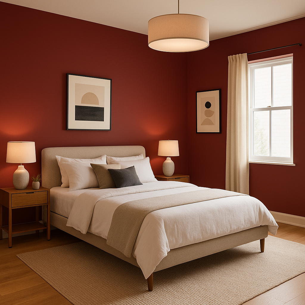
If you're looking to craft a cozy, romantic retreat, Pomegranate is an excellent option for bedroom walls. Soft lighting and plush textiles in complementary hues like cream or taupe can help balance its intensity while maintaining a serene atmosphere.
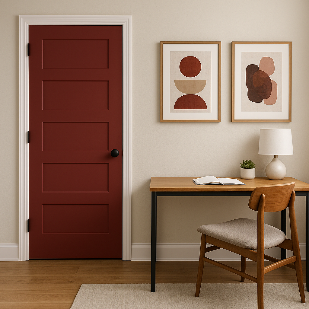
For those who love the color but prefer a more restrained approach, Pomegranate works wonderfully as an accent wall. Use it to highlight architectural features or frame a fireplace, creating a focal point that draws attention without overwhelming the entire room.
Infuse your living room with warmth and character by incorporating Pomegranate as the main wall color or through furnishings and decor. Pair it with neutral upholstery and layered textures, such as throws and rugs, to create a cozy yet refined space.
For a bold first impression, consider using Pomegranate in entryways or hallways. Its richness immediately captivates while setting the tone for the rest of the home.
Benjamin Moore Pomegranate (AF-295) is a color for those who want to make a bold yet tasteful statement. Its warm undertones, versatility, and timeless appeal make it a valuable addition to any design palette. Whether used as a main wall color or as an accent, Pomegranate inspires interiors that feel both luxurious and inviting, proving that bold choices can be effortlessly elegant.
View Colors Only by Brand (No Imagery):
Sherwin-Williams
|
Benjamin-Moore
|
Behr
|
Valspar
Live on the Eastern Slope of Colorado and looking for a local painting professional, check out all our painting services and reach out for a free estimate.
Copyright © 2026 : Wild Fox Painting Inc. : 12435 Mead Way, Littleton, CO 80125


