Benjamin Moore Oat (AF-340) is an effortlessly elegant and versatile neutral shade that embodies warmth, comfort, and understated sophistication. Part of the Affinity Color Collection, this soft, creamy beige is an ideal choice for creating inviting spaces with timeless appeal. Whether you're designing a cozy living room, a serene bedroom, or a welcoming entryway, Oat (AF-340) offers a delicate balance of warmth and neutrality to complement various design styles.
Oat (AF-340) features subtle yellow and golden undertones that give it a warm, sunlit quality. These undertones make it a more inviting and comforting alternative to cooler neutrals. While it leans toward the warmer side of the spectrum, Oat maintains a balanced softness, ensuring it doesn't feel overly saturated or overpowering. Its nuanced undertones allow it to adapt beautifully to different lighting conditions, appearing cozier in low light and brighter in spaces with ample natural light.
Benjamin Moore Oat (AF-340) pairs seamlessly with a wide range of colors, making it an incredibly versatile choice for any color palette. Here are some coordinating options to consider:
These combinations allow you to personalize the mood of your space, whether you’re aiming for cozy, contemporary, or classic.
Oat (AF-340) is a versatile neutral that works well in a variety of spaces and design applications. Here are some ideas for incorporating this delightful shade into your home:
Oat's warm, neutral tone creates a welcoming backdrop for family gatherings or quiet evenings. Pair it with plush textiles, natural woods, and metallic accents for a cozy yet sophisticated living space.
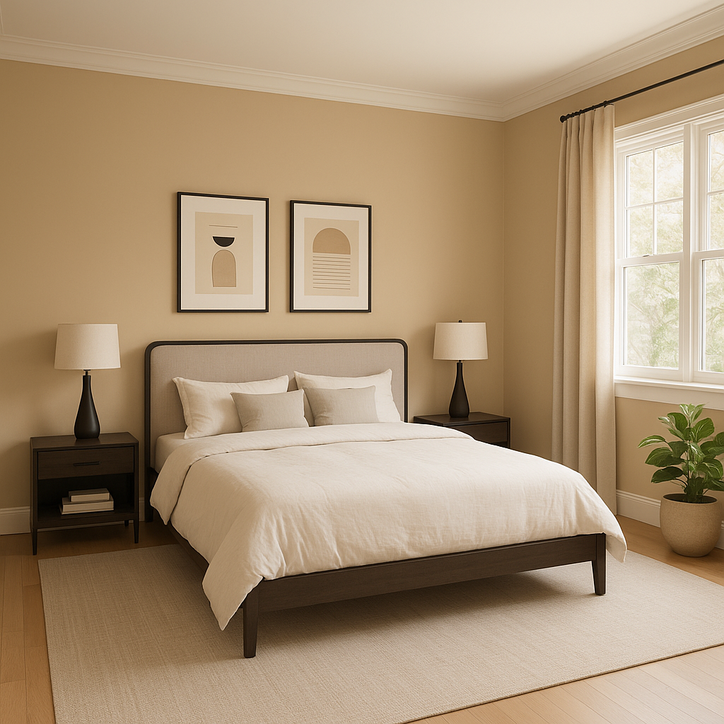
Transform your bedroom into a tranquil retreat by using Oat on the walls. Its soft warmth pairs beautifully with crisp white linens, textured throws, and muted accent colors for a serene atmosphere.
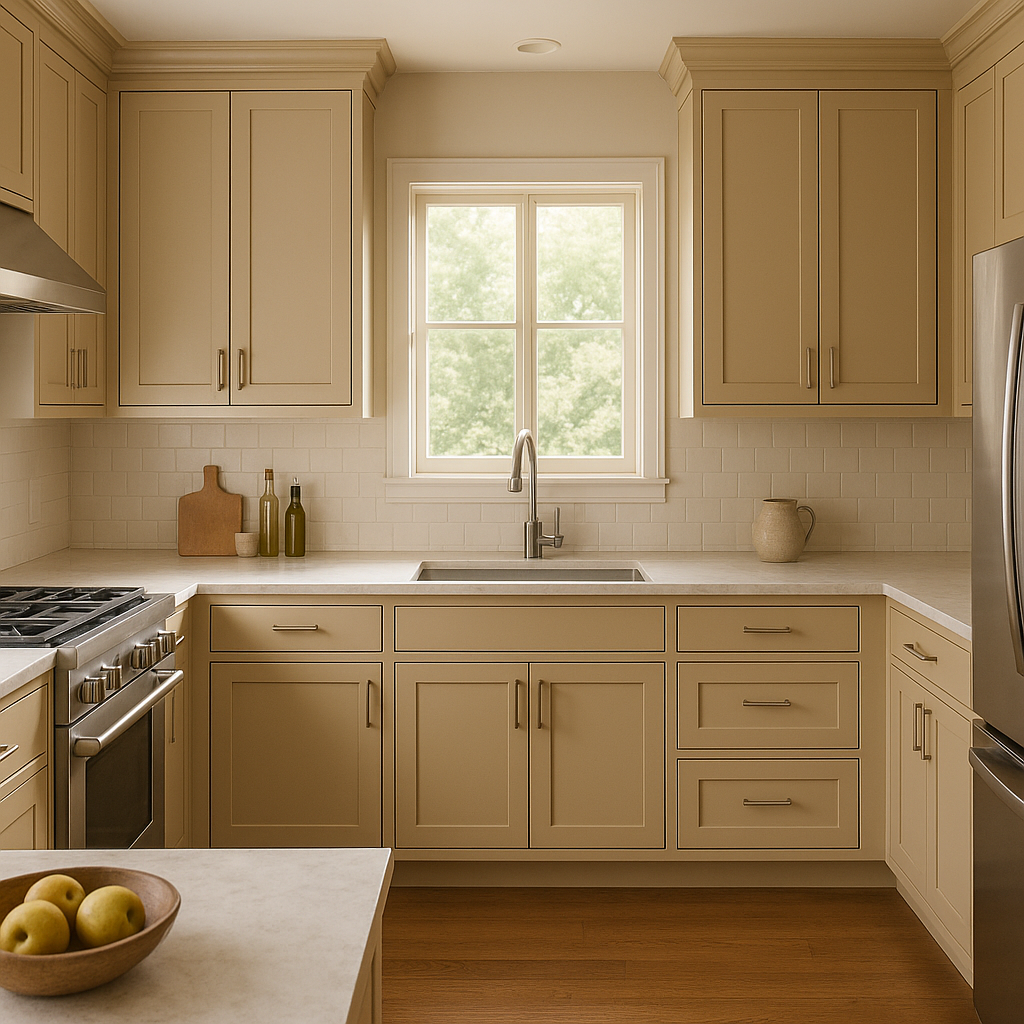
In kitchens, Oat offers an inviting alternative to stark white walls. Pair it with white cabinetry for a clean and classic look, or complement it with warm wood tones and matte black hardware for a modern farmhouse aesthetic.
Make a great first impression with Oat in your entryway or hallway. Its understated elegance ensures a seamless transition between rooms and provides a cohesive, welcoming feel to your home.
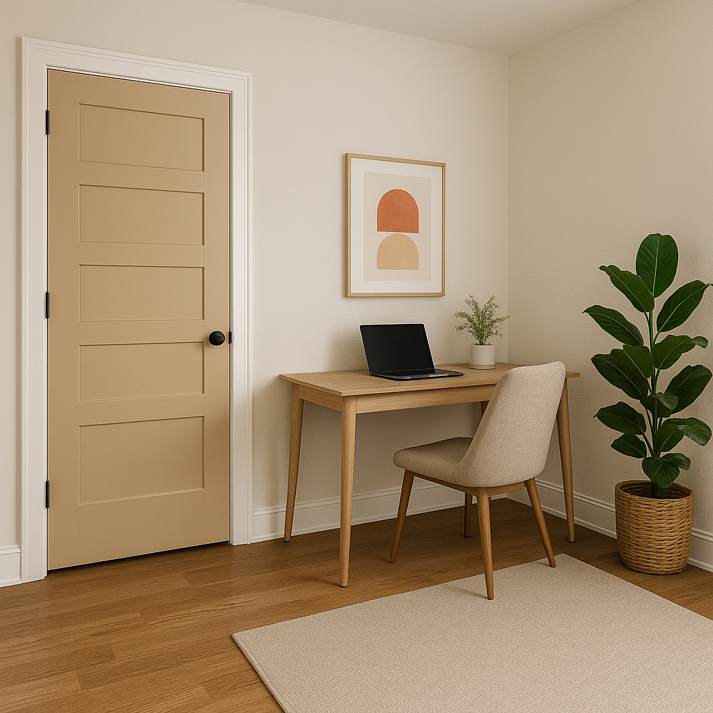
For a productive yet calming home office environment, use Oat on the walls. Pair it with natural wood furniture and pops of greenery for a space that feels grounded and inspiring.
Benjamin Moore Oat (AF-340) is more than just a neutral; it’s a warm, inviting canvas that adapts effortlessly to your design vision. Its versatility, calming undertones, and ability to harmonize with a wide array of colors and styles make it a go-to choice for any space. Whether you're refreshing a single room or reimagining your entire home, Oat provides the perfect foundation for a timeless and stylish aesthetic.
View Colors Only by Brand (No Imagery):
Sherwin-Williams
|
Benjamin-Moore
|
Behr
|
Valspar
Live on the Eastern Slope of Colorado and looking for a local painting professional, check out all our painting services and reach out for a free estimate.
Copyright © 2026 : Wild Fox Painting Inc. : 12435 Mead Way, Littleton, CO 80125


