Benjamin Moore Aventurine AF-445 is a stunning, mid-tone green that exudes both elegance and versatility. Part of the Affinity® Color Collection, this shade is perfect for creating a calming, earthy atmosphere with a modern edge. Its rich, organic hue makes it a standout choice for both residential and commercial spaces, offering timeless appeal while remaining effortlessly adaptable to a range of design aesthetics.
Aventurine AF-445 has subtle gray undertones, which give it a muted, sophisticated quality. These undertones prevent the green from feeling overly bright or saturated, making it a more subdued and versatile option compared to bolder greens. The earthy influence of gray ensures the color remains grounded, while still offering a touch of vibrancy and depth. It’s particularly effective in spaces where a balance between warmth and coolness is desired. Depending on the lighting conditions, Aventurine may appear softer and more neutral in low light, or slightly richer and more vivid in brighter environments.
Aventurine AF-445 pairs beautifully with a variety of coordinating colors, allowing you to create a harmonious and cohesive palette. Here are some complementary shades to consider:
Neutral Pairings: To highlight Aventurine’s muted tones, pair it with warm neutrals like Benjamin Moore White Dove OC-17 or Classic Gray OC-23. These soft shades will create a clean, airy backdrop, allowing Aventurine to take center stage.
Dramatic Contrasts: For a bold, contemporary look, consider pairing Aventurine with darker, charcoal hues like Kendall Charcoal HC-166 or Wrought Iron 2124-10. This combination adds depth and drama to your space without overwhelming it.
Earthy Complements: For a nature-inspired palette, combine Aventurine with warm browns like Charleston Brown HC-222 or soft beiges like Manchester Tan HC-81. These tones enhance its earthy quality, making spaces feel grounded and serene.
Vibrant Accents: Introduce pops of color with accents like Caliente AF-290, a bold red, or Golden Straw 2152-50, a soft golden yellow. These hues bring energy and warmth, adding a playful touch to the overall design.
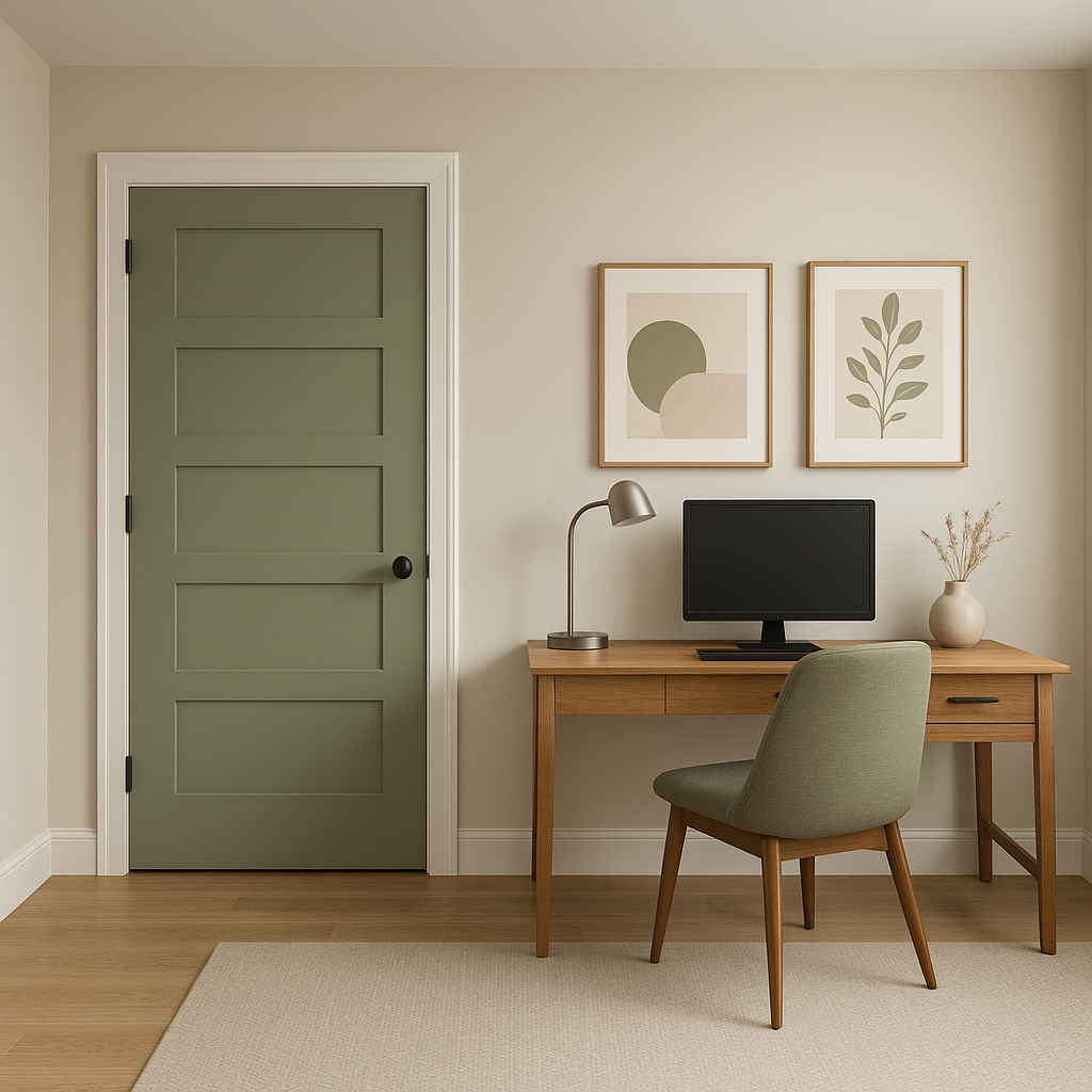
Aventurine AF-445 is an incredibly versatile hue that works beautifully across a range of applications, from walls to cabinetry. Here are some of the best ways to use this timeless green:
Aventurine’s calming and sophisticated vibe makes it an excellent choice for living rooms. Use it as a wall color to create a cozy, inviting space that feels grounded yet fresh. Pair it with neutral furniture and natural textures like wood, rattan, or linen to enhance the organic feel.
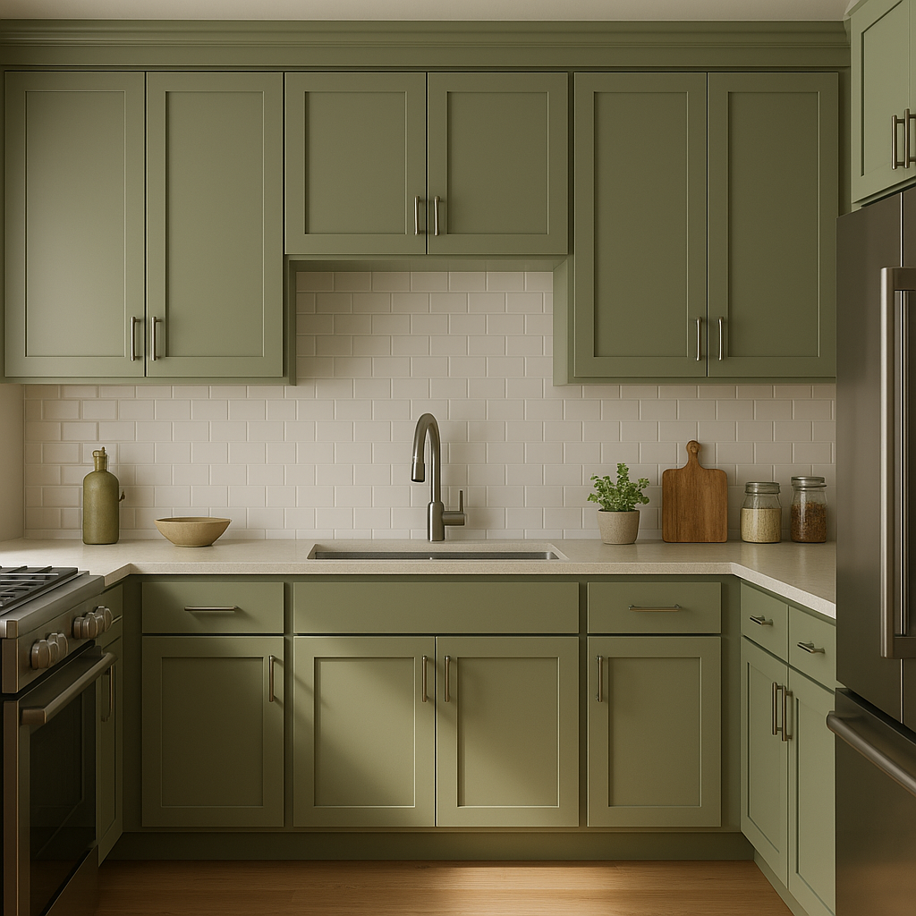
This shade is an outstanding option for kitchen cabinetry, especially in farmhouse or transitional-style kitchens. Aventurine brings a sense of warmth and character to the space, particularly when paired with white quartz countertops, brushed brass hardware, and a subway tile backsplash.
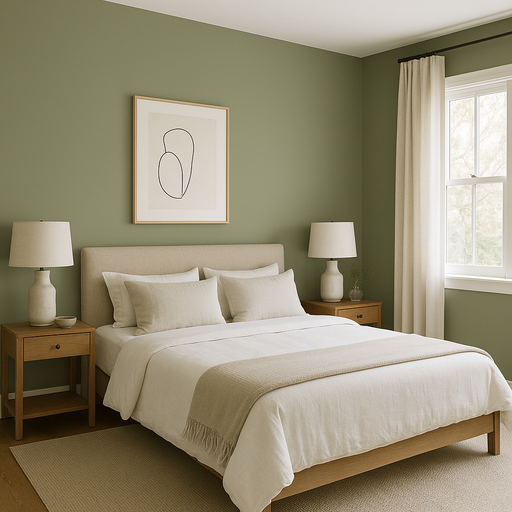
In bedrooms, Aventurine AF-445 fosters a serene, restful atmosphere. Use it as an accent wall behind the bed or as the main wall color for a cocoon-like effect. Pair it with crisp white bedding and accents of soft blush or gold for a touch of luxury.
Aventurine’s subtle gray undertones make it a fantastic choice for bathrooms. When paired with crisp white wainscoting or marble countertops, it creates a spa-like retreat that feels clean and calming.
View Colors Only by Brand (No Imagery):
Sherwin-Williams
|
Benjamin-Moore
|
Behr
|
Valspar
Live on the Eastern Slope of Colorado and looking for a local painting professional, check out all our painting services and reach out for a free estimate.
Copyright © 2026 : Wild Fox Painting Inc. : 12435 Mead Way, Littleton, CO 80125


