Benjamin Moore Flora (AF-470) is a sophisticated and versatile shade of green that effortlessly bridges the gap between nature-inspired tranquility and refined elegance. Part of Benjamin Moore’s Affinity Collection, this color is designed to harmonize beautifully with a wide range of palettes, making it a favorite among interior designers and homeowners alike.
Flora is a muted, medium-toned green with subtle gray undertones that lend it a soft, calming quality. Unlike brighter greens that can feel overpowering, Flora offers a subdued richness that works well in both modern and traditional spaces. The gray undertones temper the green, giving it a grounded and sophisticated vibe while maintaining a connection to nature. This balanced hue evokes the feeling of lush foliage and organic landscapes, making it a perfect choice for creating a serene ambiance.
In certain lighting conditions, Flora may reveal hints of olive or sage, adding depth and character to the shade. Its chameleon-like quality allows it to adapt beautifully to different environments, making it a versatile choice for various design styles.
Benjamin Moore Flora is part of the Affinity Collection, which is curated to complement other colors with ease. For harmonious pairing, consider the following coordinating colors:
Neutral Pairings:
Bold Accents:
Complementary Greens:
Flora’s versatility allows it to shine in a variety of applications throughout the home. Here are some creative ways to incorporate this elegant green:
Flora is a fantastic choice for living rooms, offering a relaxing and grounding atmosphere. Pair it with soft cream furniture and natural wood tones to create a cozy, inviting space. Add accents of brushed brass or matte black for a modern touch.
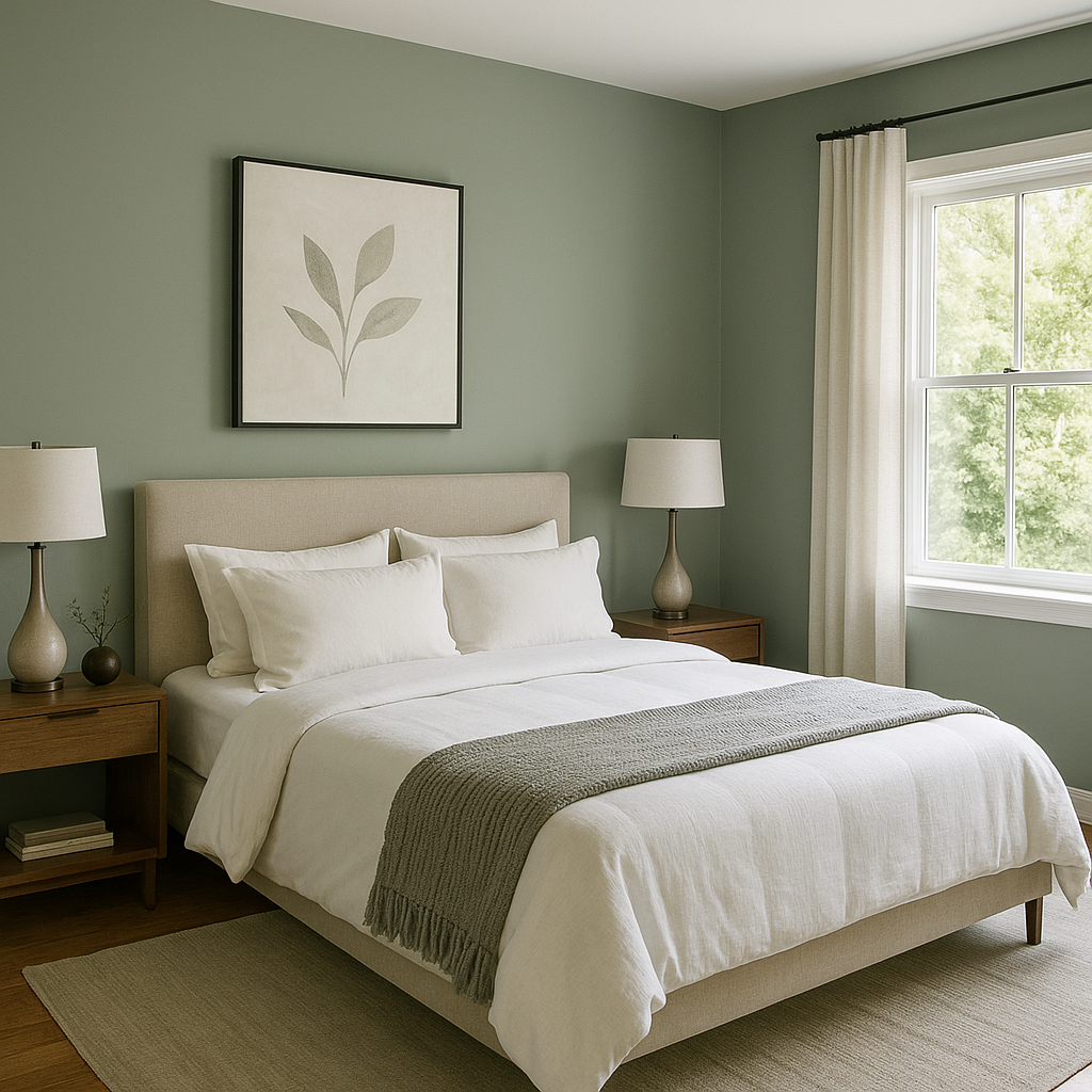
In bedrooms, Flora promotes restful sleep and tranquility. Use it on walls with crisp white bedding and curtains for a soothing retreat. For added warmth, incorporate throw pillows or blankets in earthy tones like rust, mustard, or taupe.
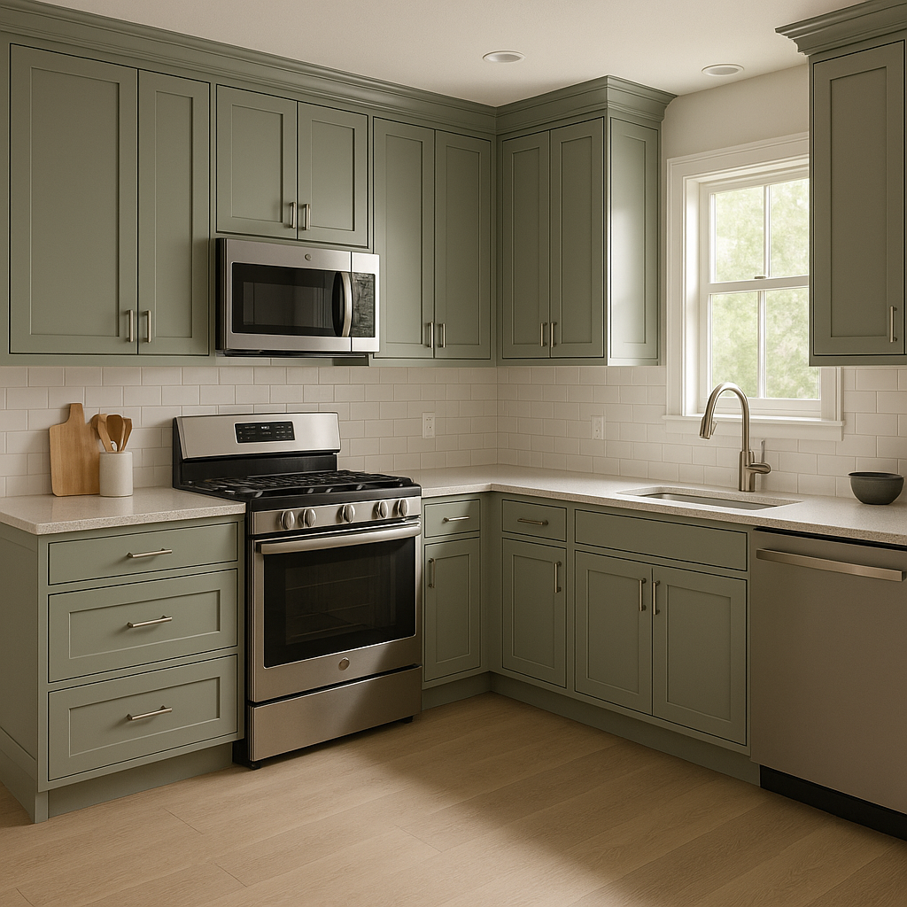
Bring a fresh, garden-inspired feel to your kitchen by using Flora on cabinetry or walls. Pair it with white subway tile backsplashes and polished nickel hardware for a timeless appeal. Wood accents such as butcher block countertops or open shelving can further enhance its organic vibe.
In bathrooms, Flora creates a spa-like atmosphere. Combine it with marble or white tiles for a luxurious look, and add greenery to complete the serene setting. Consider painting vanity cabinets in this shade for a bold yet calming statement.
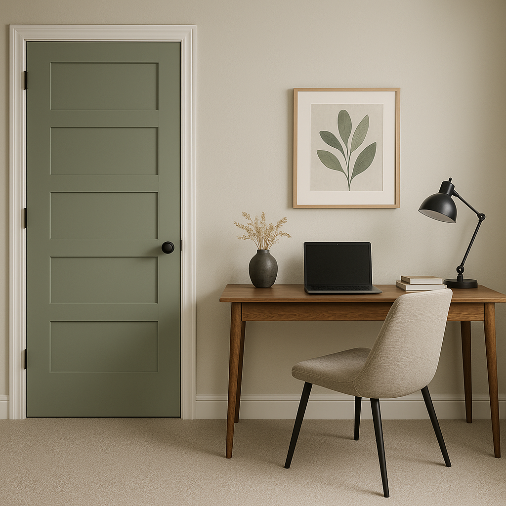
Flora’s muted green tones are perfect for a productive home office. It fosters focus and calm, making it an excellent backdrop for workspaces. Pair it with natural wood desks and black metal accents for a modern aesthetic.
If you’re not ready to commit to Flora throughout an entire room, use it as an accent wall color. Its depth and richness make it ideal for creating a focal point without overpowering the space.
Flora reacts beautifully to different lighting conditions. In spaces with abundant natural light, its green tones will feel fresh and vibrant, while in dimmer settings, its gray undertones will provide a cozy, muted feel. Always test a swatch in your space to see how the color interacts with your lighting and decor.
Benjamin Moore Flora (AF-470) is a timeless color that combines the calming essence of nature with sophisticated undertones. Its versatility makes it suitable for nearly any room or design style, from modern minimalism to rustic charm. Whether used as a main wall color, accent shade, or cabinetry finish, Flora brings a sense of balance and understated elegance to any interior.
View Colors Only by Brand (No Imagery):
Sherwin-Williams
|
Benjamin-Moore
|
Behr
|
Valspar
Live on the Eastern Slope of Colorado and looking for a local painting professional, check out all our painting services and reach out for a free estimate.
Copyright © 2026 : Wild Fox Painting Inc. : 12435 Mead Way, Littleton, CO 80125


