Benjamin Moore Tranquility (AF-490) is a sublime blend of soft blue and gray that evokes a sense of calm and balance. This understated but elegant shade belongs to Benjamin Moore’s Affinity Collection and is celebrated for its versatility and timeless appeal. Tranquility’s muted nature makes it an ideal choice for creating serene interiors, where relaxation and sophistication seamlessly coexist.
One of Tranquility’s defining characteristics is its subtle undertones. While primarily a blue-gray, it carries hints of green, which add depth and complexity to the color. These green undertones warm up the shade slightly, preventing it from feeling too cold or sterile. The result is a soothing hue that feels grounded and harmonious, working beautifully in a variety of lighting conditions.
In north-facing rooms or spaces with cooler light, Tranquility may lean more toward its gray-blue side, creating a crisp and calming atmosphere. In warmer, sunlit spaces, the green undertones subtly emerge, giving the color a soft, inviting glow that feels fresh yet understated.
Benjamin Moore Tranquility pairs effortlessly with a wide range of colors, thanks to its balanced nature. For a cohesive and sophisticated palette, consider the following coordinating colors:
For pops of color, consider pairing Tranquility with warm accents like Soft Pumpkin (2166-40) or deep navy hues like Hale Navy (HC-154) for a bold yet balanced contrast.
Tranquility (AF-490) is a versatile shade that works beautifully in a variety of spaces and design styles. Its calming properties make it particularly well-suited for areas where relaxation is key.
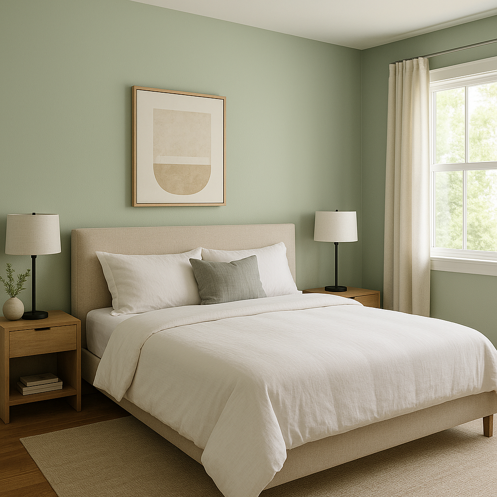
Create a peaceful sanctuary by using Tranquility on the walls of a bedroom. Pair it with crisp white linens and soft gray or taupe accents to achieve a serene, spa-like retreat. The color’s soothing undertones encourage relaxation, making it a perfect choice for winding down at the end of the day.
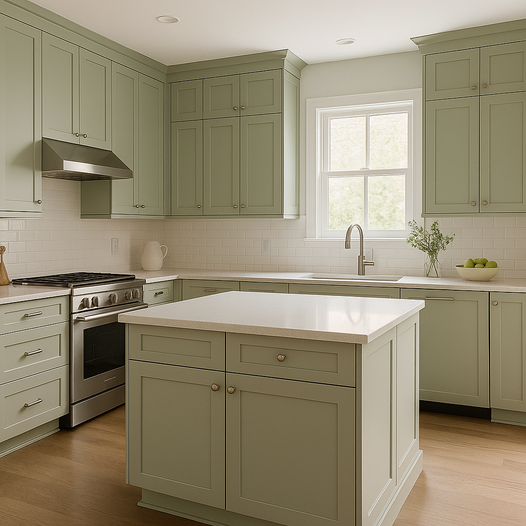
In living rooms, Tranquility sets the stage for understated elegance. Pair it with neutral furniture and natural textures like woven rugs or wooden accents to create a modern, timeless look. For added depth, incorporate metallic finishes such as brushed gold or silver in lighting fixtures and décor pieces.
Tranquility shines in bathrooms, offering a fresh and clean aesthetic. Use it on the walls to evoke a sense of calm, and pair it with white subway tiles, marble countertops, and polished chrome fixtures for a luxurious feel. Its soft bluish-green undertones make it ideal for creating a spa-like atmosphere.
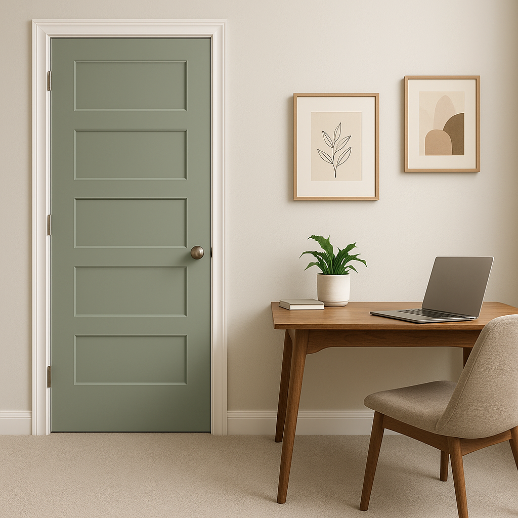
Need a productive yet soothing environment? Tranquility is an excellent choice for home offices or reading nooks. The color’s muted tone promotes focus while maintaining a calming ambiance, allowing you to work or relax in comfort.
Impress guests with a welcoming and sophisticated entryway by using Tranquility as a wall color. Pair it with white trim and dark wood furniture to create a striking contrast while maintaining an inviting feel.
Tranquility’s adaptability makes it suitable for both bright and dimly lit spaces, but its appearance will vary depending on the lighting. In artificial or dim lighting, the gray undertones may dominate, giving the color a cooler, more contemporary feel. In brighter, natural lighting, the green undertones come alive, adding warmth and vibrancy to the space. Be sure to test the color in different lighting scenarios to see how it interacts with your specific environment.
Benjamin Moore Tranquility is versatile enough to complement a wide range of design styles:
Benjamin Moore Tranquility (AF-490) is a color that transcends trends, offering a serene and sophisticated backdrop for any interior space. Whether you’re designing a restful bedroom, a welcoming entryway, or a modern living room, this versatile hue delivers an enduring charm that is sure to inspire.
View Colors Only by Brand (No Imagery):
Sherwin-Williams
|
Benjamin-Moore
|
Behr
|
Valspar
Live on the Eastern Slope of Colorado and looking for a local painting professional, check out all our painting services and reach out for a free estimate.
Copyright © 2026 : Wild Fox Painting Inc. : 12435 Mead Way, Littleton, CO 80125


