Benjamin Moore Frostine (AF-5) is a delicate, cool-toned gray that exudes sophistication and versatility. This shade is part of the Affinity® Color Collection, known for its harmonious and expertly curated palette. Frostine is perfect for creating a serene and polished atmosphere in both residential and commercial spaces, making it a favorite choice among designers and homeowners alike.
One of Frostine’s standout qualities is its subtle undertones. This light gray carries a hint of blue, giving it a cool, crisp edge without feeling stark or overly cold. The blue undertone ensures that Frostine remains fresh, making it an ideal choice for spaces that need a sense of openness and tranquility. However, depending on the lighting, you may notice soft lavender undertones emerge, adding depth and sophistication to the color. Its chameleon-like ability to adapt to its surroundings makes Frostine a highly versatile neutral.
When designing with Frostine, you’ll find that it pairs beautifully with a variety of hues, from deep, dramatic tones to other soft neutrals. Here are a few coordinating colors that work seamlessly with Frostine:
These combinations allow you to tailor Frostine to a variety of design styles, from modern minimalism to classic elegance.
Frostine’s soft, cool character makes it an excellent choice for nearly any room in the house. Its versatility ensures it can complement a wide range of design aesthetics. Here are some of the best uses for Frostine:
Frostine is a fantastic backdrop for a living room, especially when paired with natural textures like light wood, woven fabrics, and soft, cozy textiles. The cool undertones create a calming environment, making it an ideal choice for spaces where you unwind or entertain.
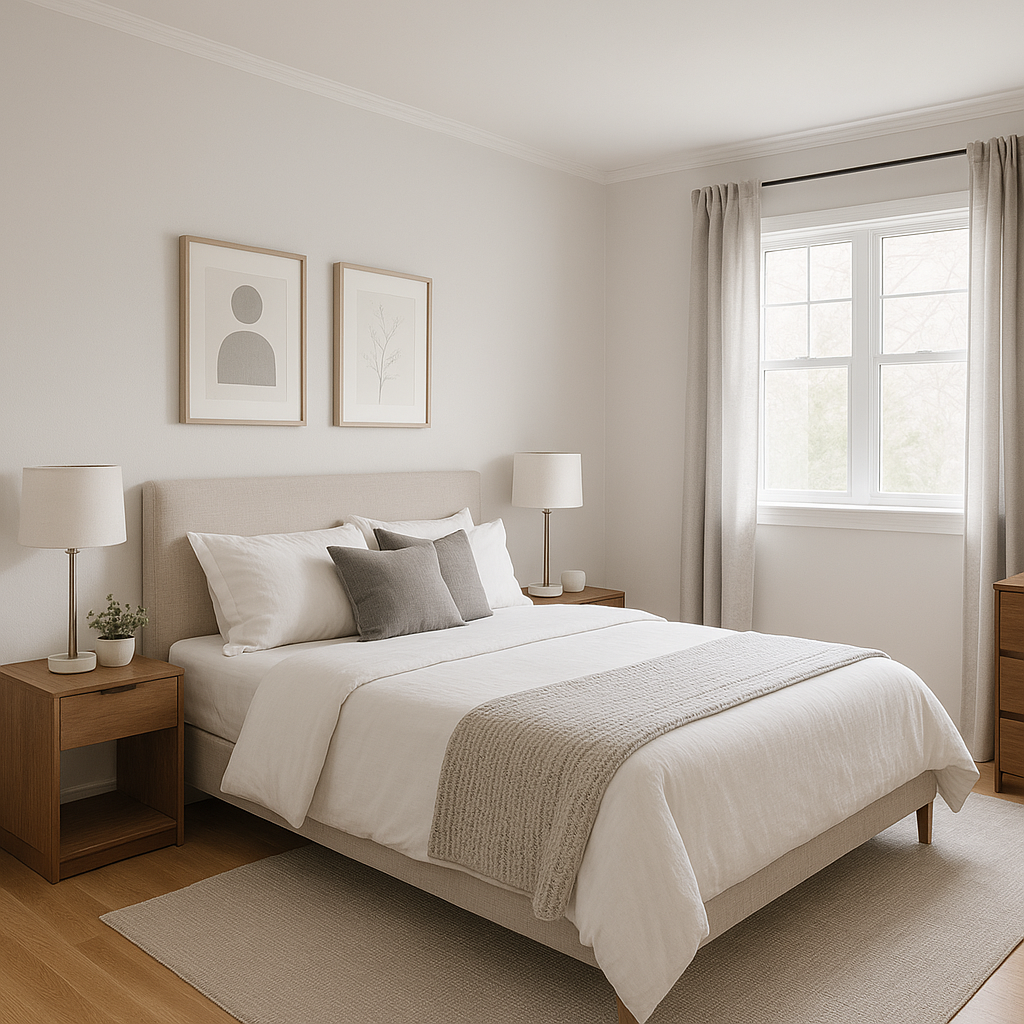
In a bedroom, Frostine fosters a tranquil, spa-like ambiance. Pair it with crisp white linens and soft, pastel accents for a relaxing retreat. It works equally well in both master bedrooms and guest rooms.
Frostine’s cool blue undertones make it perfect for bathrooms, where it evokes a clean and refreshing feel. Pair it with polished chrome fixtures and white tiles for a timeless and elegant aesthetic.
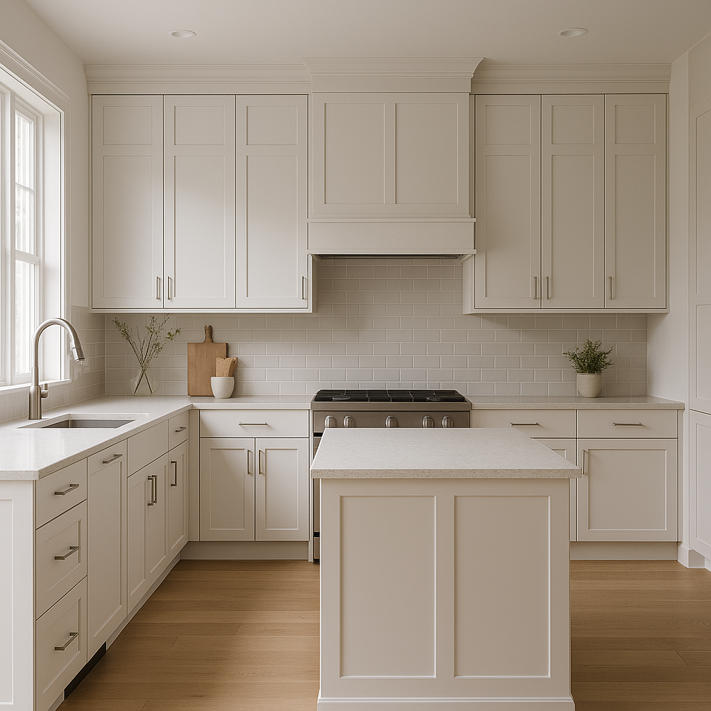
For kitchens, Frostine offers a sleek and modern alternative to traditional whites. It pairs beautifully with stainless steel appliances, marble countertops, and navy or charcoal cabinetry.
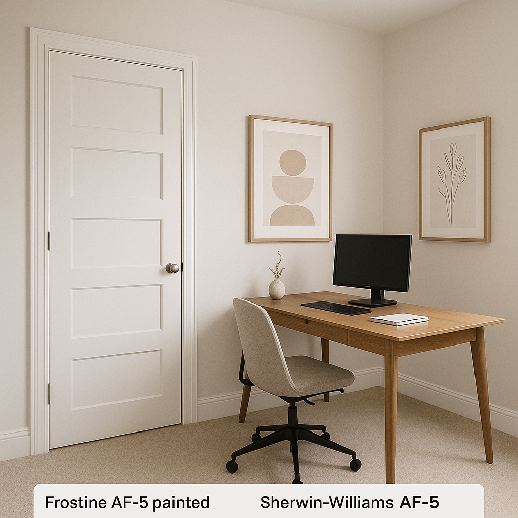
In a home office, Frostine promotes focus and clarity. Its cool tones help reduce visual clutter, creating a workspace that feels both productive and serene.
As with any paint color, the way Frostine appears can change depending on the lighting in your space. In natural daylight, its cool blue undertones are more pronounced, lending a bright and airy quality. Under warm artificial light, you may notice a slight softening of the blue, with subtle lavender hints emerging. To ensure Frostine is the right fit for your space, test it on your walls at different times of the day and in various lighting conditions.
Benjamin Moore Frostine is a sophisticated neutral that brings a sense of calm and refinement to any space. Its cool undertones, versatility, and ability to coordinate with a wide range of colors make it a go-to choice for designers and homeowners looking to create timeless, polished interiors. Whether you’re refreshing a single room or designing an entire home, Frostine offers a modern yet classic foundation that will stand the test of time.
View Colors Only by Brand (No Imagery):
Sherwin-Williams
|
Benjamin-Moore
|
Behr
|
Valspar
Live on the Eastern Slope of Colorado and looking for a local painting professional, check out all our painting services and reach out for a free estimate.
Copyright © 2026 : Wild Fox Painting Inc. : 12435 Mead Way, Littleton, CO 80125


