Benjamin Moore Amsterdam (AF-550) is a deeply evocative blue that brings a sense of luxury and refinement to any space. Its rich, saturated hue is bold yet calming, making it a versatile choice for both classic and modern interiors. The color is part of Benjamin Moore's Affinity® Color Collection, known for its harmonious and effortlessly coordinating shades. Amsterdam stands out as a statement-making color while maintaining a timeless appeal.
Amsterdam is a deep blue with subtle gray undertones, which lend it a grounded and sophisticated character. These gray undertones prevent the color from leaning too vibrant or overly bright, making it feel more subdued and elegant. The muted quality of Amsterdam gives it a velvety depth, ideal for creating a moody yet cozy atmosphere. Depending on the lighting, it can shift slightly—appearing cooler in spaces with natural light and more dramatic in areas lit with artificial or lower lighting.
Amsterdam’s versatility allows it to pair well with a range of coordinating colors, whether you’re aiming for a balanced, monochromatic look or a dynamic contrast. Here are some complementary shades to consider:
Neutrals: Pair Amsterdam with soft neutrals like Benjamin Moore White Dove (OC-17) or Classic Gray (OC-23) to create a clean and sophisticated palette. These lighter tones balance the richness of Amsterdam and prevent the space from feeling too dark.
Warm Accents: For a touch of warmth, consider pairing it with earthy tones like Revere Pewter (HC-172) or Pale Oak (OC-20). The contrast between the rich blue and these warm neutrals creates a cozy and inviting aesthetic.
Bold Contrasts: If you're looking to make a bold design statement, Amsterdam pairs beautifully with vibrant hues like Golden Straw (2152-50) or Caliente (AF-290). These colors provide striking pops of energy against the deep blue backdrop.
Monochromatic Harmony: For a layered blue palette, combine Amsterdam with lighter blues such as Breath of Fresh Air (806) or Van Courtland Blue (HC-145). This creates a serene and cohesive look.
Amsterdam is a dynamic color that works across a variety of design styles and applications. Its versatility allows it to shine in different spaces and contexts:
As a feature wall or full-room color, Amsterdam transforms living spaces into intimate and elegant retreats. Pair it with plush textiles and metallic accents to heighten the sense of luxury.
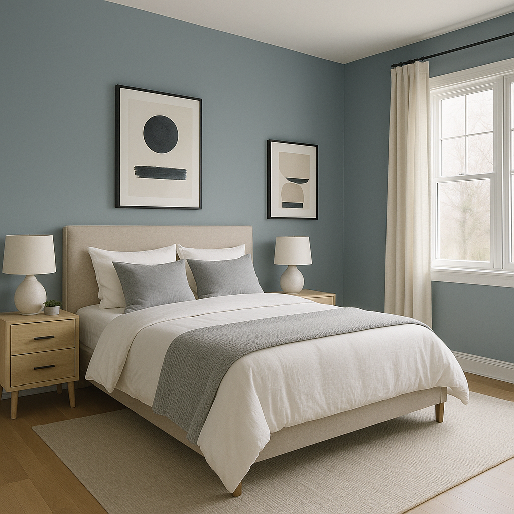
Amsterdam’s calming undertones make it an excellent choice for bedrooms, where it can create a soothing sanctuary. Combine it with soft, neutral bedding and natural wood furniture for a serene atmosphere.
Ideal for formal dining spaces, Amsterdam exudes a sense of grandeur. Pair it with rich wood finishes, crystal lighting, and gold or brass accents to elevate the dining experience.
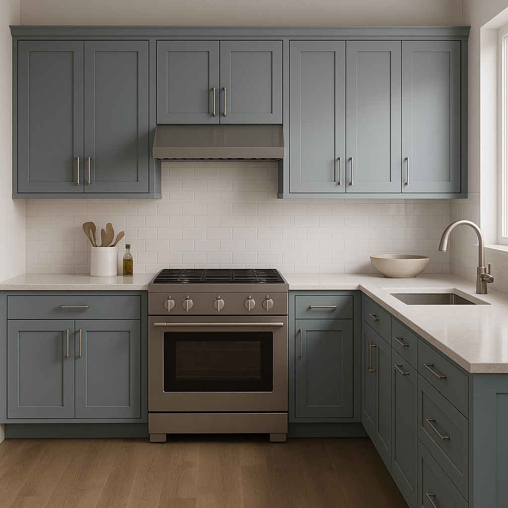
For a bold, contemporary twist, use Amsterdam on cabinetry in kitchens or bathrooms. Pair it with white countertops, subway tiles, and sleek hardware for a high-contrast, modern aesthetic.
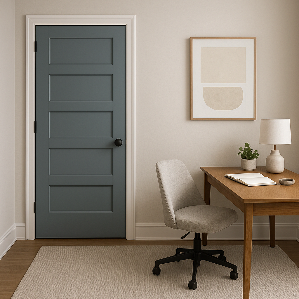
Amsterdam isn’t just for interiors—it works beautifully on home exteriors, especially when paired with crisp white trim or warm gray accents. Its depth adds a classic charm to front doors, shutters, and siding.
Lighting plays a significant role in how Amsterdam appears in your space. In rooms with abundant natural light, the blue will appear cooler and more vibrant, while in dimly lit areas, its gray undertones will become more prominent, creating a cozy and enveloping feel. To ensure it’s the right fit for your space, test Amsterdam on your walls at different times of day and under various lighting conditions.
Amsterdam is a color that blends boldness with timeless sophistication. Whether you want to make a dramatic statement or create a tranquil retreat, this deep blue with its subtle gray undertones offers the perfect balance. Its ability to pair effortlessly with a variety of shades makes it a go-to choice for designers and homeowners alike.
With Benjamin Moore Amsterdam, you can craft a space that feels both stylish and enduring—one that invites admiration and inspires relaxation.
View Colors Only by Brand (No Imagery):
Sherwin-Williams
|
Benjamin-Moore
|
Behr
|
Valspar
Live on the Eastern Slope of Colorado and looking for a local painting professional, check out all our painting services and reach out for a free estimate.
Copyright © 2026 : Wild Fox Painting Inc. : 12435 Mead Way, Littleton, CO 80125


