Benjamin Moore Wisteria (AF-585) is a captivating shade that effortlessly combines sophistication and charm. This color is part of Benjamin Moore’s esteemed Affinity® Collection, known for its harmonious palette that makes color coordination seamless. Wisteria is a medium-toned lavender hue that evokes a sense of serenity and refinement, making it an ideal choice for creating inviting and timeless spaces.
Wisteria (AF-585) is a balanced lavender with subtle gray undertones. These gray undertones ensure the color feels grounded and versatile, preventing it from veering too sweet or overly pastel. The muted quality of Wisteria gives it a modern edge, making it suitable for both classic and contemporary interiors. Depending on the lighting, the color can shift slightly—appearing warmer in natural sunlight and cooler under artificial lighting. This transformative quality adds depth and intrigue to any room.
One of the key advantages of Wisteria is its ability to pair beautifully with a wide range of colors. Here are some suggestions for coordinating hues that will enhance its beauty:
Neutrals: Pair Wisteria with soft neutrals like Benjamin Moore Decorator’s White (OC-149) or White Dove (OC-17) for a clean and elegant contrast. These whites work exceptionally well on trim, ceilings, or cabinetry to complement Wisteria’s gentle lavender tones.
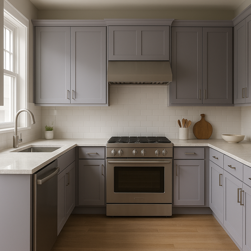
Grays: For a sophisticated monochromatic look, coordinate Wisteria with warm grays such as Revere Pewter (HC-172) or Stormy Monday (2112-50). The subtle interplay between lavender and gray creates a refined, cohesive atmosphere.
Earthy Greens: Shades like Saybrook Sage (HC-114) or October Mist (1495) bring out the natural softness of Wisteria, creating an organic and serene palette inspired by nature.
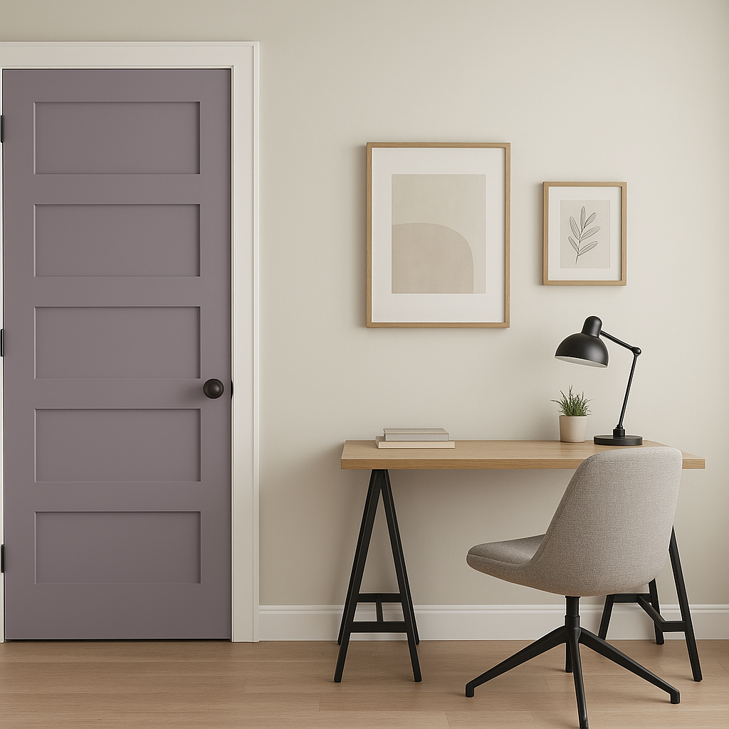
Deep Purples: For a bold and dramatic effect, pair Wisteria with rich purples such as Shadow (2117-30) or Black Raspberry (2072-20). This combination adds depth and a luxurious feel to a space.
Accent Colors: Add pops of color with cheerful yellows like Hawthorne Yellow (HC-4) or vibrant blues such as Blue Dragon (2067-10). These accents create lively energy while keeping the overall scheme balanced.
Wisteria’s serene yet sophisticated presence makes it highly versatile across different rooms and design styles. Here are some of the most effective ways to use it in your home:
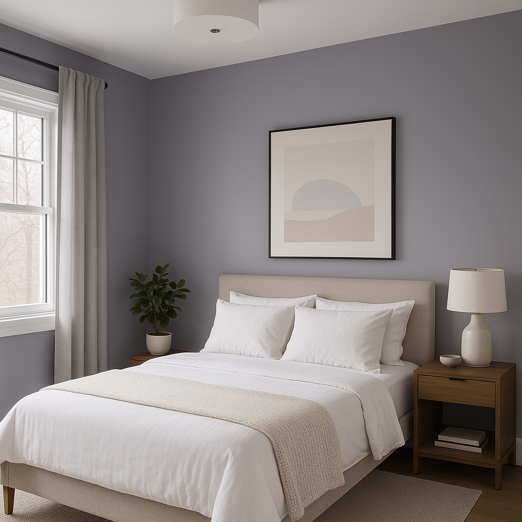
Wisteria is a perfect choice for bedrooms, where its calming lavender tones promote relaxation and tranquility. Pair it with crisp white bedding and soft gray accents for a soothing retreat. Adding textured throw pillows or a plush area rug can enhance the cozy vibe.
In living rooms, Wisteria creates a welcoming and stylish ambiance. It works beautifully as a main wall color, especially when complemented by neutral furniture and metallic accents like brushed gold or silver. For a touch of drama, consider pairing it with darker trim or a bold artwork.
Transform your bathroom into a spa-like haven with Wisteria on the walls. Its soft, muted quality pairs wonderfully with white fixtures and marble countertops. Add natural greenery and lavender-scented candles to complete the serene atmosphere.
Wisteria is a delightful option for nurseries, offering a gentle and gender-neutral alternative to traditional pinks and blues. Pair it with pastel accents or whimsical decor to create a dreamy space for your little one.
For dining spaces, Wisteria adds a touch of elegance without feeling overly formal. Pair it with rich wood furniture and muted metallics for a sophisticated and inviting setting that feels perfect for gatherings.
If you’re not ready to commit to Wisteria on all four walls, use it as an accent color. A single Wisteria wall can serve as a stunning backdrop for artwork or shelving, adding personality and depth to the room.
Lighting plays a critical role in how Wisteria appears in your space. In rooms with ample natural light, the lavender tones will feel brighter and more airy. In spaces with limited light, the gray undertones may become more pronounced, lending a cozy and subdued feel. To ensure you achieve the desired effect, always test the color with swatches in different lighting conditions before committing.
Benjamin Moore Wisteria (AF-585) is a stunning choice for interiors that require a touch of elegance and calm. Whether used as a primary wall color or as part of a carefully curated palette, its versatility and timeless appeal make it a standout option for elevating your home’s design.
View Colors Only by Brand (No Imagery):
Sherwin-Williams
|
Benjamin-Moore
|
Behr
|
Valspar
Live on the Eastern Slope of Colorado and looking for a local painting professional, check out all our painting services and reach out for a free estimate.
Copyright © 2026 : Wild Fox Painting Inc. : 12435 Mead Way, Littleton, CO 80125


