Benjamin Moore Tempest (AF-590) is a captivating paint color that balances sophistication and drama with effortless grace. Part of the esteemed Affinity® Collection, this rich, medium-deep gray with subtle undertones of violet delivers a sense of intrigue and depth to any space. Its complex character makes it an excellent choice for creating environments that feel both elegant and enveloping, making Tempest a favorite among interior designers seeking an elevated aesthetic.
Tempest is not your ordinary gray; its nuanced undertones set it apart from more conventional shades. Beneath its smoky gray exterior lies a soft yet detectable trace of violet. These undertones inject a quiet warmth into the color, helping it avoid feeling overly cold or sterile. The violet undertones also lend Tempest a hint of mystique, making it ideal for spaces where you want to infuse a sense of refinement and subtle drama.
This color performs beautifully under both natural and artificial lighting. In rooms with abundant sunlight, Tempest leans toward its cooler gray tones, while in dimly lit spaces, the violet undertones become slightly more pronounced, adding a rich, sumptuous depth.
Benjamin Moore Tempest (AF-590) is a versatile shade that pairs seamlessly with a variety of colors, whether you’re aiming for a monochromatic look or a bold contrast. Here are some coordinating colors to consider:
Tempest is an incredibly versatile color that works well across a wide range of interior styles, from contemporary to classic. Here are some ways to incorporate it into your space:
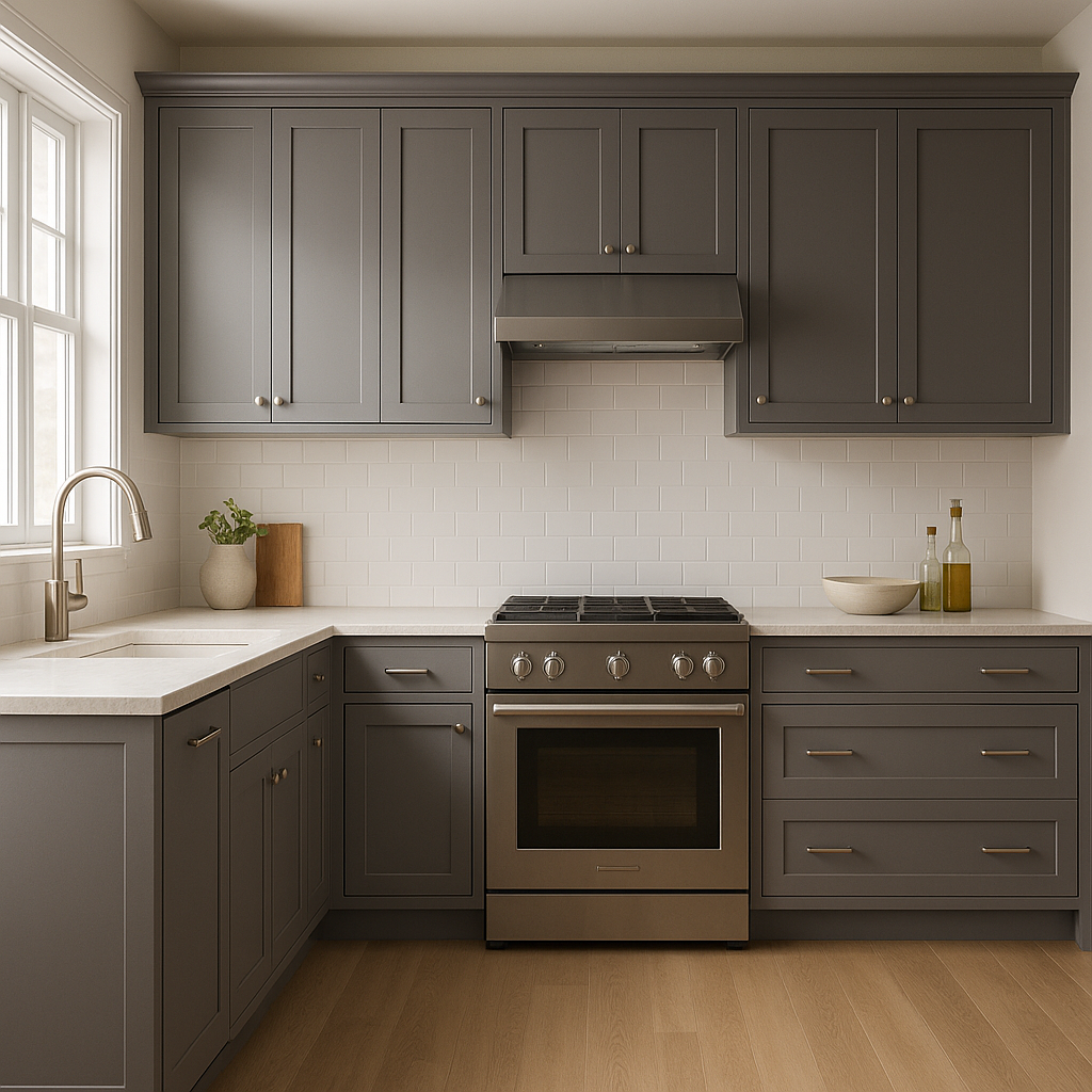
Tempest can transform living rooms into sophisticated retreats. Pair it with plush velvet furnishings and metallic accents, such as gold or brass, to emphasize its luxurious side. It also works beautifully with natural materials like wood and stone for a more grounded, modern look.
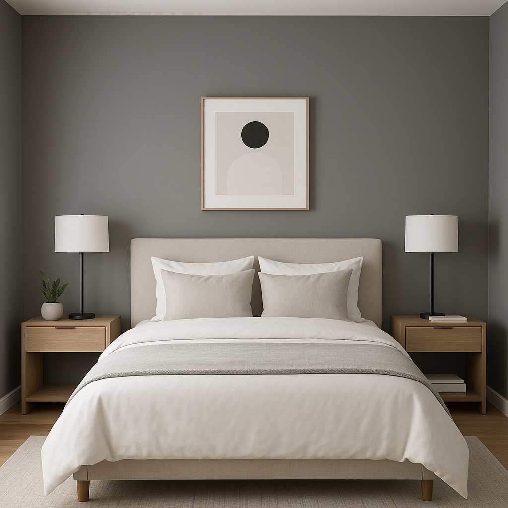
The moody elegance of Tempest makes it an ideal choice for bedrooms. Use it on walls to create an intimate, cocoon-like ambiance, then layer soft textiles in complementary hues like cream or lavender for a serene retreat.
Create a refined dining space with Tempest as the backdrop. Dark wood furniture and crystal chandeliers play beautifully against its rich tones, while silver or pewter décor accents heighten its sophistication.
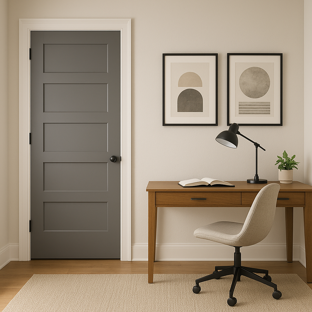
Tempest makes a stunning accent wall or color for built-in cabinetry. Its depth adds dimension to spaces, particularly in studies, libraries, or entertainment areas.
In bathrooms, Tempest pairs incredibly well with white marble, chrome fixtures, or matte black accents. Together, these elements create a spa-like atmosphere that feels both modern and timeless.
Tempest is a masterful blend of drama, elegance, and versatility. Its ability to adapt to various lighting conditions and pair with a wide spectrum of complementary colors makes it a designer’s dream. Whether you’re revamping your living space, adding sophistication to a bedroom, or crafting a memorable dining experience, Tempest offers the perfect foundation for a refined and enduring palette.
View Colors Only by Brand (No Imagery):
Sherwin-Williams
|
Benjamin-Moore
|
Behr
|
Valspar
Live on the Eastern Slope of Colorado and looking for a local painting professional, check out all our painting services and reach out for a free estimate.
Copyright © 2026 : Wild Fox Painting Inc. : 12435 Mead Way, Littleton, CO 80125


