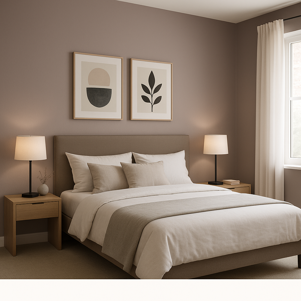
Benjamin Moore Amorous (AF-600) is a deeply sophisticated and alluring color that brings a sense of warmth and intimacy to any space. This rich, muted shade is a blend of dusty plum and deep mauve, exuding a timeless charm that feels both dramatic and inviting. Perfectly suited for creating cozy yet luxurious interiors, Amorous strikes a balance between boldness and subtlety, making it a versatile choice for a variety of design aesthetics.
Amorous (AF-600) is more than just a plum-inspired hue. Its complex undertones set it apart, giving it a multidimensional quality. You’ll notice a soft mix of warm red and cool gray undertones that ground the color, preventing it from feeling overly saturated. The gray influence gives it a muted, velvety finish, while the subtle red undertone infuses a sense of romantic warmth. This duality allows Amorous to change depending on lighting conditions—appearing more dramatic and moody in dim lighting, yet sophisticated and serene in brighter spaces.
Benjamin Moore Amorous is a star player in a well-planned color palette. Its depth and complexity pair beautifully with a range of complementary and contrasting hues. Here are some expert suggestions for coordinating colors:
Neutrals: Pair Amorous with soft, creamy neutrals like Benjamin Moore White Dove (OC-17) or Classic Gray (OC-23) to create a balanced and elegant look. These lighter tones will highlight Amorous’s richness while keeping the overall feel airy and refined.
Accent Colors: For a bold, contemporary design, consider pairing it with a jewel tone like Newburg Green (HC-158) or Gentleman’s Gray (2062-20). These deep blues and greens add a layer of depth to the palette.
Warm Tones: If you’re leaning into the romantic warmth of Amorous, combine it with soft blushes like First Light (2102-70) or warm taupes like Pashmina (AF-100) to create a cohesive, cozy vibe.
Metallic Accents: Amorous takes on a sophisticated edge when paired with metallic finishes like brushed gold, antique brass, or soft pewter. These accents can elevate the overall aesthetic, making it feel luxurious yet approachable.
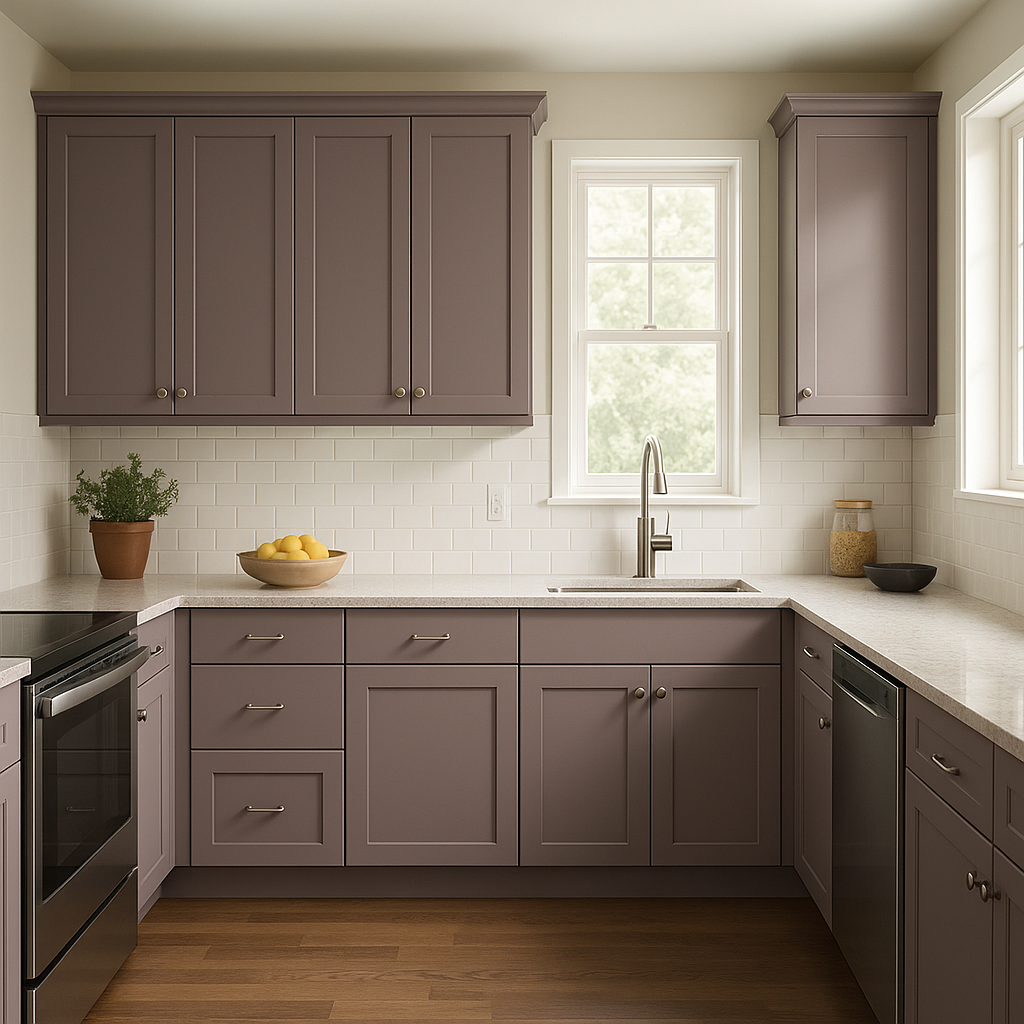
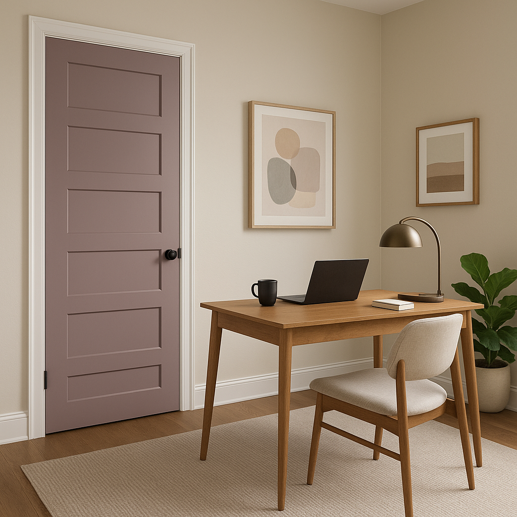
Amorous is a versatile shade that works beautifully in a variety of settings, thanks to its ability to evoke both drama and comfort. Here are some creative ways to use this color in your home or workspace:
Amorous (AF-600) is a chameleon-like color, shifting its appearance based on the lighting in your space. In natural daylight, it leans more toward its gray-mauve undertones, offering a soft, sophisticated look. Under incandescent or warmer artificial lighting, its red undertones become more pronounced, creating a cozy and enveloping feel. Always test the color in your space under different lighting conditions to fully appreciate its nuances.
Benjamin Moore Amorous (AF-600) is a color that tells a story. Whether you’re designing a romantic bedroom, a dramatic dining area, or a serene home office, this hue offers endless possibilities. Its ability to adapt to various lighting, styles, and palettes makes it a go-to choice for designers and homeowners seeking a versatile yet distinctive color. With its timeless elegance and rich undertones, Amorous invites you to infuse your space with warmth, depth, and sophistication.
View Colors Only by Brand (No Imagery):
Sherwin-Williams
|
Benjamin-Moore
|
Behr
|
Valspar
Live on the Eastern Slope of Colorado and looking for a local painting professional, check out all our painting services and reach out for a free estimate.
Copyright © 2026 : Wild Fox Painting Inc. : 12435 Mead Way, Littleton, CO 80125


