Benjamin Moore Aplomb (AF-625) is a refined, medium gray that exudes sophistication and understated charm. Perfect for homeowners and designers seeking a neutral that feels modern yet timeless, Aplomb strikes the ideal balance between warmth and coolness, making it a versatile choice for a wide range of interiors. With its soft, calming presence, this shade can seamlessly enhance contemporary, transitional, or even traditional spaces.
Aplomb is a gray with subtle undertones that lean slightly toward purple. These undertones give the color a unique depth and richness, allowing it to change subtly under different lighting conditions. In bright, natural light, Aplomb may reveal its cooler gray tones, while in dimmer or artificial light, the faint purple undertones add a gentle warmth. This adaptability makes Aplomb a dynamic color that brings layers of personality to any room.
Benjamin Moore Aplomb pairs beautifully with a range of complementary hues, allowing for endless design possibilities. Here are some exceptional coordinating colors:
These coordinating colors can be used strategically to create contrast, continuity, or a layered look, depending on the mood and style you desire.
Aplomb’s versatility knows no bounds, making it suitable for various applications throughout your home:
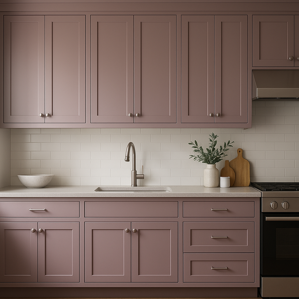
Aplomb creates a perfect backdrop for living rooms or family spaces. Its neutral yet intriguing tone allows furniture, artwork, and decor to take center stage. Pair it with plush textiles and metallic accents for a modern luxe vibe, or incorporate natural wood tones for a warm, organic feel.
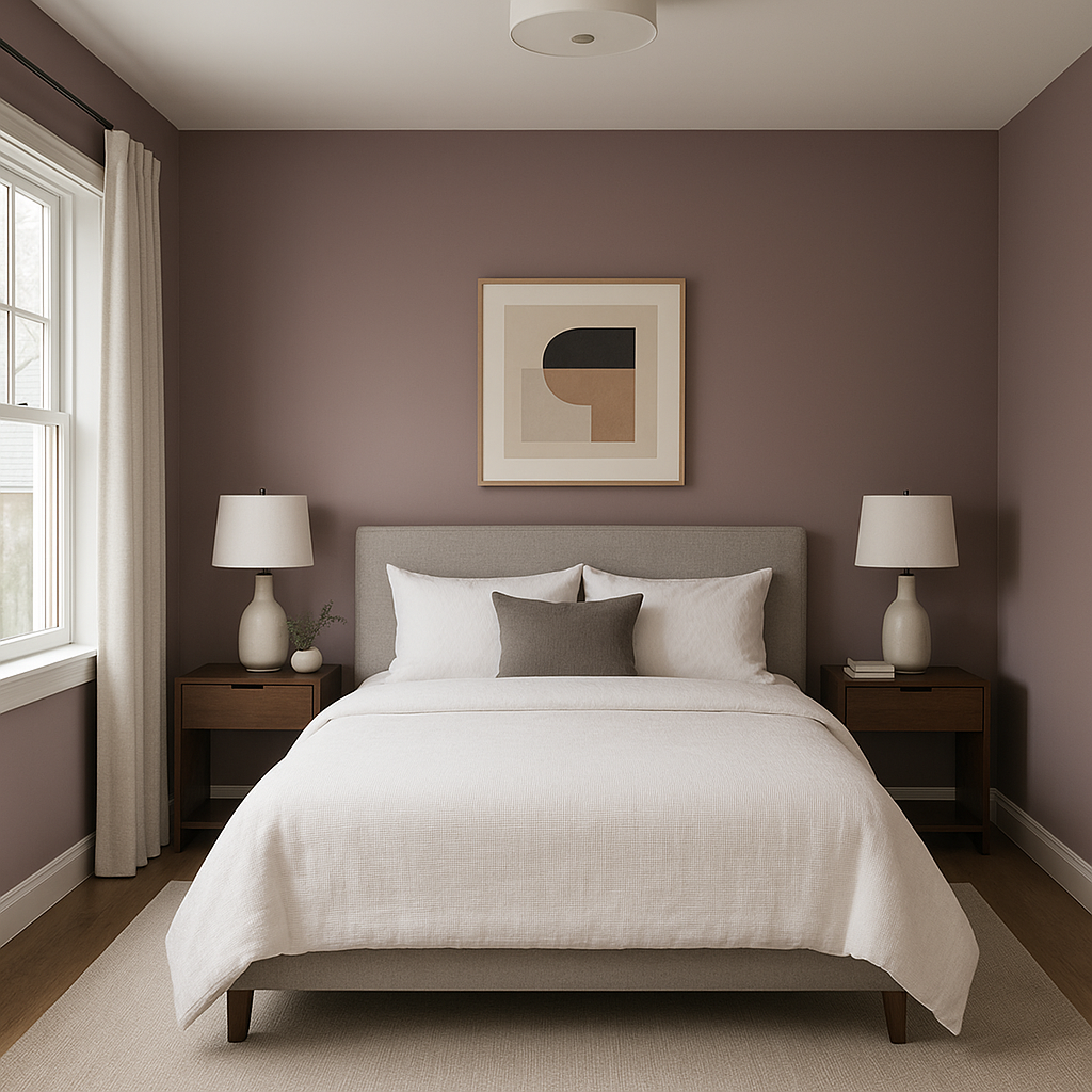
The serene quality of Aplomb makes it an excellent choice for bedrooms. Its calming undertones create a restful ambiance, especially when paired with soft whites, muted blues, or dusty lavender for a tranquil retreat.
For a spa-like experience, Aplomb can be paired with crisp whites, light grays, and subtle greens. Consider using it on walls alongside sleek chrome or brushed nickel fixtures for a clean, polished look.
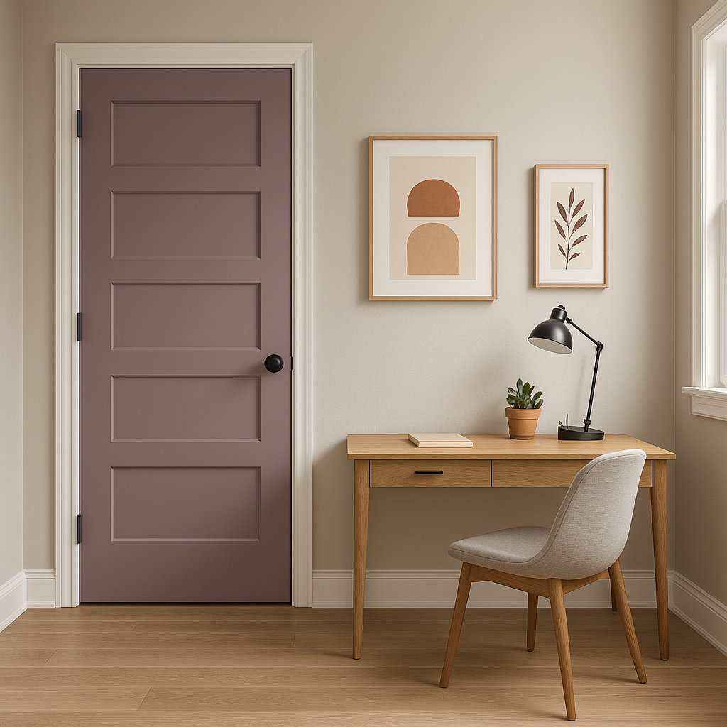
Aplomb’s balanced neutrality fosters focus and productivity, making it ideal for home offices. Pair it with darker accent colors like navy or charcoal for a professional and grounded workspace.
Aplomb can make a striking first impression in entryways and hallways. Its medium tone is light enough to brighten narrow spaces but rich enough to feel impactful. Pair it with bold artwork or patterned rugs for added visual interest.
As with any paint color, lighting plays a significant role in how Aplomb appears in your space. In rooms with ample natural light, its cooler gray tones will dominate, creating a fresh and airy effect. In spaces with warmer artificial lighting or northern exposure, its purple undertones will emerge slightly, lending a cozy and elegant feel. Always test Aplomb with swatches in your space to see how it interacts with your unique lighting conditions.
Aplomb (AF-625) is more than just a neutral gray; it’s a color that adapts to its surroundings while maintaining a sophisticated and polished aesthetic. Whether you’re designing a cozy retreat or a sleek modern space, this versatile shade serves as an anchor for your design palette, effortlessly tying elements together. Its ability to work well with a variety of coordinating colors and its subtle undertones make it a standout choice for any home.
Benjamin Moore Aplomb (AF-625) truly captures the essence of timeless elegance, proving that neutrals can be anything but boring.
View Colors Only by Brand (No Imagery):
Sherwin-Williams
|
Benjamin-Moore
|
Behr
|
Valspar
Live on the Eastern Slope of Colorado and looking for a local painting professional, check out all our painting services and reach out for a free estimate.
Copyright © 2026 : Wild Fox Painting Inc. : 12435 Mead Way, Littleton, CO 80125


