Benjamin Moore Granite (AF-660) is a rich, complex shade of gray that effortlessly combines sophistication and versatility. This alluring neutral is part of Benjamin Moore's Affinity® Collection, a curated palette known for harmonious hues that make design coordination seamless. Granite (AF-660) stands out as a perfect balance between warmth and coolness, making it a favorite among interior designers for its adaptability and timeless aesthetic.
Granite (AF-660) is not your typical gray—it carries subtle undertones that add depth and character to the shade. Its warm taupe undertones prevent it from feeling too cold or stark, while faint hints of beige lend a softness that makes it inviting. These undertones give Granite the ability to complement a variety of design schemes, from modern and industrial to traditional and transitional.
The undertones also make Granite a chameleon in different lighting conditions. In spaces with warm lighting, it leans more toward a cozy greige, while in cooler lighting, it takes on a deeper, smokier gray appearance. This dynamic quality ensures that Granite adapts beautifully to its surroundings, making it an ideal choice for rooms that require a refined yet versatile backdrop.
Granite (AF-660) pairs effortlessly with a range of colors, thanks to its neutral undertones. Here are some recommended coordinating shades to create a cohesive and stylish palette:
When choosing coordinating colors, consider the mood and style you want to achieve, as well as the lighting and architectural details of the space.
Granite (AF-660) is a versatile shade that can be used in virtually any room or design style. Its sophisticated neutral tone makes it a favorite for both residential and commercial settings. Here are some ways to incorporate Granite into your space:
Granite adds an understated elegance to living spaces, making it a perfect choice for walls or accent areas. Pair it with plush furnishings in contrasting textures—such as velvet or linen—for a cozy yet polished look. Add metallic accents like brass or chrome to enhance its refined character.
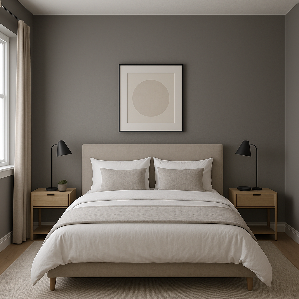
Create a serene retreat by using Granite as a wall color in bedrooms. Its soft taupe undertones foster a relaxing atmosphere, especially when paired with crisp white bedding and accessories. Incorporate pops of color through artwork or cushions to personalize the space.
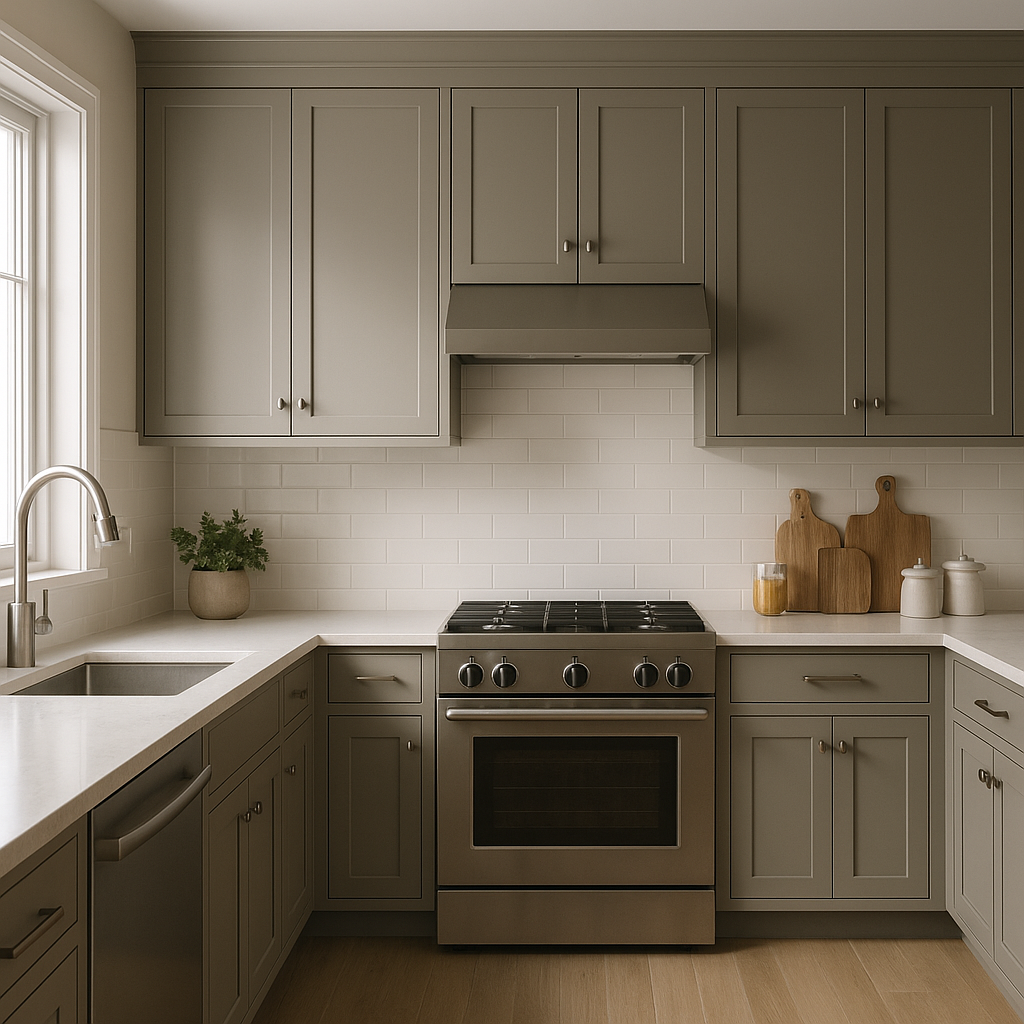
Granite works beautifully in kitchens, particularly as a backdrop for cabinetry in shades of white, cream, or even deep navy. It can also serve as a striking choice for a kitchen island or backsplash, adding depth without overpowering the design.
Elevate your bathroom with Granite’s sophisticated tone. Pair it with sleek fixtures, marble countertops, and coordinating tiles in shades of white or gray to achieve a spa-like ambiance.
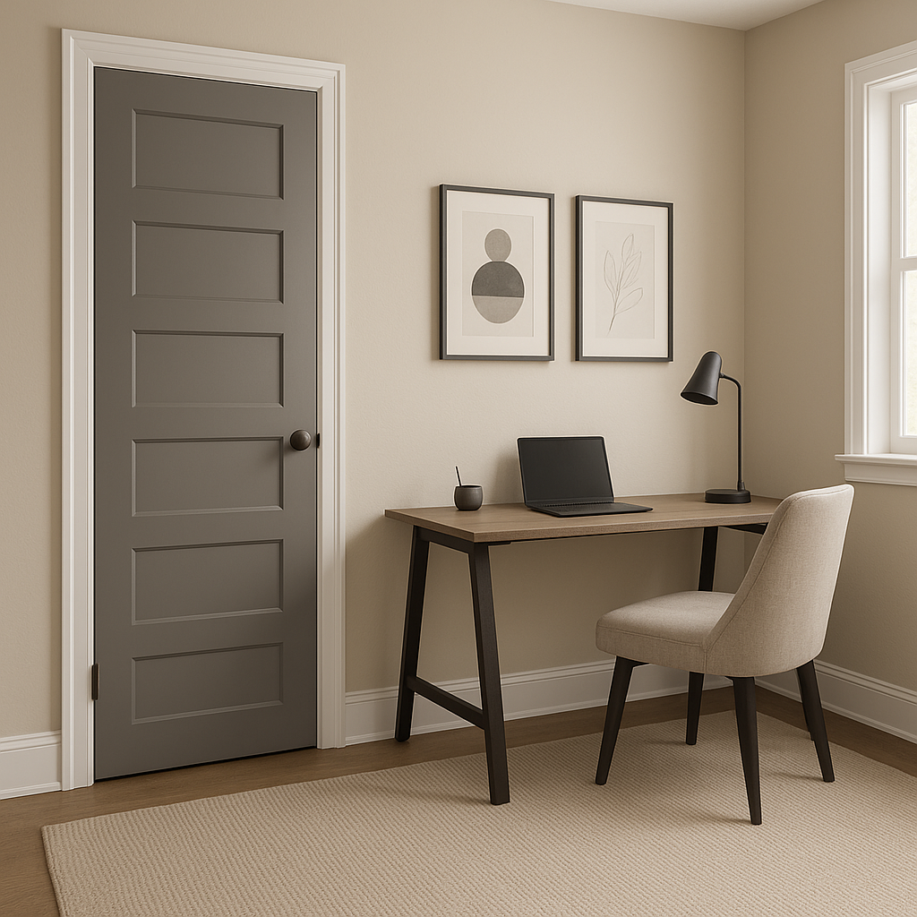
Granite’s balanced undertones make it an excellent choice for home offices, as it fosters focus and calm. Combine it with pops of greenery and warm wood tones for a workspace that’s both productive and inviting.
For those looking to add drama without overwhelming a space, Granite is a stunning option for accent walls. Use it in a dining room, entryway, or behind a headboard to create visual interest and depth.
Benjamin Moore Granite (AF-660) is the epitome of versatility and elegance. Its warm taupe undertones and ability to adapt to varying lighting conditions make it a design powerhouse. Whether used as a main wall color, an accent shade, or as part of a larger color palette, Granite is sure to elevate any space with its timeless charm.
Make Granite (AF-660) the foundation of your next interior design project, and experience how this sophisticated neutral can transform your home into a stylish and inviting sanctuary.
View Colors Only by Brand (No Imagery):
Sherwin-Williams
|
Benjamin-Moore
|
Behr
|
Valspar
Live on the Eastern Slope of Colorado and looking for a local painting professional, check out all our painting services and reach out for a free estimate.
Copyright © 2026 : Wild Fox Painting Inc. : 12435 Mead Way, Littleton, CO 80125


