Benjamin Moore Eternity (AF-695) is a refined, soft gray that exudes a sense of calm and sophistication. Part of the Affinity® Color Collection, this hue is the epitome of timeless elegance, making it a versatile choice for interiors that aim to feel serene yet upscale. Whether you're creating a minimalist retreat or enhancing a transitional-style home, Eternity offers a harmonious backdrop that complements a wide range of design aesthetics.
Eternity is a delicate gray with cool undertones, leaning slightly toward blue. The subtle bluish tint gives the shade a gentle crispness, allowing it to feel airy and fresh without veering too stark or clinical. Its undertones make it ideal for spaces where you want to evoke a sense of tranquility, such as bedrooms, bathrooms, and living rooms.
This cool gray is balanced enough to avoid feeling overly cold, meaning it can pair beautifully with both warm and cool palettes. The understated blue undertones lend themselves to spaces with natural light, where the shade can shift dynamically throughout the day, adding depth and character.
Benjamin Moore Eternity (AF-695) shines brightest when paired with complementary hues that enhance its cool and calming nature. Some suggested coordinating colors include:
Eternity is a perfect choice for living rooms where you want to create a serene and welcoming environment. Pair it with plush white or beige furniture, soft blue throw pillows, and natural wood accents to achieve a modern yet cozy aesthetic. Its versatility allows it to coordinate seamlessly with a variety of styles, from Scandinavian minimalism to transitional design.
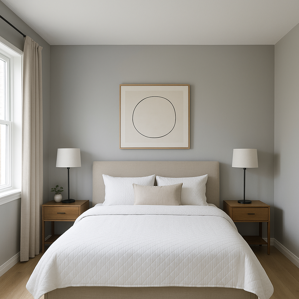
In bedrooms, Eternity serves as a tranquil backdrop that promotes relaxation. Pair it with crisp white linens and soft blue or green accents for a coastal-inspired retreat, or layer it with deeper grays and charcoals for a more luxurious, moody ambiance.
The cool undertones of Eternity make it ideal for bathrooms, especially ones with ample natural light. It pairs beautifully with white marble countertops, chrome fixtures, and light blue towels for a spa-like feel. Add greenery to complete the look and bring a touch of vitality to the space.
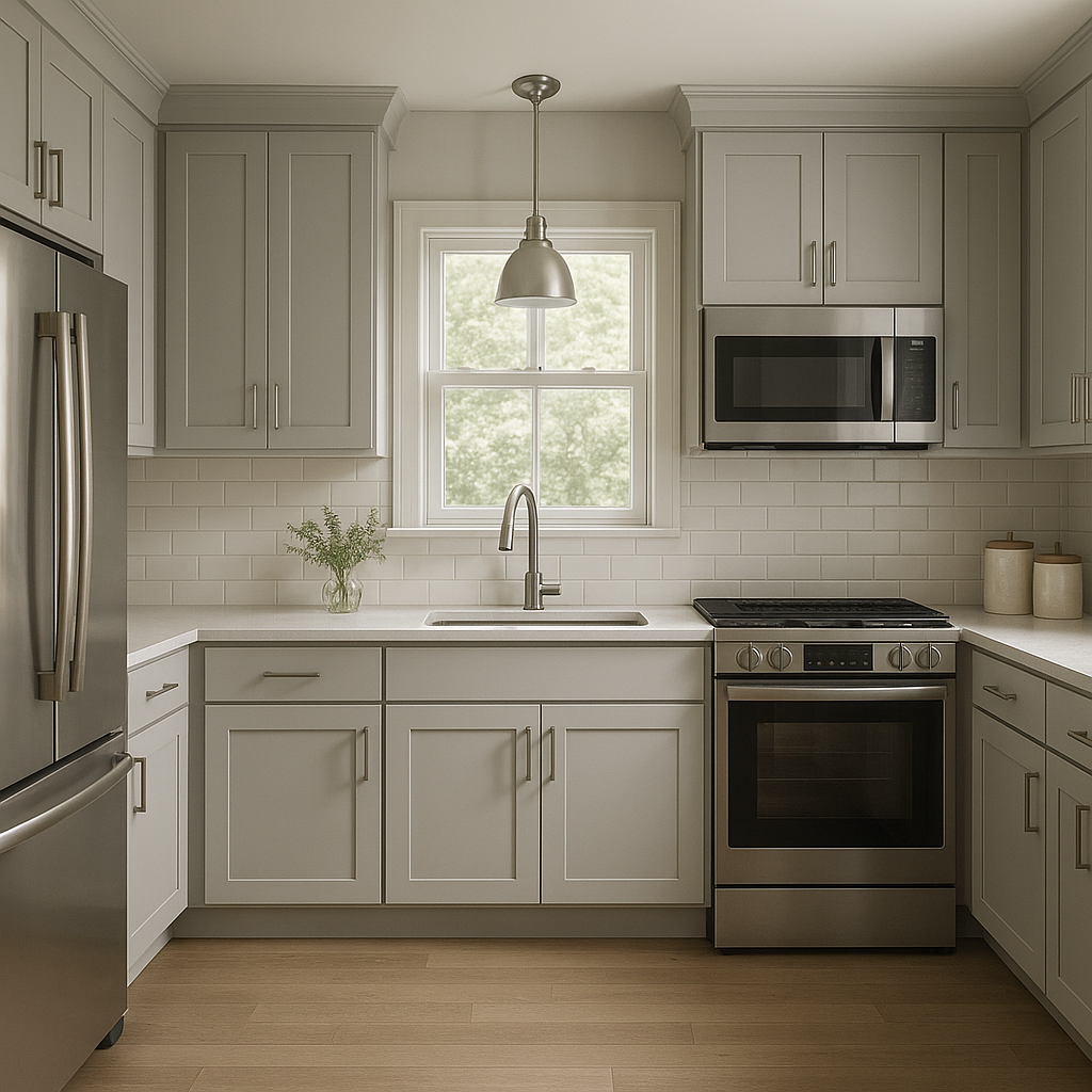
Eternity works wonderfully in kitchens and dining spaces, especially when paired with white cabinetry and brushed nickel hardware. For a more eclectic vibe, consider using it alongside bold accent colors like navy blue or emerald green on islands, chairs, or decorative elements.
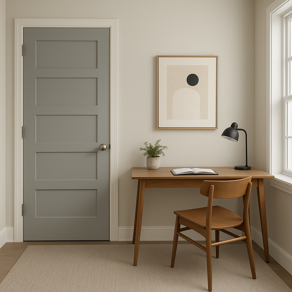
Gray tones like Eternity can foster focus and productivity in home offices. Pair it with darker wood furniture and deep blue or green accents to create a sophisticated, distraction-free workspace.
Eternity’s understated elegance makes it a fantastic choice for entryways and hallways where you want to set a welcoming tone. Use it to tie together different areas of your home with a cohesive color palette that feels polished and contemporary.
Eternity (AF-695) is highly responsive to lighting conditions. In spaces with abundant natural light, its bluish undertones become more prominent, giving the room a fresh and airy feel. In dimmer or artificial lighting, Eternity can lean slightly warmer, making it adaptable to both daytime and evening settings. To ensure the perfect look, test the paint in your space under varying lighting conditions.
Benjamin Moore Eternity (AF-695) is more than just a paint color—it's a statement of timeless sophistication. Its versatile nature, soft undertones, and ability to harmonize with other colors make it an exceptional choice for any room. Whether you're designing a serene retreat or a polished gathering space, Eternity offers the perfect blend of elegance and adaptability.
View Colors Only by Brand (No Imagery):
Sherwin-Williams
|
Benjamin-Moore
|
Behr
|
Valspar
Live on the Eastern Slope of Colorado and looking for a local painting professional, check out all our painting services and reach out for a free estimate.
Copyright © 2026 : Wild Fox Painting Inc. : 12435 Mead Way, Littleton, CO 80125


