Benjamin Moore Jute (AF-80) is a versatile and sophisticated neutral paint color that brings understated elegance to any space. This warm taupe hue is part of Benjamin Moore’s Affinity Collection, known for its harmonious and carefully curated palette. Jute's soft earthiness makes it a fantastic choice for creating inviting interiors that feel grounded yet refined.
Jute is a warm neutral with subtle beige and taupe undertones, enhanced by a hint of golden warmth. These undertones give the color its depth and ability to adapt to a variety of lighting conditions. In spaces with natural light, Jute takes on a softer, creamy appearance, while in artificial lighting, its beige and taupe notes become more prominent, creating a cozy ambiance.
Its gentle warmth ensures it never feels too stark or cold, making it an excellent choice for homeowners seeking a neutral that leans warm without veering into yellow or orange territory.
Benjamin Moore Jute’s versatile nature means it pairs beautifully with a range of colors, allowing you to curate a cohesive palette for your home. Below are some excellent coordinating colors:
Jute’s neutral yet engaging personality makes it ideal for a wide range of applications in the home. Whether you’re aiming for a serene retreat or a polished, sophisticated look, this color delivers.
Jute’s warm undertones create a welcoming and relaxed atmosphere, making it a perfect backdrop for living room walls. Pair it with plush furniture in cream or beige tones and accent with pops of navy or muted greens for a sophisticated yet cozy feel.
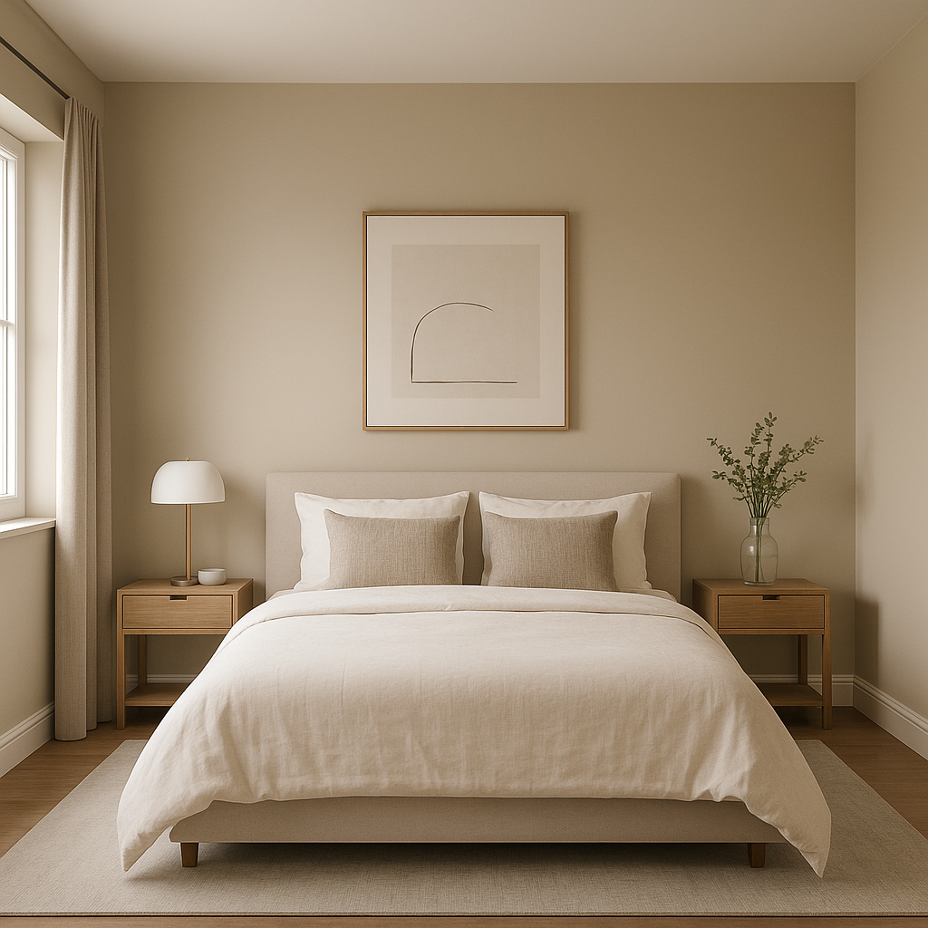
In bedrooms, Jute provides a soothing and calming environment. Combine it with soft whites like White Dove for bedding and trim, and incorporate natural textures like linen, jute rugs, or wicker furniture to enhance its organic vibe.
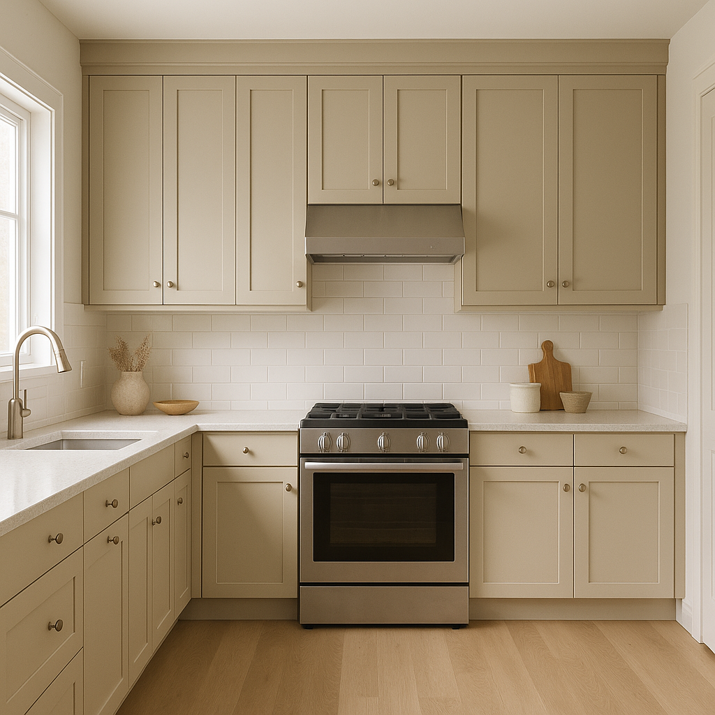
Jute is a fantastic choice for kitchens, especially when paired with white cabinetry and warm wood accents. It creates a timeless, clean look that feels both modern and inviting.
For a spa-like bathroom, use Jute on the walls alongside pale greens or light grays. Incorporate natural materials like stone or wood for a cohesive design that promotes relaxation.
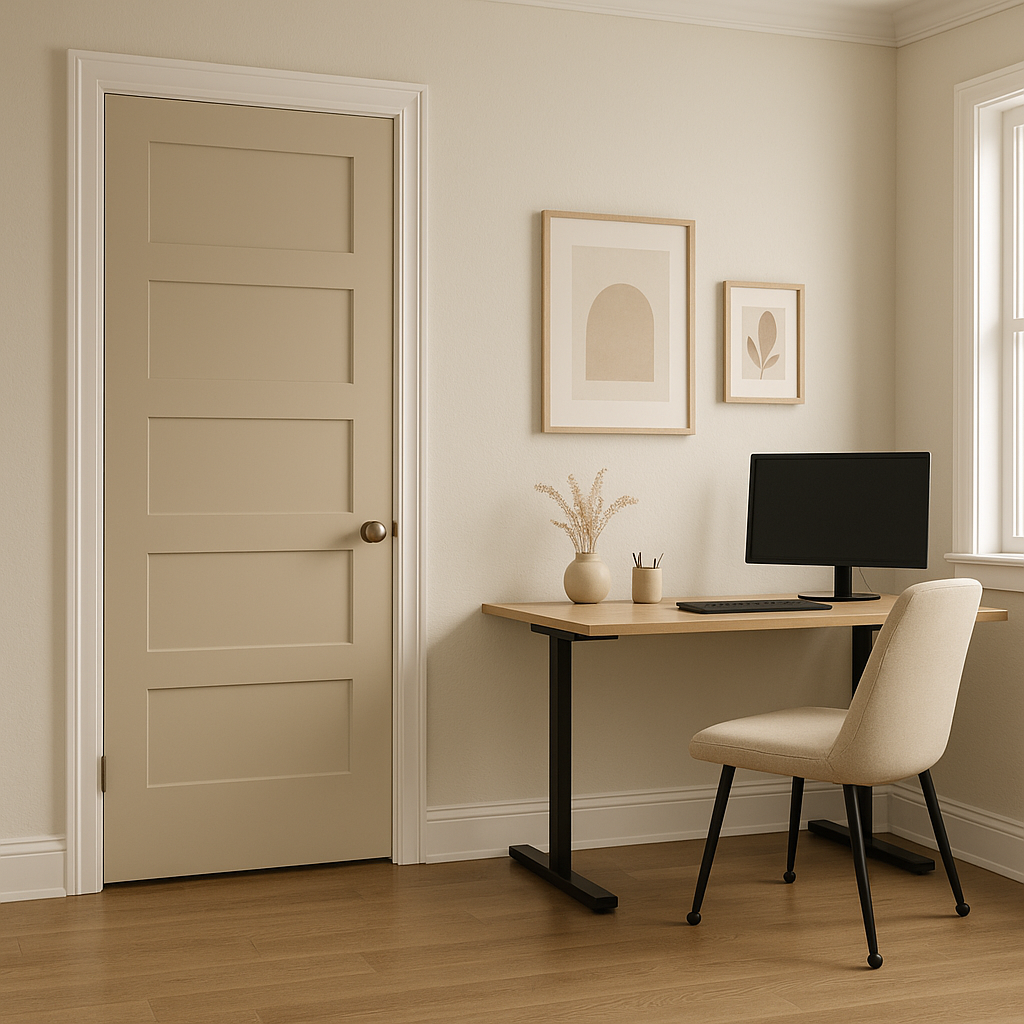
Jute’s versatility shines in transitional areas like hallways and entryways, where it can tie together the color schemes of adjoining rooms. Its ability to adapt to various lighting conditions ensures it always looks polished and inviting.
Benjamin Moore Jute is much more than just a neutral. Its warm undertones, adaptability, and timeless appeal make it an exceptional choice for homeowners and designers alike. Whether you’re creating a minimalist haven, a rustic retreat, or a modern masterpiece, Jute provides the perfect foundation for your vision. Pair it with complementary hues, incorporate a mix of textures, and let its subtle warmth transform your space into a place of beauty and comfort.
View Colors Only by Brand (No Imagery):
Sherwin-Williams
|
Benjamin-Moore
|
Behr
|
Valspar
Live on the Eastern Slope of Colorado and looking for a local painting professional, check out all our painting services and reach out for a free estimate.
Copyright © 2026 : Wild Fox Painting Inc. : 12435 Mead Way, Littleton, CO 80125


