Benjamin Moore Harmony AF-90 is a refined neutral paint color that exudes warmth, sophistication, and timeless appeal. Part of Benjamin Moore’s esteemed Affinity Color Collection, this shade offers a perfect balance of subtlety and versatility, making it an ideal choice for a variety of interior spaces. Whether you're designing a cozy living room, a serene bedroom, or a professional workspace, Harmony AF-90 provides a foundation that feels inviting yet polished.
Harmony AF-90 is a light greige (a blend of gray and beige) with soft taupe undertones. Its warmth leans slightly toward the beige side, but the faint gray influence keeps it grounded and modern. This blend of undertones allows the color to adapt beautifully to different lighting conditions. In rooms with abundant natural light, Harmony AF-90 will appear lighter and more neutral, while in dimmer settings, its warmer beige tones take center stage, creating a cozy and intimate atmosphere.
The subtle taupe undertones also ensure that Harmony AF-90 complements a wide range of other colors, making it a favorite for both monochromatic and contrasting design schemes.
One of the standout features of Harmony AF-90 is its ability to pair effortlessly with other hues. It serves as a perfect backdrop for both bold accent colors and other neutrals. Here are a few coordinating options:
The adaptability of Harmony AF-90 makes it a go-to choice for various design applications. Here are some ways to incorporate it into your home or workspace:
Harmony AF-90 creates a welcoming and serene environment, making it perfect for living rooms. Pair it with warm wood accents, light neutral furniture, and layered textiles to give the space a cozy, inviting feel. Add pops of color with throw pillows or artwork for visual interest.
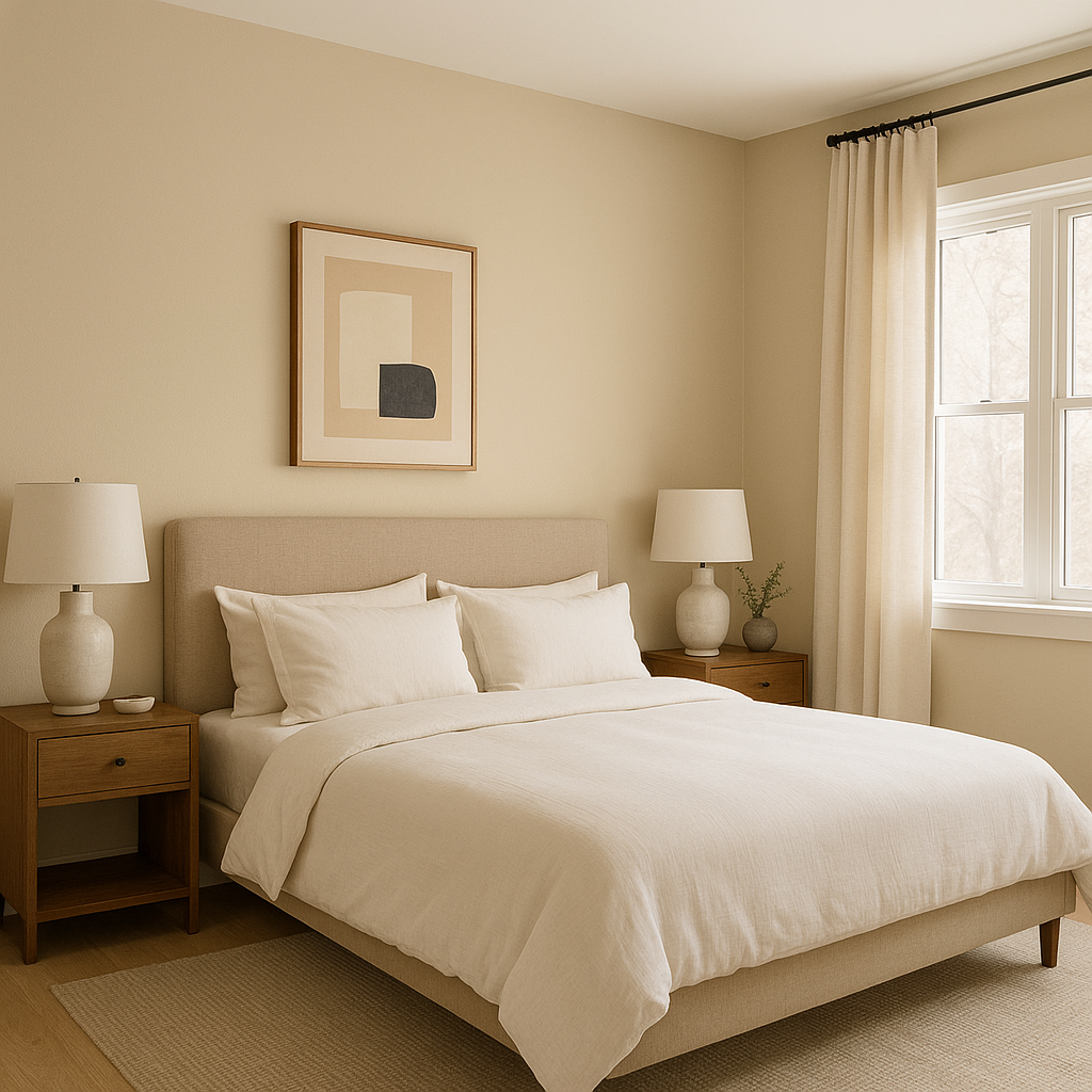
For bedrooms, Harmony AF-90 establishes a calming retreat. Use it as a wall color and pair it with crisp white bedding for a clean, minimalist look or add layers of soft pastel tones for a romantic, tranquil atmosphere.
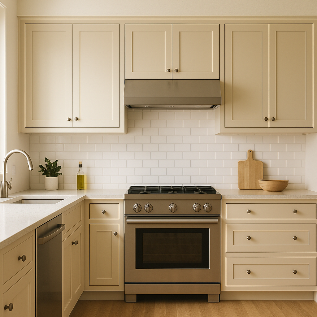
In kitchens, Harmony AF-90 works beautifully on walls or cabinetry. Pair it with white quartz countertops and brushed nickel hardware for a sleek, modern finish. Alternatively, combine it with warm wood tones and earthy greens for a rustic, farmhouse-inspired aesthetic.
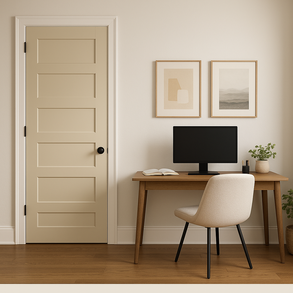
The neutral yet sophisticated quality of Harmony AF-90 makes it an excellent choice for home offices.
View Colors Only by Brand (No Imagery):
Sherwin-Williams
|
Benjamin-Moore
|
Behr
|
Valspar
Live on the Eastern Slope of Colorado and looking for a local painting professional, check out all our painting services and reach out for a free estimate.
Copyright © 2026 : Wild Fox Painting Inc. : 12435 Mead Way, Littleton, CO 80125


