Benjamin Moore Tofino (CC-156) is a timeless, soft neutral that effortlessly balances warmth and sophistication. Named after the tranquil coastal beauty of Tofino, this hue draws inspiration from natural elements, making it an excellent choice for creating inviting interiors that evoke a sense of calm. Its understated elegance and adaptability make it a favorite among homeowners and designers alike.
Tofino is a light greige (gray-beige) paint color with warm undertones. The beige component lends a sense of coziness to the color, while the gray base provides a modern, grounded feel. This delicate balance ensures Tofino works harmoniously in a variety of lighting conditions—from soft morning light to bright artificial lighting—without appearing too stark or overly yellow. Its versatility allows it to adapt to both contemporary and traditional spaces with ease.
Benjamin Moore Tofino (CC-156) shines when paired with complementary colors that enhance its neutral charm. Whether you're designing a monochromatic space or adding pops of color for contrast, here are a few standout options:
Whites and Off-Whites: Pair Tofino with Benjamin Moore Simply White (OC-117) or White Dove (OC-17) for trim and ceilings to create a crisp, clean look. These shades highlight Tofino’s subtle warmth and keep the space feeling bright and airy.
Deeper Grays: For a layered neutral palette, consider coordinating Tofino with Benjamin Moore Chelsea Gray (HC-168) or Kendall Charcoal (HC-166). These darker tones add depth and sophistication, making them ideal for accent walls or cabinetry.
Earthy Greens and Blues: Combine Tofino with muted greens like Benjamin Moore Saybrook Sage (HC-114) or soft blues like Silver Gray (2131-60) for a serene, nature-inspired palette that evokes coastal elegance.
Warm Accents: Add richness with warm accent colors such as Benjamin Moore Lenox Tan (HC-44) or rust-inspired hues like Audubon Russet (HC-51). These tones work beautifully in spaces where you want to create a cozy, inviting atmosphere.
Benjamin Moore Tofino (CC-156) is incredibly versatile, making it suitable for a wide range of applications in both residential and commercial settings. Here are some ideas for incorporating this serene neutral into your designs:
Tofino is perfect for living rooms where you want a relaxing yet refined ambiance. Use it as the main wall color and pair it with soft furnishings in complementary shades like cream, taupe, or muted blues. Add natural textures such as linen curtains and wooden furniture to complete the look.
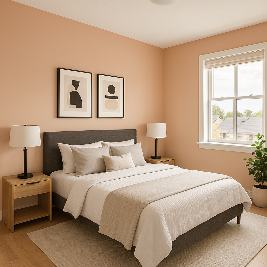
In bedrooms, Tofino creates a soothing retreat. Its warm undertones foster relaxation, making it ideal for walls in a space meant for unwinding. Layer bedding and décor in soft whites, grays, and pastel tones to enhance the peaceful atmosphere.
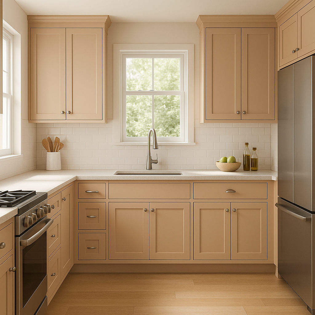
For kitchens, Tofino works beautifully on walls or cabinetry. Pair it with marble countertops and white subway tiles for a modern yet timeless aesthetic. Add metallic accents like brushed nickel or brass hardware to elevate the overall design.
Tofino is an excellent choice for bathrooms, offering a spa-like feel. Combine it with crisp white tiles, natural stone, and plush towels in shades of sage green or pale blue to evoke a coastal-inspired sanctuary.
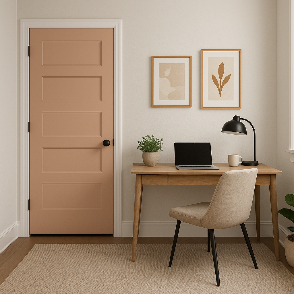
As a subtle neutral, Tofino is ideal for hallways and entryways, providing a welcoming and cohesive backdrop without overpowering the space. Pair it with rich wood tones for flooring and furniture to create a grounded, elegant look.
Benjamin Moore Tofino stands out for its ability to blend seamlessly into various design styles, from modern minimalist to classic coastal. Its warm undertones prevent it from feeling cold, while its subtle gray base ensures it remains contemporary and versatile. Whether you're refreshing a single room or designing an entire home, Tofino offers a calming canvas that adapts beautifully to your vision.
With its serene personality and endless versatility, Benjamin Moore Tofino (CC-156) is a go-to neutral that transforms spaces into tranquil, inviting havens.
View Colors Only by Brand (No Imagery):
Sherwin-Williams
|
Benjamin-Moore
|
Behr
|
Valspar
Live on the Eastern Slope of Colorado and looking for a local painting professional, check out all our painting services and reach out for a free estimate.
Copyright © 2026 : Wild Fox Painting Inc. : 12435 Mead Way, Littleton, CO 80125


