Benjamin Moore White CC-160 is a classic and timeless paint color that embodies sophistication and versatility. This soft white offers a perfect balance of warmth and brightness, making it a popular choice for both traditional and modern interiors. Whether you're looking to refresh a single room or create a cohesive look throughout your home, White CC-160 serves as a reliable and elegant foundation for any design style.
One of the standout features of White CC-160 is its subtle undertones. It leans slightly warm, with soft hints of cream and beige that add depth and charm without veering too yellow. These delicate undertones make it an inviting and cozy shade, suitable for a variety of spaces. The warmth in White CC-160 prevents it from feeling stark or clinical, making it a welcoming option for homes that need a touch of softness.
Its warm undertones also allow it to adapt beautifully to different lighting conditions. In natural sunlight, White CC-160 appears bright and fresh, while under artificial lighting, it takes on a more intimate and creamy quality. This adaptability ensures it maintains a harmonious look throughout the day and in various rooms.
White CC-160 pairs effortlessly with a wide array of colors, making it a versatile choice for any color scheme. Here are some suggestions for coordinating hues:
Neutral Pairings: For a clean and sophisticated look, pair White CC-160 with cool grays like Benjamin Moore's Coventry Gray (HC-169) or Revere Pewter (HC-172). This combination creates a balanced and serene palette that works well in living rooms, bedrooms, or offices.
Earthy Tones: Enhance the warm undertones of White CC-160 by pairing it with earthy hues such as Edgecomb Gray (HC-173) or Shenandoah Taupe (AC-36). These combinations are ideal for creating cozy, inviting spaces like family rooms or dining areas.
Bold Accents: Add a pop of color with bold shades like Hale Navy (HC-154) or Kendall Charcoal (HC-166). These deeper hues provide striking contrast and work particularly well for accent walls, cabinetry, or trim.
Soft Pastels: For a serene and calming atmosphere, consider pairing White CC-160 with pastel shades like Palladian Blue (HC-144) or Soft Fern (2144-40). This pairing is perfect for nurseries, bathrooms, or bedrooms with a tranquil vibe.
White CC-160 is a highly versatile color that can be used in a variety of ways throughout your home. Here are some of its most popular applications:
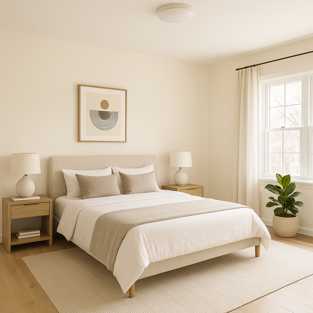
White CC-160 is an excellent choice for walls in any room. Its warm undertones create a welcoming backdrop that works well in both small and large spaces. Use it in open-concept areas to provide a seamless flow between rooms or in bedrooms for a serene and restful environment.
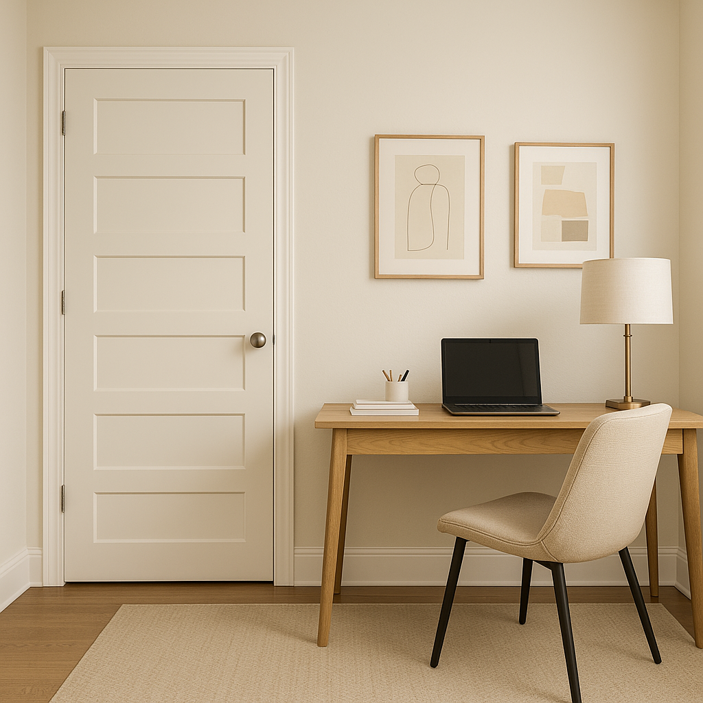
If you're looking for a shade for trim and molding, White CC-160 is a fantastic option. Its crisp yet warm quality adds definition without feeling too harsh. Pair it with darker or more saturated wall colors for a beautiful contrast.
Often overlooked, ceilings painted in White CC-160 can create a cohesive and polished look. Its soft warmth makes it an excellent alternative to cooler whites, adding a subtle layer of interest to the overall design.
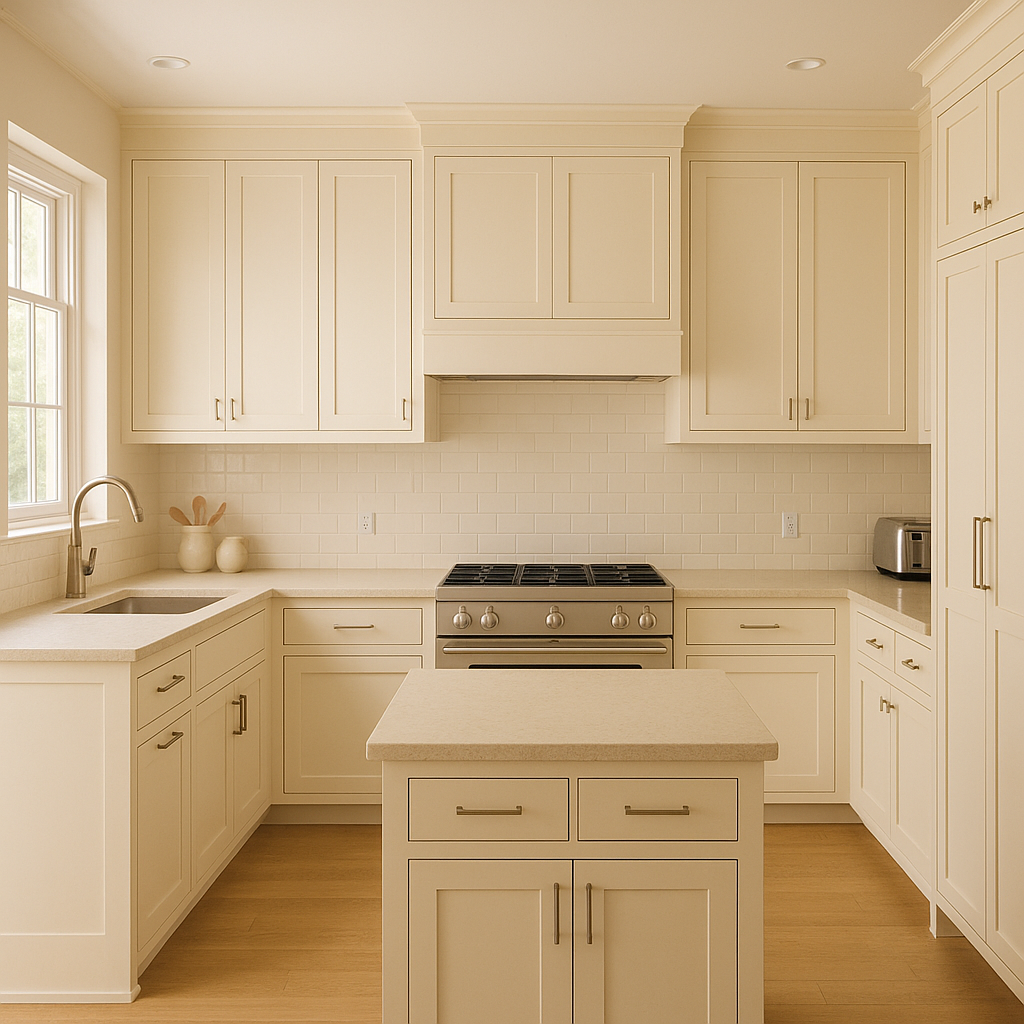
White CC-160 is a popular choice for kitchen cabinetry, thanks to its timeless appeal. It works beautifully with natural wood tones, marble countertops, and brass or black hardware, creating a kitchen that feels both modern and classic.
This color is not limited to interiors—
View Colors Only by Brand (No Imagery):
Sherwin-Williams
|
Benjamin-Moore
|
Behr
|
Valspar
Live on the Eastern Slope of Colorado and looking for a local painting professional, check out all our painting services and reach out for a free estimate.
Copyright © 2026 : Wild Fox Painting Inc. : 12435 Mead Way, Littleton, CO 80125


