Benjamin Moore Raphael (CC-2) is a sophisticated and versatile neutral that exudes warmth and elegance. This classic shade belongs to the Off-White Collection, making it a timeless choice for homeowners and designers seeking a soft, refined look. Raphael is a creamy off-white with gentle beige undertones that strike the perfect balance between warmth and neutrality. Its understated charm offers a serene and welcoming ambiance, making it a favorite for traditional, transitional, and modern interiors alike.
One of the defining characteristics of Raphael (CC-2) is its subtle beige undertones. These warm undertones provide depth and richness without overpowering the space. Unlike stark whites or overly yellow creams, Raphael achieves a harmonious middle ground that feels both cozy and sophisticated. Its tone adapts beautifully to different lighting conditions, appearing warmer in spaces with natural sunlight while retaining a soft, creamy glow in artificial light. This adaptability makes it an ideal choice for rooms of all sizes and orientations.
Raphael (CC-2) is a highly versatile neutral that pairs effortlessly with a wide range of colors. Whether you’re aiming for a monochromatic look or a high-contrast design, this shade acts as a reliable anchor for your palette. Here are some coordinating colors to consider:
By mixing Raphael with these coordinating colors, you can craft a cohesive and inspiring design that reflects your personal style.
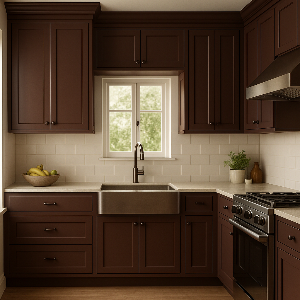
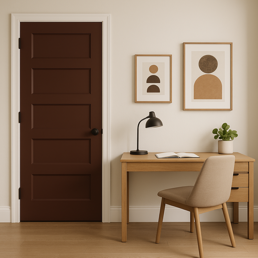
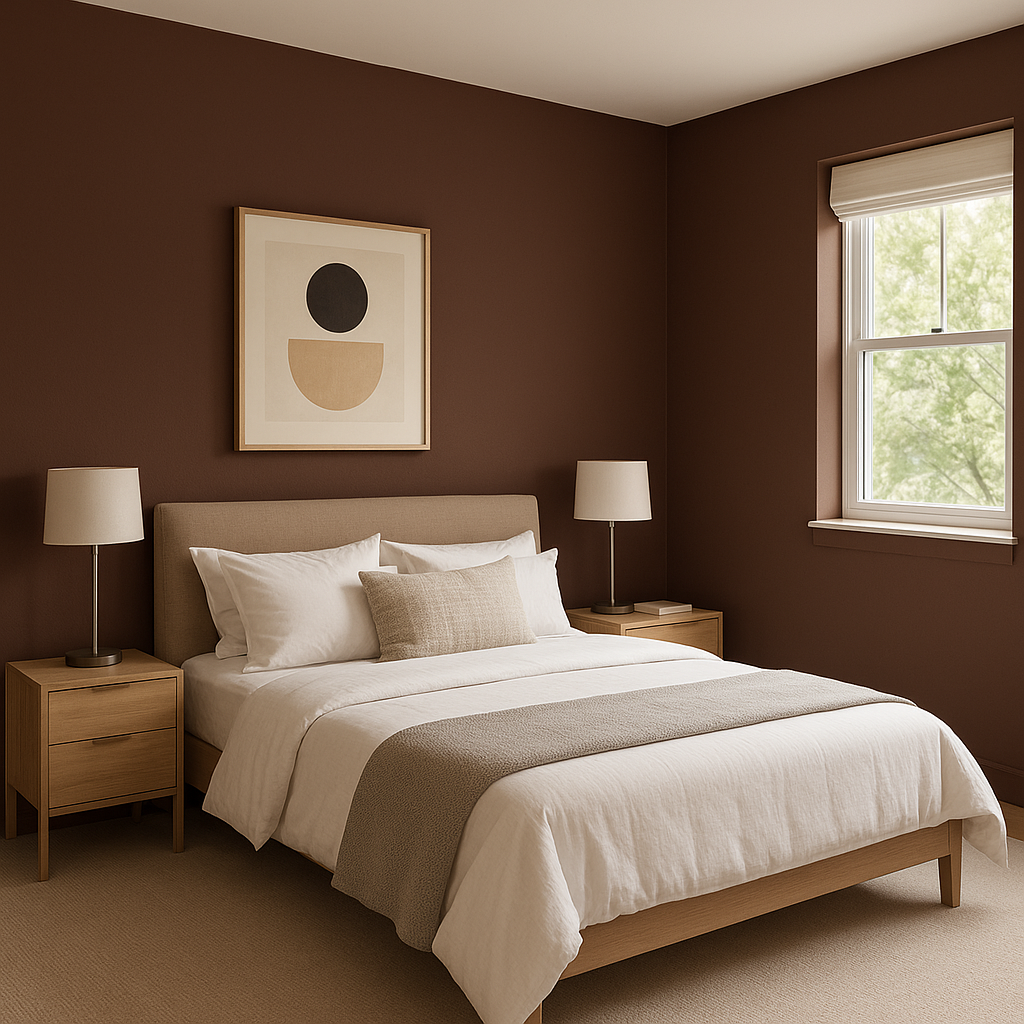
Raphael’s versatility makes it a go-to choice for a variety of spaces and design applications. Its warm, neutral tone provides an ideal backdrop for both bold and subtle decor elements, ensuring it can adapt to your evolving style. Here are some ideas for incorporating Raphael into your home:
Raphael (CC-2) has a timeless appeal that transcends fleeting trends. Its warm undertones and soft finish create a sense of understated luxury, making it a favorite for both classic and contemporary interiors. This color is particularly well-suited for spaces where you want to evoke feelings of comfort, elegance, and warmth. Whether your design leans traditional or modern, Raphael’s adaptability ensures it will complement your vision beautifully.
Benjamin Moore Raphael (CC-2) is more than just a paint color—it's a design staple that brings warmth, depth, and versatility to any space. Its creamy undertones, effortless pairing options, and ability to enhance the mood of a room make it a standout choice for creating a timeless and inviting home.
View Colors Only by Brand (No Imagery):
Sherwin-Williams
|
Benjamin-Moore
|
Behr
|
Valspar
Live on the Eastern Slope of Colorado and looking for a local painting professional, check out all our painting services and reach out for a free estimate.
Copyright © 2026 : Wild Fox Painting Inc. : 12435 Mead Way, Littleton, CO 80125


