Benjamin Moore Butter (CC-260) is a rich, creamy shade that exudes warmth, comfort, and sophistication. Evoking the soft, golden tones of freshly churned butter, this color creates an inviting ambiance that works beautifully in both traditional and modern interiors. Its versatility and understated elegance make it a favorite among interior designers who seek a hue that feels natural, cheerful, and serene.
Butter (CC-260) is a warm yellow with subtle golden undertones. These undertones prevent the shade from feeling overly bright or garish, giving it a soft and muted appearance. Unlike sharper yellows, Butter carries a hint of earthy depth, making it an ideal choice for spaces where warmth and coziness are priorities. The golden undertones lend a timeless appeal, ensuring that the color remains classic and adaptable throughout changing design trends.
Butter (CC-260) pairs effortlessly with a variety of complementary shades, allowing for a cohesive and harmonious design. The following colors work particularly well with this delightful hue:
Neutral Pairings:
Earthy Tones:
Accent Colors:
Butter (CC-260) is an extremely versatile color that can be used in various spaces to create different moods:
Transform your living room into a cozy retreat with Butter as the main wall color. Pair it with plush neutral furniture and accents in earthy tones like taupes, browns, and creams for a relaxed yet sophisticated vibe. Add pops of color through artwork or throw pillows to enhance the cheerful nature of Butter.
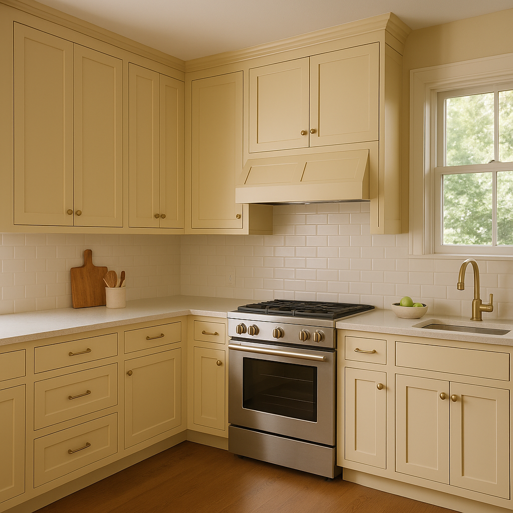
Butter is a classic choice for kitchens, particularly in spaces with wooden cabinetry or farmhouse-style decor. Its warm, golden hue complements natural wood tones beautifully, creating a welcoming space for family gatherings. Pair it with white subway tiles or light gray countertops for a timeless look.
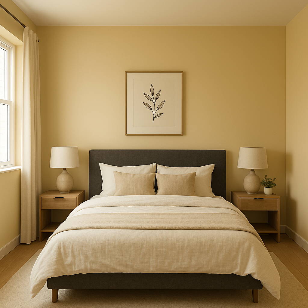
For a calming and soothing bedroom, use Butter to bathe the walls in soft warmth. Combine it with crisp white linens and touches of muted blues or greens to evoke a serene, nature-inspired atmosphere.
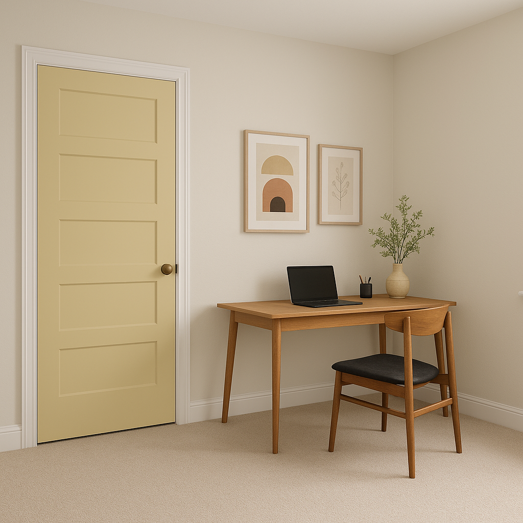
Butter's inviting nature makes it a great choice for entryways or hallways. It sets the tone for the rest of the home, creating a welcoming environment for visitors. Pair it with darker accents like deep browns or navy blues to make the space feel grounded and sophisticated.
The gentle, cheerful quality of Butter lends itself beautifully to nurseries or kids' rooms. Its warm undertones create a nurturing environment, while its versatility allows you to incorporate playful accent colors like pastel pinks, greens, or blues for a lively yet soothing design.
Benjamin Moore Butter (CC-260) is a highly adaptable shade that brings warmth, cheerfulness, and elegance to any space. Whether you pair it with neutrals for understated charm or bold hues for dramatic contrast, Butter is sure to create a timeless and welcoming atmosphere in your home.
View Colors Only by Brand (No Imagery):
Sherwin-Williams
|
Benjamin-Moore
|
Behr
|
Valspar
Live on the Eastern Slope of Colorado and looking for a local painting professional, check out all our painting services and reach out for a free estimate.
Copyright © 2026 : Wild Fox Painting Inc. : 12435 Mead Way, Littleton, CO 80125


