
Benjamin Moore Kitsilano CC-278 is a sophisticated, versatile neutral that brings an understated elegance to any interior or exterior setting. This soft, muted taupe has a calming presence that effortlessly bridges classic and contemporary design styles. Its adaptability, combined with its subtle depth, makes it a favorite among homeowners and designers seeking a serene yet inviting backdrop.
One of the most defining characteristics of Kitsilano CC-278 is its well-balanced undertones. This shade leans towards a warm taupe base with gentle hints of gray, ensuring it remains soft and neutral without feeling overly beige or cool. The warm undertones add a layer of coziness, while the subtle gray notes keep it modern and sophisticated. These undertones work harmoniously to create a hue that changes beautifully under different lighting conditions, from warm golden hues in natural sunlight to a more subdued tone under artificial lighting.
Kitsilano CC-278 pairs effortlessly with a variety of coordinating colors, making it a versatile choice for both monochromatic and contrasting palettes. Here are a few suggestions to bring out its full potential:
Kitsilano CC-278’s versatility makes it suitable for a wide range of applications throughout your home or commercial space:
Its warm, neutral tone provides a serene backdrop that complements a variety of furniture styles and shades. Whether your decor leans toward mid-century modern, rustic, or transitional, Kitsilano creates a cohesive and inviting atmosphere.
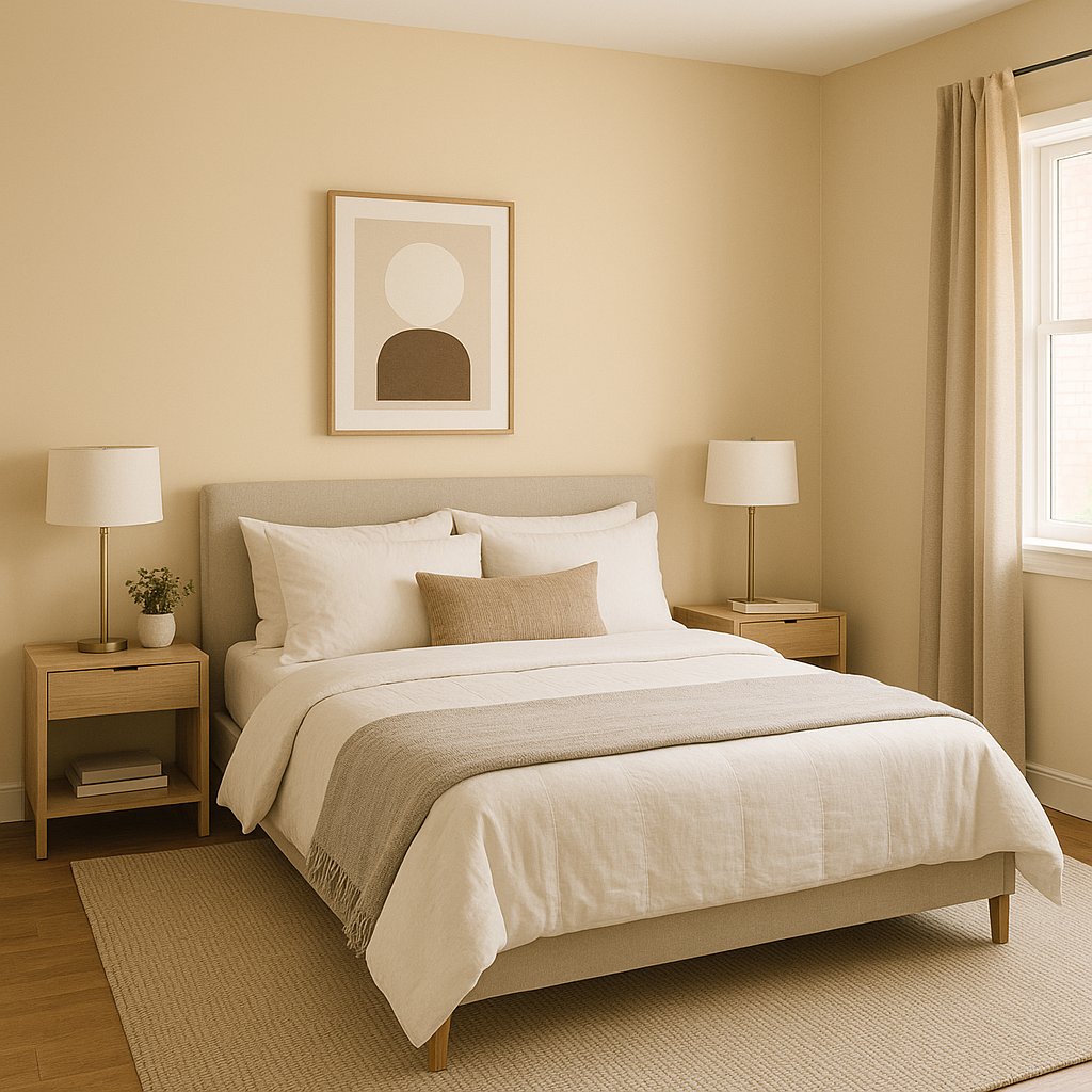
The soothing taupe and gray undertones make this color a perfect choice for bedrooms, promoting relaxation and comfort. Pair it with soft linens and warm lighting for a cozy retreat.
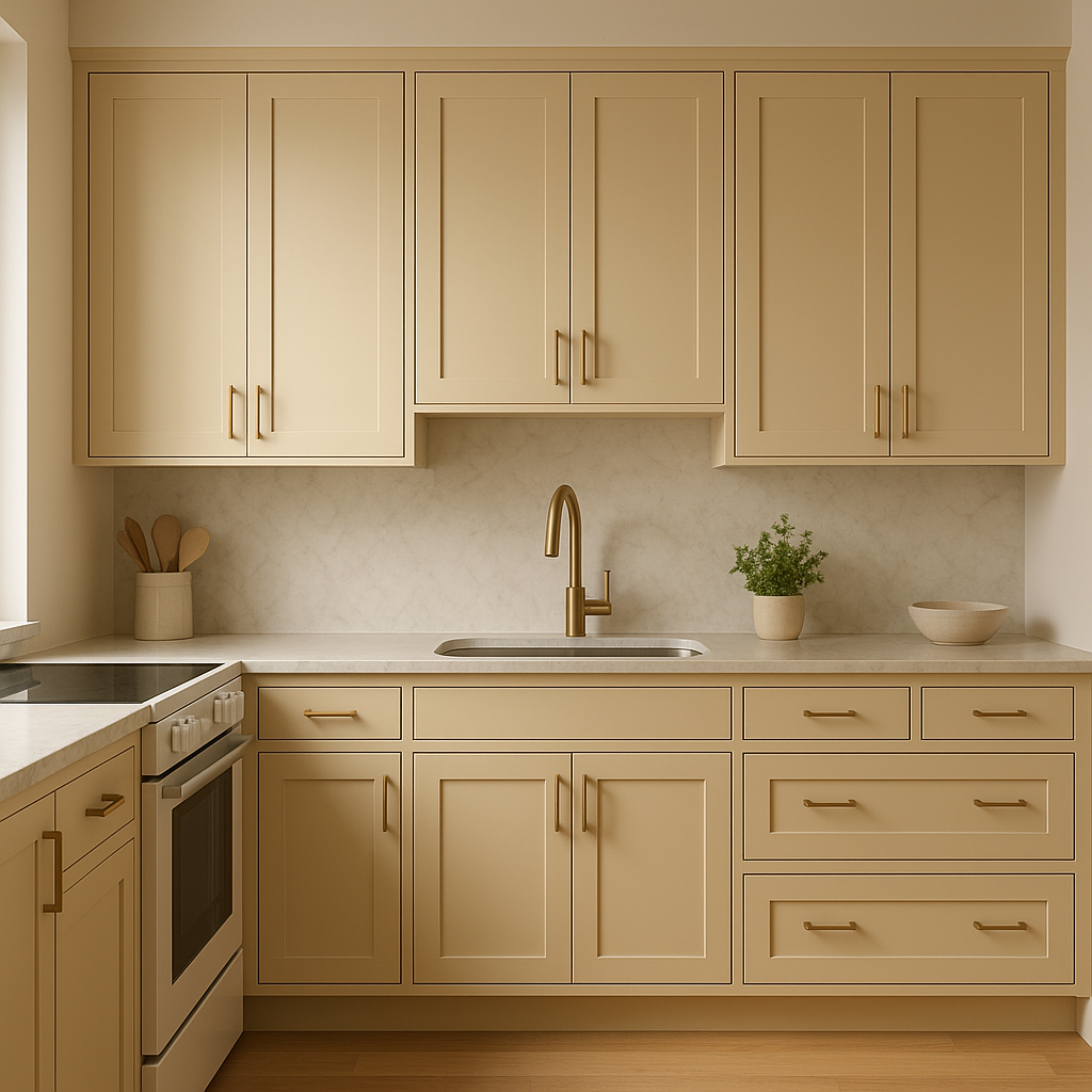
For a timeless kitchen design, use Kitsilano on walls or cabinetry. It works especially well with natural wood finishes, brushed metals, and white or marble countertops.
Its muted elegance lends itself beautifully to spa-like bathrooms. Pair it with white subway tiles, polished chrome fixtures, and soft green or blue accents for a refreshing yet grounded feel.
Kitsilano CC-278 is equally striking as an exterior color. Its neutral tone adapts to outdoor lighting, making it a great choice for siding, trim, or front doors. It pairs beautifully with stone accents, dark shutters, and natural landscaping.
Lighting plays a significant role in how Kitsilano CC-278 is perceived. In spaces with ample natural light, its warm undertones shine through, creating a cozy yet airy vibe.
View Colors Only by Brand (No Imagery):
Sherwin-Williams
|
Benjamin-Moore
|
Behr
|
Valspar
Live on the Eastern Slope of Colorado and looking for a local painting professional, check out all our painting services and reach out for a free estimate.
Copyright © 2026 : Wild Fox Painting Inc. : 12435 Mead Way, Littleton, CO 80125


