Benjamin Moore Sisal (CC-304) is a versatile, warm neutral that exudes understated elegance and natural charm. With its subtle beige base and soft golden undertones, Sisal creates an inviting atmosphere that feels both grounded and refined. This color is perfect for homeowners and designers who seek a timeless, adaptable backdrop for their interiors.
Sisal is distinguished by its delicate undertones, which lean towards a soft, golden warmth. Unlike cooler neutrals with gray or blue undertones, Sisal brings a gentle touch of sunshine to your space, making it feel cozy and approachable. It’s a warm neutral that balances beautifully between beige and tan, without leaning too heavily into yellow. These undertones make Sisal a perfect choice for creating a welcoming environment that radiates comfort and sophistication.
Sisal’s neutral personality makes it a versatile partner for a variety of coordinating colors. Whether your aesthetic leans toward modern minimalism, rustic charm, or classic elegance, Sisal pairs effortlessly with complementary hues. Here are some color pairings to consider:
Sisal’s versatility and warmth make it an excellent choice for a wide array of interior applications. Its ability to adapt to different lighting conditions ensures it works well in both bright and dimly lit spaces.
Sisal is a perfect choice for living and family rooms. Its warm undertones create a cozy, inviting space where family and friends can gather. Pair it with soft textiles, wood accents, and layered lighting to amplify its warmth.
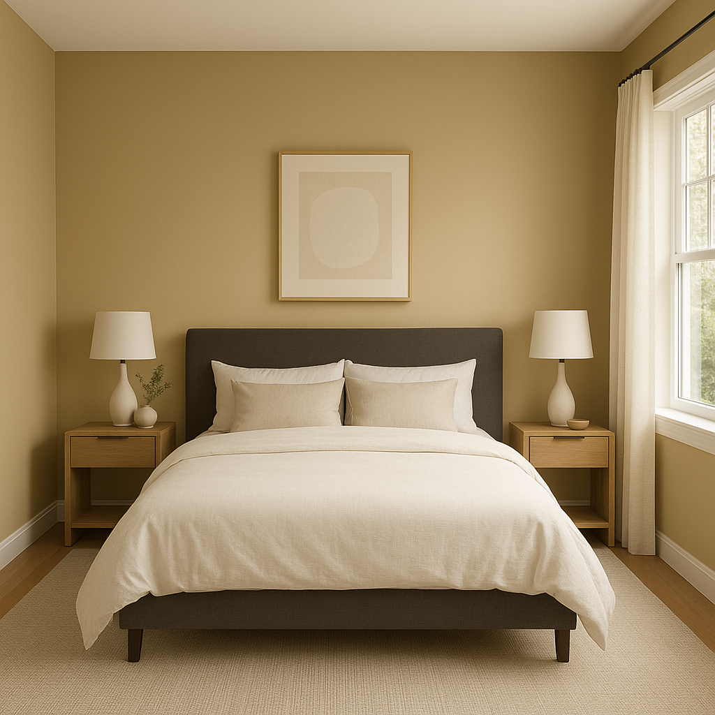
In the bedroom, Sisal fosters a restful, serene environment. Pair it with light-toned bedding and soft, neutral curtains for a calming retreat. For an elevated look, incorporate metallic accents in gold or bronze to complement the golden undertones.
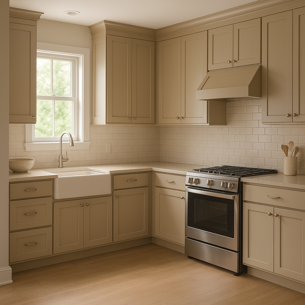
Sisal adds a touch of warmth to kitchens, especially when paired with white or cream cabinetry. It works well with both modern and traditional kitchen designs, and its neutral tone allows colorful backsplashes or decorative tiles to stand out.
For a spa-inspired bathroom, pair Sisal with natural stone, white trim, and soft greens or blues. Its warm undertones will create a soothing, cohesive look that feels fresh and timeless.
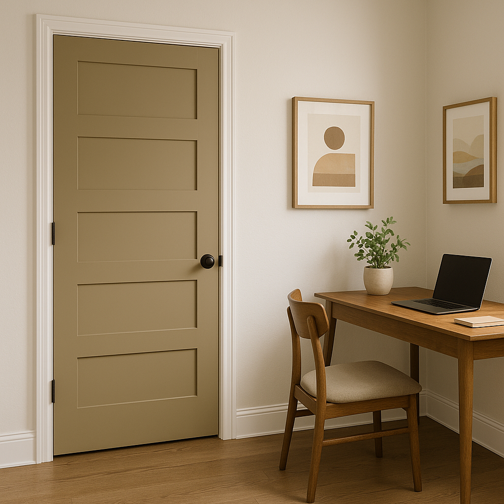
In transitional spaces like hallways and entryways, Sisal provides a polished, welcoming feel. Its neutral tone ensures it will flow seamlessly into adjoining rooms painted in complementary colors.
Benjamin Moore Sisal (CC-304) is a classic choice for those who value flexibility, warmth, and sophistication. Its golden undertones make it a standout neutral that adapts to a variety of styles and environments. Whether you’re refreshing a single room or designing an entire home, Sisal’s timeless appeal ensures it will remain a beloved choice for years to come.
For those seeking a dependable neutral that radiates warmth without overwhelming a space, Sisal is the perfect solution. Pair it with coordinating colors that match your aesthetic, and enjoy the way it transforms your interiors into a haven of comfort and elegance.
View Colors Only by Brand (No Imagery):
Sherwin-Williams
|
Benjamin-Moore
|
Behr
|
Valspar
Live on the Eastern Slope of Colorado and looking for a local painting professional, check out all our painting services and reach out for a free estimate.
Copyright © 2026 : Wild Fox Painting Inc. : 12435 Mead Way, Littleton, CO 80125


