Benjamin Moore Nubuck CC-366 is a versatile, warm neutral that exudes understated elegance and timeless appeal. With its subtle complexity, this paint color has gained popularity among homeowners and designers alike for its ability to create a soothing, harmonious atmosphere in a variety of spaces. Whether you’re designing a modern retreat or a classic, cozy nook, Nubuck CC-366 provides a perfect canvas for your vision.
Nubuck CC-366 is a soft, muted beige with warm undertones that lean slightly taupe. Its delicate balance of warmth and neutrality gives it a sophisticated depth without feeling too heavy or overly yellow. The taupe undertones allow Nubuck to pair seamlessly with both warm and cool color palettes, making it a highly adaptable choice for different design schemes.
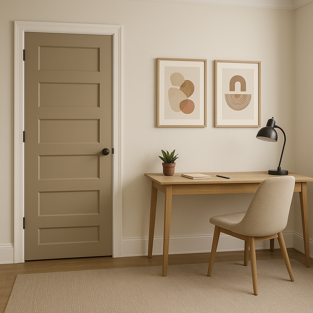
This color is particularly well-suited for spaces where you want to create a calm and inviting ambiance. The warmth in its undertones prevents it from feeling stark, while the taupe influence adds dimension, making it an excellent choice for walls, trim, or even cabinetry.
Benjamin Moore Nubuck CC-366 pairs beautifully with a wide range of coordinating colors, allowing you to achieve a cohesive and polished look in any space. Here are some suggestions for complementary tones:
Benjamin Moore Chantilly Lace OC-65: This crisp, clean white is perfect for trim, ceilings, or accents. Its brightness balances the warmth of Nubuck, creating a fresh and airy look.
Benjamin Moore Revere Pewter HC-172: A classic greige with subtle warmth, Revere Pewter pairs harmoniously with Nubuck for a monochromatic yet layered effect.
Benjamin Moore Hale Navy HC-154: For a bold contrast, opt for this deep navy. It adds a touch of drama and sophistication, especially in spaces like dining rooms or home offices.
Benjamin Moore Healing Aloe 1562: A soft, muted green with cool undertones, Healing Aloe complements Nubuck beautifully for a serene, nature-inspired palette.
Benjamin Moore Kendall Charcoal HC-166: If you’re looking for a darker neutral to ground your design, Kendall Charcoal provides a striking yet balanced contrast.
This neutral paint color is versatile enough to be used throughout your home or as an accent in specific spaces. Here are some ideas for incorporating Nubuck CC-366 into your design:
Living Rooms: Create a cozy and inviting atmosphere by using Nubuck on the walls. Pair it with plush textiles, natural wood tones, and metallic accents for a sophisticated yet comfortable space.
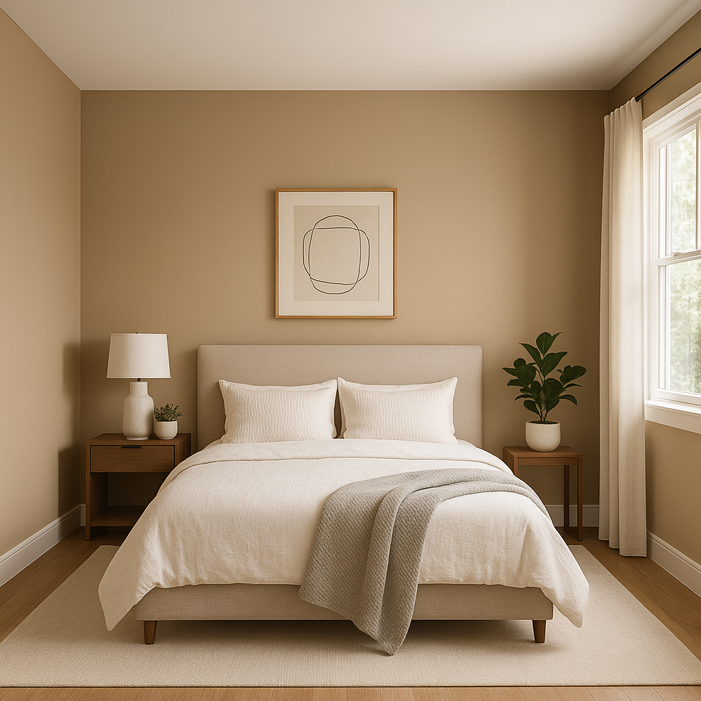
Bedrooms: Nubuck’s warm undertones lend themselves well to creating a restful sanctuary. Pair it with soft whites, muted blues, or gentle greens for a tranquil bedroom retreat.
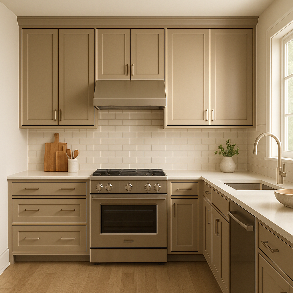
Kitchens: Use Nubuck on cabinetry or as a wall color to complement quartz countertops, stainless steel appliances, and subway tile backsplashes. It brings warmth without overpowering the space.
Bathrooms: For a spa-like vibe, pair Nubuck with soft whites, marble finishes, and pale aqua accents. Its warmth adds a touch of coziness to the often-cool tones of bathrooms.
Hallways and Entryways: Nubuck’s neutral elegance makes it a great choice for transitional spaces, creating a welcoming and cohesive flow throughout your home.
As with any paint color, Nubuck CC-366’s appearance will vary depending on the lighting in your space. In rooms with ample natural light, Nubuck will appear lighter and more luminous, showcasing its warm beige qualities. In spaces with artificial or dim lighting,
View Colors Only by Brand (No Imagery):
Sherwin-Williams
|
Benjamin-Moore
|
Behr
|
Valspar
Live on the Eastern Slope of Colorado and looking for a local painting professional, check out all our painting services and reach out for a free estimate.
Copyright © 2026 : Wild Fox Painting Inc. : 12435 Mead Way, Littleton, CO 80125


