Benjamin Moore Sandpiper CC-368 is a soft, sophisticated neutral that exudes warmth and understated elegance. Perfectly balanced, this color has a subtle complexity that makes it a favorite among designers and homeowners alike. Its gentle blend of beige and gray creates a versatile greige tone that complements a variety of styles, from modern minimalist to cozy farmhouse.
One of the defining features of Sandpiper is its nuanced undertones. While primarily a greige, Sandpiper leans slightly warm due to its faint beige undertones, which are delicately balanced by a whisper of gray. This blend ensures that the color transitions beautifully in different lighting conditions. In bright, natural light, the beige warmth is more prominent, creating a soft and inviting atmosphere. In lower, artificial lighting, the gray undertones subtly emerge, lending a more grounded and modern vibe.
This dual nature makes Sandpiper CC-368 an adaptable choice for both north- and south-facing rooms. It maintains its soft neutrality without skewing too cold or overly warm, ensuring it feels neither stark nor heavy.
Benjamin Moore Sandpiper CC-368 pairs beautifully with a wide range of colors, making it an excellent choice for cohesive palettes. Here are some recommended coordinating colors:
Crisp Whites: Colors like Benjamin Moore Chantilly Lace OC-65 or Simply White OC-117 provide a fresh, clean contrast, especially for trim, ceilings, and cabinetry. These whites highlight Sandpiper's warmth and create a timeless, elegant look.
Soft Grays: Pairing Sandpiper with light gray tones, such as Benjamin Moore Stonington Gray HC-170, enhances its subtle gray undertones, creating a harmonious and serene atmosphere.
Earthy Greens: Muted greens like Saybrook Sage HC-114 or October Mist 1495 complement Sandpiper’s warm beige notes, adding a natural, organic feel to the space.
Warm Accents: For a touch of richness, consider deeper colors like Kendall Charcoal HC-166 or Hale Navy HC-154. These moody hues add depth and drama, offering an elegant contrast to Sandpiper’s softness.
The versatility of Sandpiper CC-368 makes it suitable for a variety of applications throughout the home. Its neutral tone provides a perfect backdrop for layered decor and works well in spaces where flexibility is key.
Sandpiper is an ideal choice for living rooms, where its warm neutrality creates a welcoming, comfortable atmosphere. Pair it with plush furnishings, natural textures, and accent colors to create a cozy yet refined space.
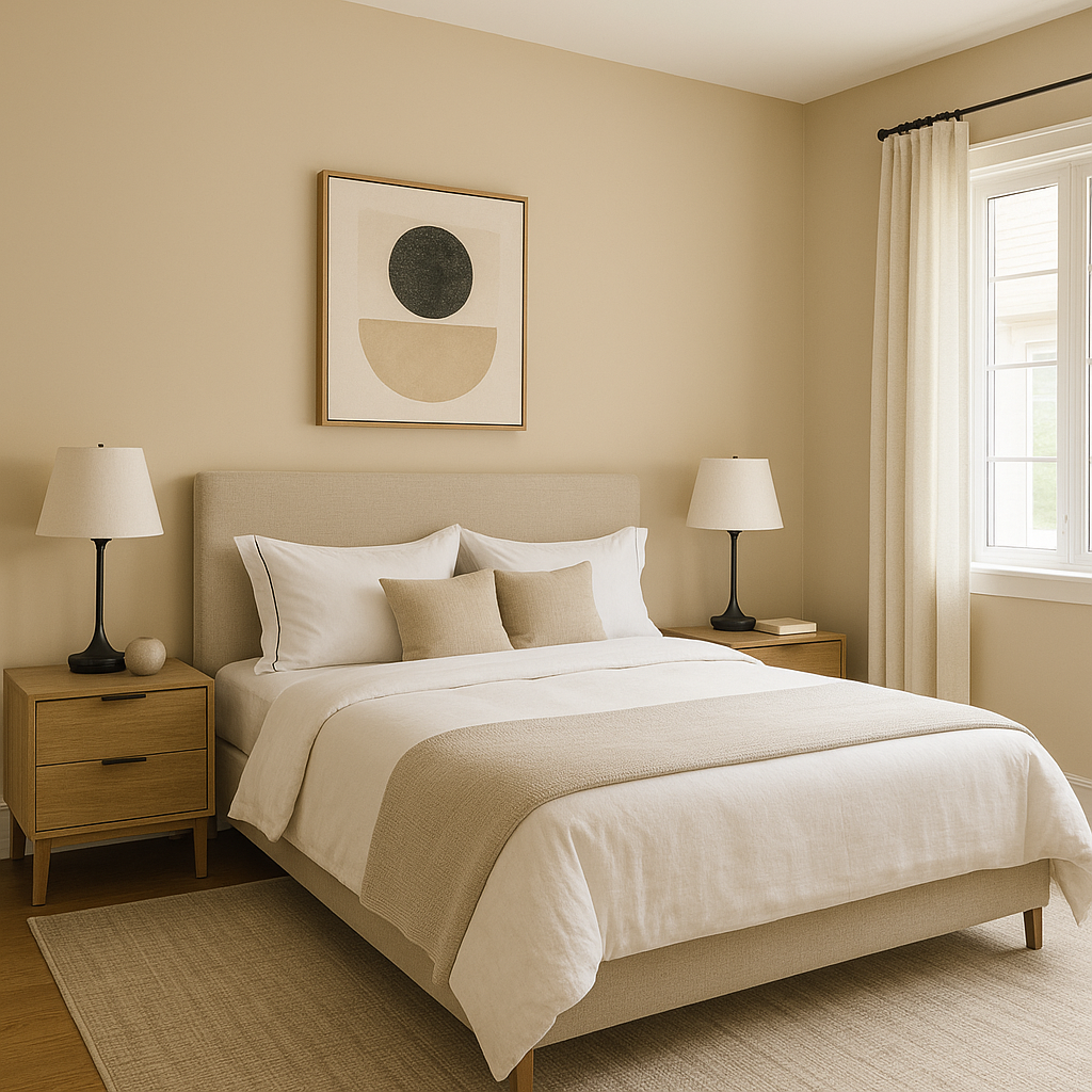
For bedrooms, Sandpiper’s soothing undertones promote relaxation and tranquility. Use it on walls and pair it with crisp white linens or soft pastel accents for a calming retreat.
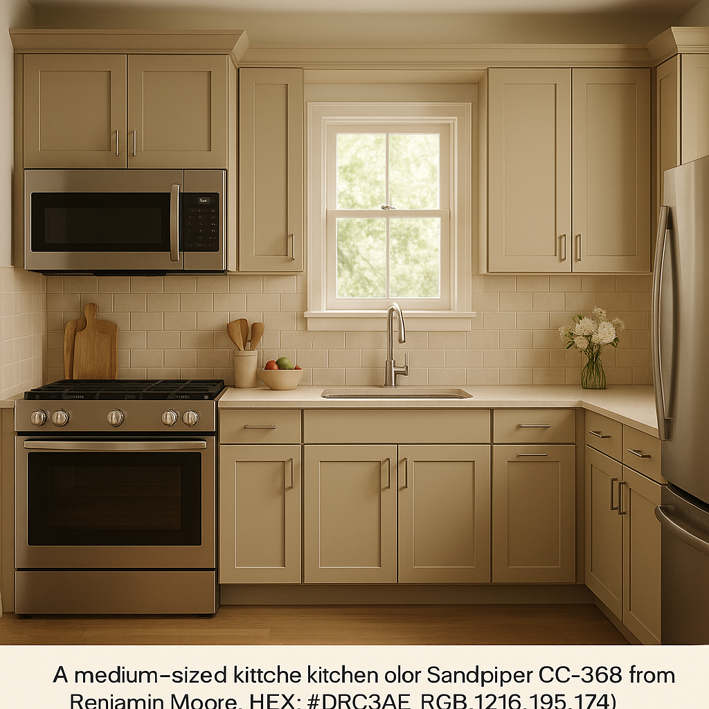
Sandpiper works beautifully in kitchens, especially when paired with white cabinetry and natural wood finishes. It creates a seamless, clean look that feels both modern and inviting.
In bathrooms, Sandpiper adds warmth without overpowering the space. Coordinate it with white tiles, brushed nickel fixtures, and soft gray towels for a spa-like ambiance.
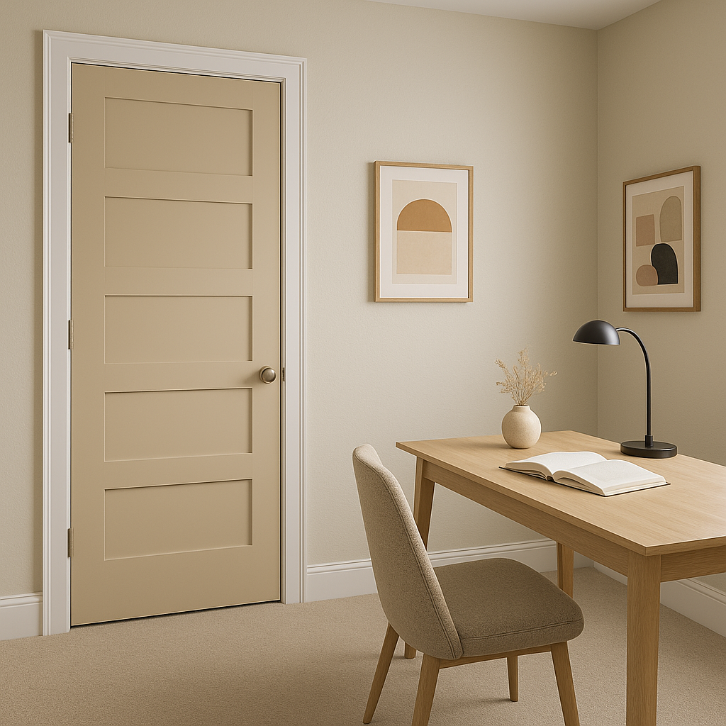
As a transitional color, Sandpiper shines in hallways and entryways. Its soft, neutral tone ensures a smooth flow between rooms while providing a polished and cohesive look.
If you’re looking for a neutral that offers both warmth and versatility, Benjamin Moore Sandpiper CC-368 is a standout choice. Its balanced undertones, ability to coordinate with a wide range of colors,
View Colors Only by Brand (No Imagery):
Sherwin-Williams
|
Benjamin-Moore
|
Behr
|
Valspar
Live on the Eastern Slope of Colorado and looking for a local painting professional, check out all our painting services and reach out for a free estimate.
Copyright © 2026 : Wild Fox Painting Inc. : 12435 Mead Way, Littleton, CO 80125


