
Benjamin Moore Dufferin (CC-456) is a refined and versatile paint color that balances warmth and elegance, making it a go-to choice for homeowners and designers alike. This soft neutral brings a sense of understated sophistication to any space, effortlessly creating a backdrop that is both inviting and adaptable. Whether you're revamping your living room, refreshing your bedroom, or curating a serene office space, Dufferin provides the perfect canvas.
Dufferin (CC-456) is a warm greige—a harmonious blend of gray and beige—with subtle taupe undertones. These undertones give the shade its depth and warmth without overwhelming the space. The gray element ensures a modern feel, while the beige undertones keep it grounded and approachable. Depending on the lighting, Dufferin can lean slightly warmer or cooler, making it a chameleon-like neutral that adapts beautifully to various settings.
Natural Lighting: In rooms flooded with natural light, Dufferin reveals its soft warmth, creating a cozy yet airy atmosphere.
Artificial Lighting: Under artificial light, especially warm-toned bulbs, its taupe undertones become more pronounced, infusing spaces with a welcoming glow.
Benjamin Moore Dufferin pairs effortlessly with other shades, making it an ideal choice for those seeking a cohesive color palette. Here are some recommendations for coordinating hues:
Dufferin’s versatility allows it to shine in a variety of settings, from modern minimalism to classic elegance. Here are some ideas for incorporating this timeless neutral into your home:
Dufferin is perfect for creating a cozy yet polished living space. Pair it with plush sofas in neutral tones and add textured throws or area rugs to enhance the warmth. Incorporate metallic accents like brass or gold for an elevated look.
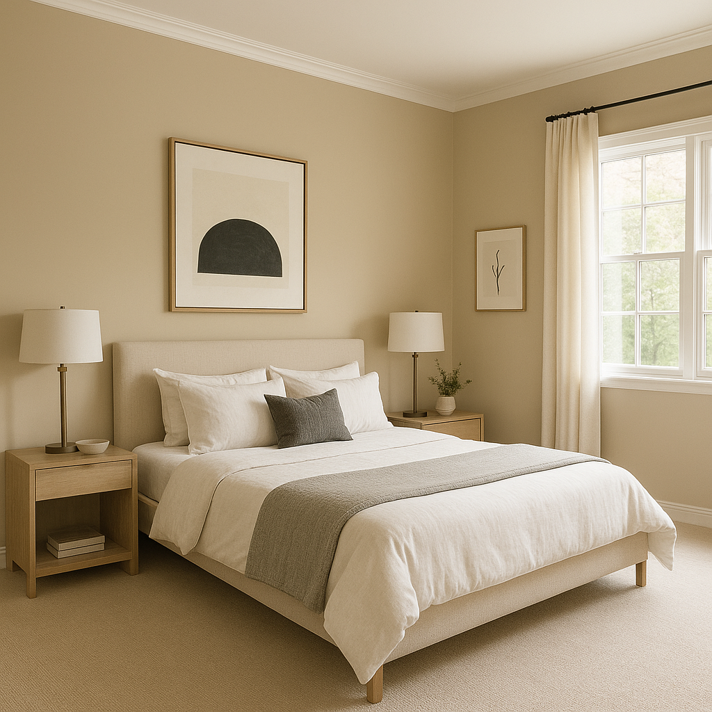
For a restful retreat, use Dufferin on the walls and pair it with crisp white bedding and soft, muted accent pillows. Add natural wood furniture to complement the warmth of the taupe undertones.
Dufferin works beautifully as a backdrop in kitchens, especially when paired with white or cream cabinetry. Add black or charcoal hardware for a touch of modern contrast, and consider a marble backsplash to enhance the sophisticated vibe.
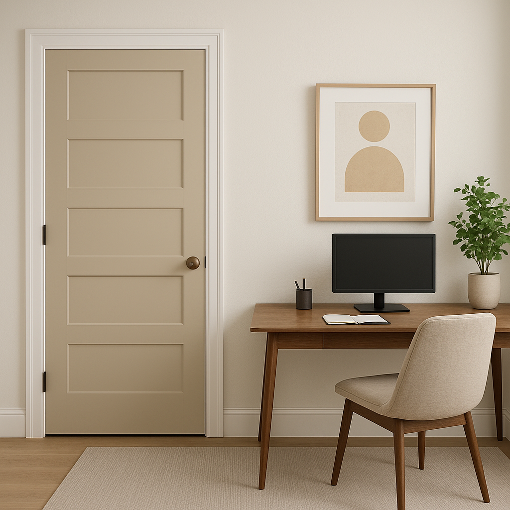
Create a productive yet inviting workspace by using Dufferin as the main wall color. Pair it with rich wood furniture and pops of color in artwork or accessories to inspire creativity.
For a spa-like ambiance, pair Dufferin with crisp white tiles and brushed nickel fixtures. Add soft greens or blues in accent towels to introduce a calming touch.
Dufferin’s ability to adapt to changing light and pair seamlessly with various colors makes it a reliable choice for almost any design style. Its warm yet neutral qualities make it equally suitable for traditional, transitional, or contemporary interiors. Whether used as a main wall color or a subtle accent, Dufferin brings depth, character, and timeless appeal to your space.
Transform your home with Benjamin Moore Dufferin (CC-456)—a shade that embodies effortless elegance and incredible versatility.
View Colors Only by Brand (No Imagery):
Sherwin-Williams
|
Benjamin-Moore
|
Behr
|
Valspar
Live on the Eastern Slope of Colorado and looking for a local painting professional, check out all our painting services and reach out for a free estimate.
Copyright © 2026 : Wild Fox Painting Inc. : 12435 Mead Way, Littleton, CO 80125


